We all know a well put together room when we see one – we might not know why it’s so pleasing to the eye, but there’s something about the movement, style and colors that draw us in.
In an effort to capture those little design elements that lie behind a well decorated room, I’m using today’s post to highlight three {quick!} fixes to offer ever so subtle modern updates. Perhaps this could turn into a full article on dressing a room top to bottom, but today’s purpose is get the mind whirling on what you might be able to fix this weekend, and not months in the future. So let’s dive right in!
 p
p
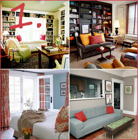
{Idea #1: Bring in Contrasting Colors}
p
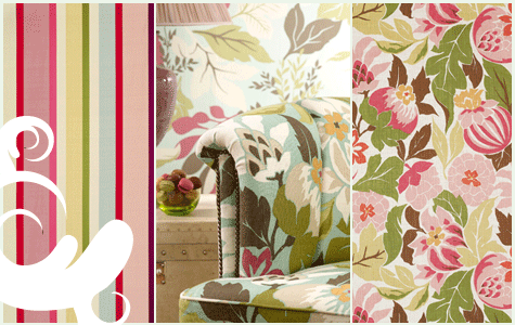
Take a look around your room and note the color theme. Perhaps it’s various shades of blue, tan or maybe red. To add an element of design that makes a pop, find an accessory in a contrasting color to add. If your living room is green, opt for fuchsia throw pillows, if it’s red, consider a plum or yellow rug, lamp or blanket draped over the couch.
Weekend mission: Throw pillows are easy-peasy, take your new search to your local design store or hit up eBay for some excellent contrasting finds.
p
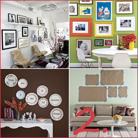
p{Idea #2: Reorganize Your Walls}
Well designed rooms incorporate well designed wall art. Pull all of your photos and paintings down from their current locations and reconsider your blank wall canvas. Now set up clusters of your favorite pictures at the base of your wall on the floor, and go about your daily business. Come back throughout the day and reorganize your photo/painting cluster until you finally have something that works well for your space and your photos. A simple rule that I like to follow is clustering in odd numbers and keeping larger photos towards the center. When your grouping looks appealing on the floor, mark out your new space with blank sheets of paper on the wall (one piece of paper represents one photo that is temporarily attached to your wall).
Weekend mission: Gather photos from all over the house and match frames that work well together for groupings (frames don’t actually need to match – I love the gold, ivory, brown frame combos, for instance – but you’ll know right away if one photo looks appropriate next to the other). If you don’t have wall art that includes brilliant black & whites of your family or brightly colored framed photos from travels, now’s the opportunity to hunt through drawers and order new, large prints from your favorite photo store – Costco photo, anyone?
p
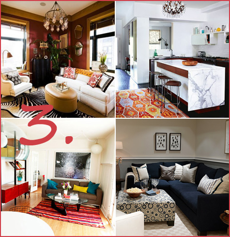
Follow the jump to learn more about patterns & texture, and for the rest of the article!…

