This has been such a busy week, so busy that I can’t believe that it’s almost over. But I am equally thrilled that it’s time for a little rest and rejuvenation :).
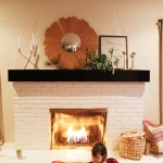
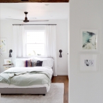
I love to share Friday guest blog interview posts with you because I love to share really great finds (read more about those here). Today I’d love to give a warm welcome to Alison from Deuce Cities Henhouse who is joining me to answer the usual five design & inspiration questions, and to share her vintage modern style and photos of her amazing home. I love (love) this girl’s home. So much about her 100-year-old casa speaks to me. There is something about the art of decorating something so old that is both exciting and incredibly daunting. I never feel that we do our 1930’s bungalow justice – and it makes me happy when I get to be inspired by bloggers that do do the old thing so well.
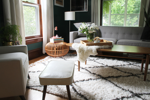
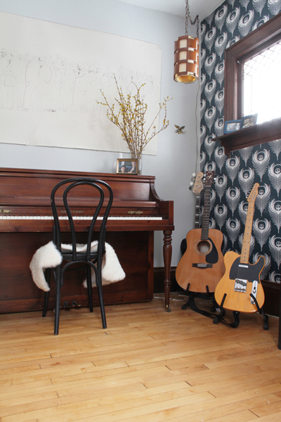
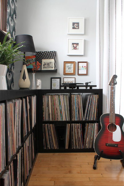
I originally noticed Alison’s home when I caught a sneak peek of her music room and that amazing wallpaper. The rest of her home is filled with beautiful patterns, a mix of modern & mid-century furniture, gorgeous green house plants and even a Franco Albini wicker ottoman (yep, Alison’s living room was one of the photos from here).
Alison (who goes by Scoops – awesome) is mom to Gus & Finn, majored in photography (hence all of the pretty pictures) and named her blog after the Twin Cities (her hometown).
Head on over to the full interview to see more house shots and read about Alison’s favorite tips and inspiration – plus an awesome DIY project that she recently tackled.
………………………………………………………………………………………………………
{PDB Interview with the Alison of Deuce Cities Henhouse}
………………………………………………………………………………………………………
What inspires your design style?
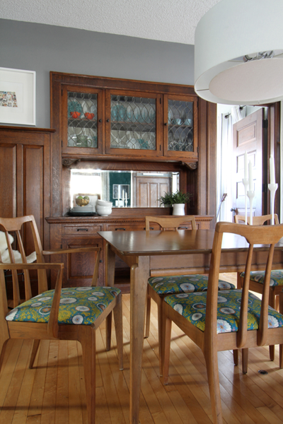
First, my 1910 four-square style home often dictates the path my design style takes – I have to incorporate my own aesthetic while preserving the character of this old home.
We have lots of dark-stained quarter sawn oak woodwork throughout the main floor of our house, and I have to resist the urge to paint it white on an almost annual basis. The woodwork has a beautiful patina and age to it, and I do my best to incorporate its age into the design of the home – I do feel like I am the care taker of the home and I need to honor the parts of it that are original. Because of that, I often times refer to my style as “Vintage Modern,” although I feel like’s its evolving and maturing a little bit these days and don’t know exactly how to define it in its current state – or it could be that I’m just gettin’ old.
I am also very inspired by sentimental objects that I love. What is a home without the things that have meaning to you surrounding you in your space? For me that’s records, pictures, books and a variety of meaningful objects. I also love Scandinavian aesthetic and modern sensibilities and try to incorporate it in small ways throughout my home.
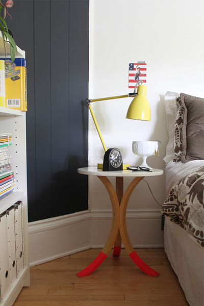
Finally, I love color and am often drawn to the color blue in almost all shades. I think it inspires a lot of my decisions whether I know it or not.
What do you love most about what you do?
Although I am not making money hand over fist, I consider myself a blogger. It is what I do. I love blogging and I feel that it is the perfect medium for me. I went to school for photography and the blog allows me to exercise that skill daily while taking photos of my house. Since I was a teen I’ve always been fascinated by web development and coding. Over the years I’ve self-taught myself HTML. I love coding CSS, it’s one of my favorite things to do, and I will happily spend hours just tinkering with the blog. Most of all, I love my home, interior design and decor. I’ve been fascinated by people and their interior spaces my entire life – it was the main topic of my photography work in art school.
To me, interior space is similar to fashion; it’s how people project themselves, and I think it’s highly cool and fascinating. My blog incorporates all of my favorite passions – I honestly wouldn’t want to be doing anything else.
What are your favorite design trends?
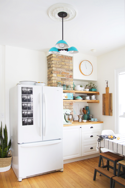
I adore the black and white trend. It’s not reinventing the wheel or anything, but I love the way it photographs and I can’t get enough of it. I just recently updated my kitchen painting it black and white with aqua, turquoise and teal accents. On occasion I pretend to be a minimalist, but I can’t resist adding color and “stuff”. My favorite trend however is house plants. I have a bit of a green thumb. I love gardening and I love having plants in my home, even if it drives my husband crazy. Now I can just tell him that it’s the cool thing to do, I can hoard them like crazy and it won’t be weird.
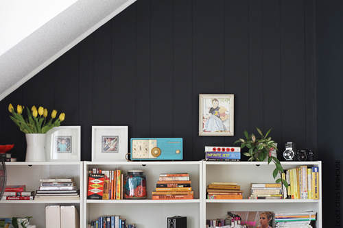
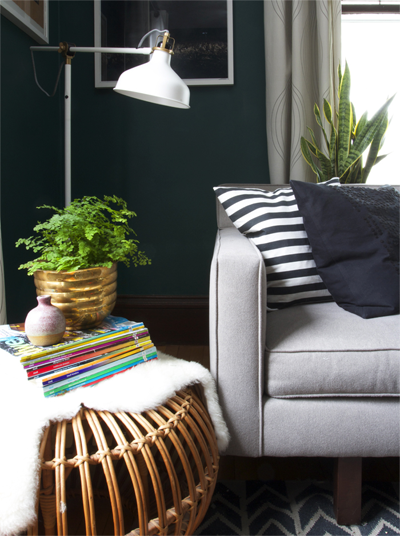
What are three design suggestions that you would like to offer readers?
Oh geez, I never like calling myself an expert on anything – this stuff always makes me nervous. There are a few general rules I live by and I’d be happy to share those with your readers.
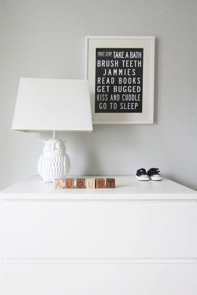
1) I try and repeat colors throughout the house. Not only does this make a home cohesive, it also allows for easy repurposing. I have two boys and we’ve had to do a lot of repurposing lately as they recently took up bunking together Having repeated colors throughout the home made it easy for me to create a guest bed room on a no-cost budget out of our youngest son’s old nursery.
2) I mentioned it above, but I think it’s really important to incorporate sentimental objects in collections throughout your home. I have a lot of artwork from friends hanging all over the house, we have a “music room” dedicated to instruments and records – our all-time favorite things – and I constantly scour the “memory box” for items to add to our home. It makes me happy to have all our favorite memories curated in our space.
3) Lastly, purge often. This is good for a few reasons. First, it makes your home feel neat tidy and uncluttered. Second, it makes you conscious of how much you are actually taking into your home and more aware and focused on what you really need.
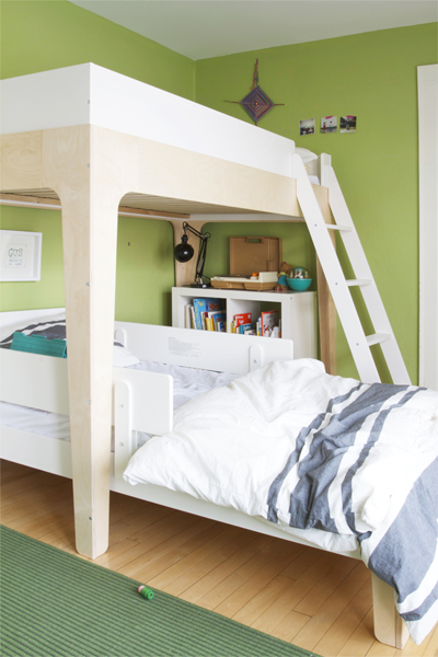
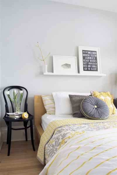
Can you share a favorite DIY project and why you loved creating it?
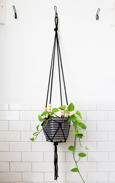
I recently shared directions on my blog for making a modern macrame plant hanger. It was really easy to do and I love the look of it. I had spent 12 weeks over the fall updating, restoring, and adding functional work spaces to our kitchen, including the original pantry. I wanted there to be a lot of plants throughout the kitchen and I was able to create this modern twist on a macrame planter. I shared each step in a tutorial you can find here. I have my new planter hanging in the corner of the kitchen – it gives a nod to those old 70’s hemp macrame plant hangers without having to be all 70’s and hempy. Plus, it’s just another excuse to have a plant in my home.
Thank you, Alison!
………………………………………………………………………………………………………
If you loved this interview, check out more great spotlights {and tips & tricks} from other Friday Guest Bloggers.

