The new gallery wall in the bedroom isn’t there yet, but it’s making progress. Last I left you, I was exploring wall layout ideas and had only committed to a couple of pieces of art. Here’s a post on my inspiration.
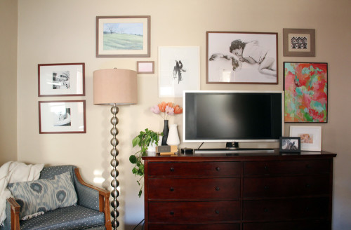
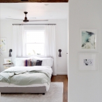
Most of my paintings/drawings/photos are framed and up! But I have a few spots that I’ll be adding to or switching things around (it feels like something’s missing to the right above, no? In the shadowy part of the wall).
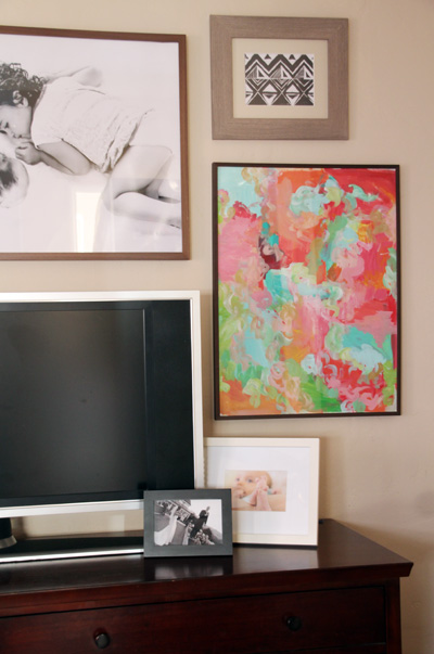
Better photos to come soon when the project is finished finished. And I’ll share sources for anything that I didn’t create myself.
The plant below was moved from the office into the bedroom on the day of these photos. It’s actually thriving now, despite its shaggy appearance here. I’m also planning on upgrading that occasional chair there to the left of the lamp (and maybe the lamp?), but I’m waiting for the perfect find.
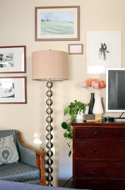
It still feels odd to have a TV in the bedroom, but after 3-4 months of having moved the older living room television into this space, I can probably count on two hands how often it’s been turned on. It’s nice knowing that if we ever want to curl up and watch a movie while already in bed it’s possible! Even if not probable :).
Gallery walls that come together over time feel more authentic. I love picking out pieces from around our house to display up here, or taking the time to shop on etsy or at local craft fairs for what feels like it belongs. It’s also nice to know that nothing is permanent and that things can change as we go.




Just finding your sweet comment! I found it at World Market (or Pier 1?) ages ago, but I think that West Elm now sells something similar!
It looks so great!! I love this idea for our bedroom. Thanks for the inspiration :)
That wall is coming along great! It’s got a great balance of color and monochromatic without feeling forced. Looking forward to seeing how the new year brings in new pieces!
Looking good! I love that you have framed photos on the dresser, too- they all kind of flow and the gallery wall makes the tv seem a part of the arrangement, not an eye sore at all. :)