The curtains are up! Remember back here when I was debating six favorite fabrics for the new curtains?
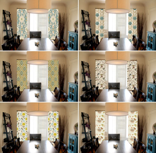
I had the hardest time deciding… but thank you all for the comments and emails that you sent my direction! You helped to confirm my final choice which was the Orla Kiely print!
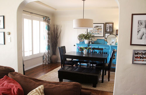
You might also remember that if I chose the Orla Kiely print I’d have to make the curtains out of a duvet cover. Well it was a close close project, but my king duvet cover (90×108″) made for a near perfect fit. I was hoping to use grommets to hang these guys but when I received the fabric in the mail I realized that the pattern ran in the 90″ direction rather than the 108″ – eek! So instead I clipped up my curtains which gave me a few extra inches of fabric to play with to create a wide hem.
These photos are a bit washed out… it was hard to capture the print against the bright windows and I may end up lining them to help show off the design that I love so much!
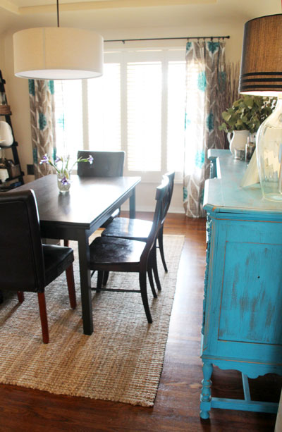
I’m sticking with just the jute rug for now, though I might swap out for the brown cowhide rug if I can find other ways to bring in bright colors (you might remember that it was my favorite but made the space feel a tad too dark).
I’ve also swapped out two dining room chairs for a bench/ottoman from the living room.
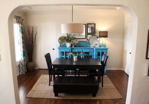
It makes the space feel much more open – though I’m also keeping an eye out for a bench that might be a little higher and a little narrower. This guy isn’t too realistic to sit on for a full meal.
I love most how the turquoisy blue in the buffet is accented so well in the curtains. They really compliment each other and look great in person.
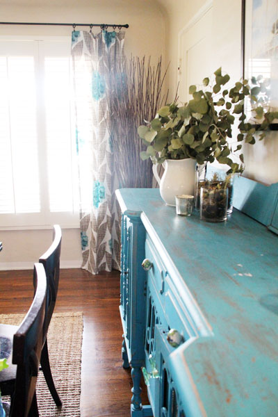
The pattern is just the modern, geometric update that the space needs!
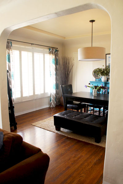
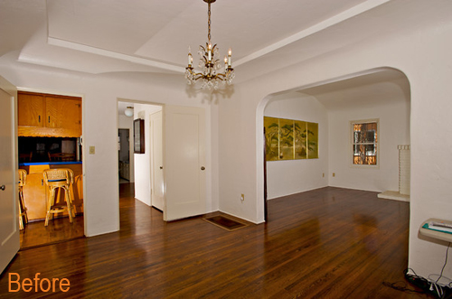
And overall the room is really moving in the right direction… here’s a reminder of the space before we moved in!
So happy I took the leap of faith with these new curtains and ordered an unusual fabric choice (a duvet cover!) off of eBay, they turned out to be much cheaper than buying the fabric by the yard and I’m so happy with the look! What do you think?
Read the full dining room story by starting here: choosing a rug, curtain call part 2, curtain call part 1, newly styled bookshelves, a buffet-over, upgrading the lighting, the before.




Thanks for this wonderful post and hoping to post more of this.
Love that choice! The blues really work together well without being matchy-matchy; and the ottoman is a great swap out too!
Thanks Leslie! I’m considering swapping out the legs – maybe I can boost that ottoman up!
oops… I meant to say they LOOK perfect with your hutch. ;)
These curtains turned out awesome, Morgan!!! They perfect with your beautiful hutch. What a great job you did, especially working with a duvet cover! :)
Thanks Janelle!
Stunning! I can’t get over how nice it looks with the side buffet (which for the record is eye candy galore). Lovely choice!
Thank you, Alex! I love that blue too.
Your fabric choice is just perfect with the turquoise buffet. Great idea to use a duvet!
Thanks, Sheila!
The curtains look great, especially with your amazing buffet! And so smart to make them out of a duvet cover. I need to remember to look for great fabric in unexpected places like that.
Yes! I love to look for fabrics in unexpected places. Sometimes the best prints are in clothing, household items and random finds!
Looks fantastic! By far this was my fave choice for your dining room. The buffet is so gorgeous, it needed an equally gorgeous complementary fabric, I don’t think it gets any better than what you’ve chosen. So much subtlety, but everything adds a perfect punch. Less is always more. Great space!
Thank you, Crystal! That means a ton!
PLEASE, PLEASE line the drapes. You will be so much happier with the beefier, more finished feel and look. They look beautiful.
I am considering lining – and adding those grommets for a beefed up look. I agree that that would look really nice! Thanks for the suggestion! :)
love the punch of color and pattern and love the bench idea. I might suggest a ceiling medallion over the chandy…the included one looks a little small in comparison to the size of the lamp shadebut what an improvement over the original room. Great job!
Hadn’t thought of that – that’s a good idea to look into!