The new office/guestroom space is humming along and it’s about time to consider how we’ll organize this somewhat looong and narrow space. Since I hope to have it fulfill two very different functions (that of an organized and well-designed office as well as a comfy space for our guests to hang their hats) the narrow-ness (is that a word?) of the room might be a bonus in disguise.
But just to lay a little context to the gray & white diagrams below… here’s the spa-like color palette I’m mulling over at the moment:

We love dark, warm furniture (as you can tell from the rest of the house) but we’re playing with the idea of keeping everything white in this room… maybe.
Here’s the layout that has been floating around the back of my mind since day 1:
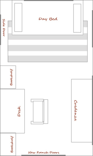
The day bed end of the room would be the bedroom and the desk end the office space. The off center french doors actually line up with the doors to our kitchen and the island, but it looks a bit odd in the diagram.
Of course a day bed isn’t exactly the comfiest option for couples spending the night – and we regularly have more than one guest (such as our parents, grandparents, friends with children) so here are two potential designs that would include a full bed.
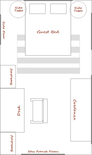
Or:
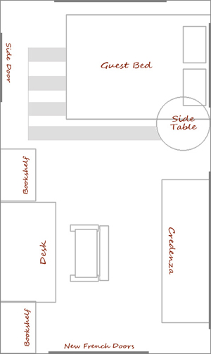
The office space portion might change as we hunt down thrift store and Craigslist finds to fit the area, but this at least gives us a list to start exploring. Ideally we could track down a set of bookshelves and even create a ‘built-in’ look with molding for around the new desk.
The thought of creating a more natural partition between the two spaces has crossed my mind as well – perhaps an open bookshelf or fabric screen divider will find its way into the space, as long as it doesn’t compromise the little room we’re working with!
Oh the decisions… back to the drawing board we go.



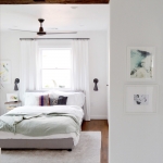

We’ve considered the idea of a murphy bed but don’t seem to have enough wall space sans windows or doors to make it happen… it’s a great way to clear out space in a crowded office though.
I also love the idea of a “wall of light”, I’ll have to look into that!
~Morgan
I think these schemes seem nice. If you still want to divide the space, you could use a light division such as a biombo or a small floating “wall of light” (fluorescents between a translucid material, any shape, hanging from the ceiling).
Have you looked into Murphy Beds? We just got one for our tiny guest room so we could convert it to an office without losing the sleeping area. It looks wonderful and you can customize the stain, handles, moulding to suit your needs.
We also ordered one that is horizontal, so when it is mounted on the wall it looks like a credenza.
Love recieving your blog posts! Thank you.
Great!!!!I feel happy to visit ur blog..you are simply amazing and adorable….
Thank you for your suggestions! We’re on the hunt for a day bed but not many with a trundle option pop up on Craigslist. The search is on! Still haven’t ruled out a full, but I agree the space would be a bit tighter (and if we do go full, I think I like the third option too!).
~Morgan
you’re still home?! baby must be comfy…
We decided to do a day bed with a trundle in our guest room, and it really works out great. It has more of a couch look to it when its not being used as a bed, but makes a huge comfy bed easily when we have guests… I guess it all depends how much space you have.
I like I like the third layout if you don’t do a day bed… I LOVE the color palette!
I’m so wishing I had a room with enough space to have a clear delineation between guest space and office/crafting space! On the daybed front, if you put a trundle underneath, you could pull it out and then couples can sleep on it like a double (I’ve been one of those guests..so I know that it’s workable!)
That color palette looks so soothing and wonderful!