
Happy Friday! Welcome back to PDB’s Friday Guest Blog Interview series where I introduce a fresh and inspiring blog that I think you’ll love a couple of times a month. There are incredibly talented bloggers out there that hold their own in the design world and it’s very neat to see how and what they’re working on – and to get inside of their heads for further prodding.
One such blogger is Emily of Emily A. Clark who describes her blog as “ideas, inspirations, and musings of a home stylist”. I love her home and if there’s not a more perfect portfolio for ones style I don’t know what is.
,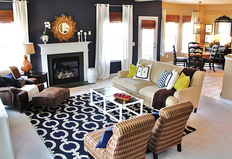
Emily recently posted a little tour of her previous home and it made me smile – her new space is a complete 180 and reminds me how much we change and grow as we’re influenced in design! I adore her home and am excited to share a little house tour along with the four usual PDB interview questions (which I equally love, her answers and tips are inspiring). Check it out just after the jump.
 ………………………………………………………………………………………………………
{PDB Interview with Emily of Emily A. Clark}
………………………………………………………………………………………………………
What inspires your design style?
I would say design blogs have been a huge influence. My current home looks a lot different than our last home, and I think a lot of that has to do with the fact that I started reading blogs after our move. It’s amazing how much creativity is out there from “real” people versus high-end designers. I personally like such a wide range of styles, so in my own home, I just go with what feels good, not necessarily sticking to one style or another.
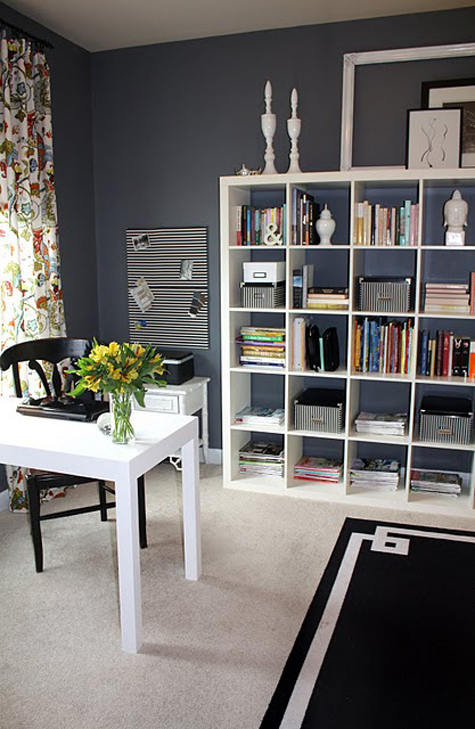
Emily’s office
What do you love most about what you do?
I love helping people see the potential in their own homes. It’s fun to see someone get excited about an idea they would’ve never thought of on their own. My work is also a much needed creative outlet for me, since I stay at home with my three kids. After all, playing with pretty fabrics is more fun than changing dirty diapers. . . .
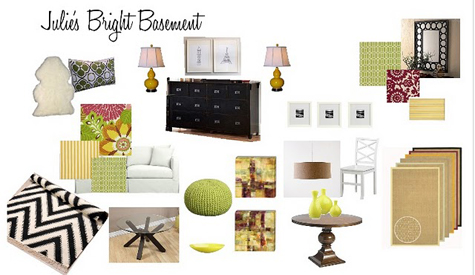
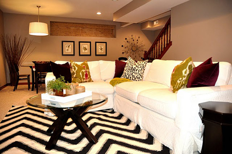
A style board from Emily’s portfolio and the finished space for a client
What are your favorite design trends?
Lately, I’m really drawn to weathered pieces that look like they’ve been really beaten up. I think this may have something to do with all of the glossy finishes in my own home. I just love how layering textures makes a room feel.
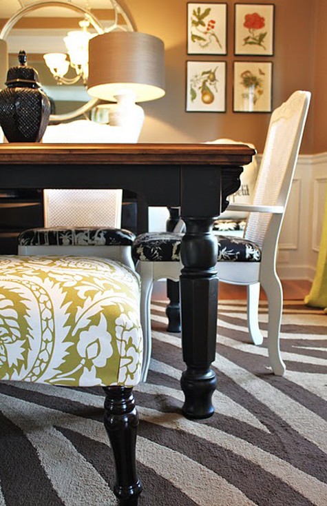
Emily’s dining room
I also love bold color. For me, this is more of a way of life than a trend. I usually end up using one strong burst of color in each of my rooms. I think it gives so much life and energy to a space, even if it’s as small as one lamp.
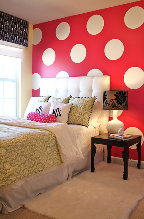
Emily’s daughter’s room
What are three design suggestions that you would like to offer our readers?
{1} Buy what you love instead of shopping for a piece to fit a certain spot in your home. It makes things so much more interesting and ultimately creates a space that really reflects you.

Emily’s breakfast nook
{2} When accessorizing, think fewer and bigger, rather and more and smaller. In other words–clear the clutter! Instead of filling a mantel with lots of small trinkets, choose one or two larger statement pieces and keep things clean.
{3} If you’re in a decorating rut, play around with your furniture arrangement. My pet peeve is furniture that’s pushed up against all of the walls. Swing your sofa out in the middle of the room and create a conversation area with a couple of chairs. Sometimes just making a few simple changes can give you a whole new perspective on your space.
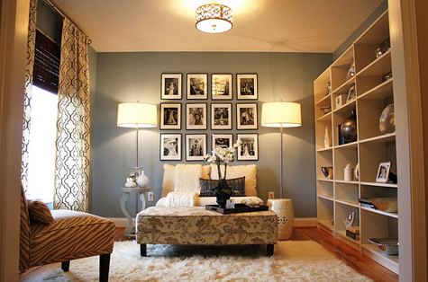
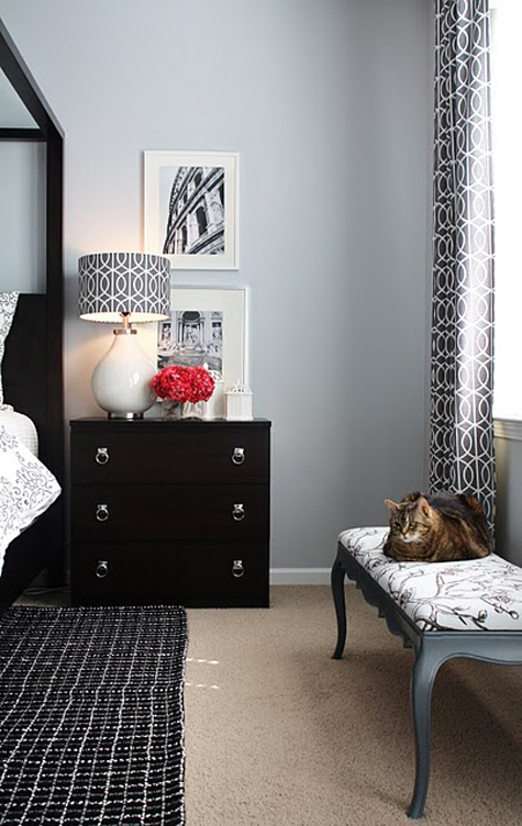
Above images from Emily’s portfolio
Thank you, Emily!
………………………………………………………………………………………………………
If you loved this interview, check out more great spotlights {and tips & tricks!} from fantastic bloggers!




Good advice from a fabulously talented designer.