Back with another kitchen update! Progress has slowed a bit around these parts as Kevin goes back to school (he’s currently studying architecture full time) and daily dedicated renovating hours drops to a third of the time we used to be able to fit in. But nevertheless it continues!
We’re technically at day 28 of work, though it’s taken roughly 8 weeks to get us that far. (If you need a quick catch up, here is the first week (including great ‘before’ photos), second week, and third week – as well as our inspiration board.)
Let’s jump right into week four:
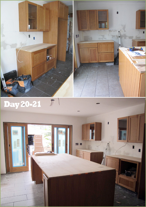
As soon as we had word that the fabrication of our quartz countertops was complete, prep work began on getting the cabinets ready to support those big heavy loads. Plywood and even metal rods (embedded into the plywood on the island where there’s an overhang) will help to keep the weight of the countertops evenly dispersed.
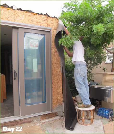
And then suddenly fall hit – as did big white clouds threatening rain and drizzle on the exposed house. Day 22 was dedicated to weatherproofing our raw walls to keep the elements out.
With our new heat-resistant, scratch-proof countertops in place, the kitchen was beginning to look, well, more kitchen like. This project, in addition to the major electrical work, were the only two projects where we pulled in outside help. Quartz combines natural quartz (one of nature’s hardest materials), with polymer resin and pigment to produce a durable surface that will last and last. We left the fabrication, measuring and installation to the pros. (Just in case you’re interested, we chose HanStone in Tiffany Grey).
With those big, beautiful slabs installed, we were able to begin playing with color and materials for the walls and backsplash. To be sure the paint color complimented the room at all times of day, and blended well with both the wood and backsplash, I lined up strips of randomly selected greens to observe for several days and slowly began plucking them down as they were crossed off the list.
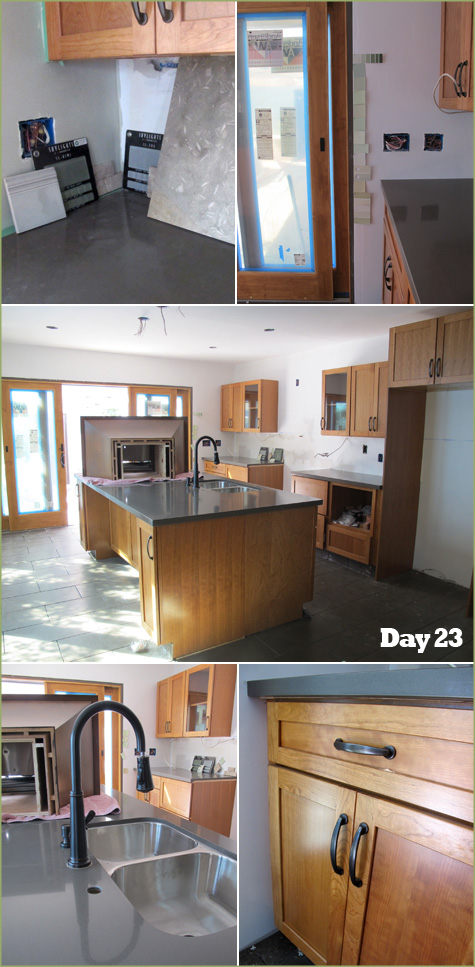
We found the perfect rubbed bronze faucet in the 50% off clearance section of Home Depot – and matching pulls for the cabinets at our favorite local cabinetry shop.
Look at all of this wonderful counter space! Very excited to use it for cooking prep and projects. And below that, here’s the stainless steal under-mount (a must) sink we scored on Craigslist for a measly $75 bucks. The retail value is 3-5 times that amount and we were thrilled with the find.
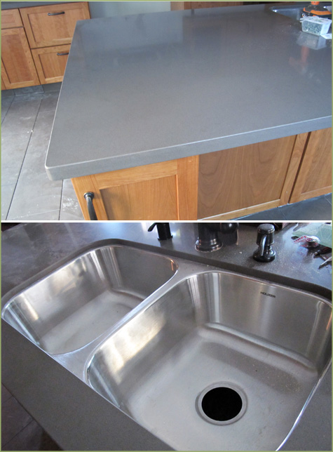
Mixing finishes (aka the stainless sink with the rubbed bronze fixtures) wasn’t an issue for us. The dark faucet was very Spanish, while the stainless steel matched our appliances and provided that pop of modern.
Then came the big backsplash decisions – how to incorporate a modern design that fit an historic Spanish-style home seamlessly? After testing out a variety of materials (see a few collages up) we settled on subway-shaped tile in glass. (Ohhh there are so many choices… keep an inspiration board/photo and edit as your tastes change). And the winning backsplash design?
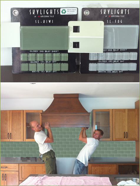
A solid subway motif for behind the counters! That’s my photoshop rendering above to test out the look. If you checked in to Monday’s post, you noticed that we were debating between four similar looks, three of which included small 1″ square tiles in the same color to create a pattern behind the stove. And after much consideration, the subway prevailed in all of it’s simple glory!
But before we could install we had to wait for our chosen tile to ship to our local shop… (Arizona Tile, Kiwi Glass Subway by Skylights)
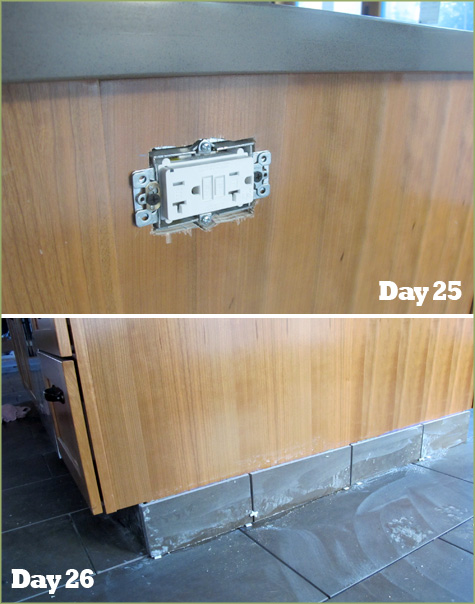
So while we waited, the electrician popped in to add a few outlets to the island and finish up a bit of wiring, and Kev applied a ‘floor board’ of tile along the cabinet edges. We liked this modern look and we’ve heard it does wonders for cleaning the kitchen while preserving the all wood cabinets (mopping, etc).
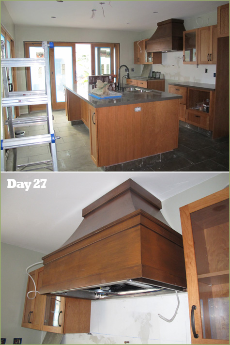
Since the kitchen has already received a layer of primer, the new “Buzz Brown” (by Velspar) color was added while I was away on a business trip (yeah for no icky fumes for the babe!). The olive color was the perfect match for the maple wood, dark counters and kiwi tiles.
Once the paint was dry, up went the custom hood and vent system that Kevin designed and installed from scratch (the room had been previously used as a bedroom & den, after all).
Finally it was time to install the backsplash – I had long awaited this moment as it had become a pivotal milestone in my mind for kitchen progress (cue the angels singing) and the nearing of construction in this part of the house.
And how beautiful it looks! I was thrilled with the final layout and the clean design. Hopefully I’ll have some pictures with better lighting to post soon – these are all a bit ‘cooler’ in tone than the actual soft look of the kitchen.
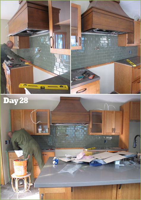
This is where the kitchen stands today.
Our goal was 30 days of total work and the projects remaining include: grout floor and backsplash, install molding, haul in appliances (which now sit in the garage) and hook all up to electrical, water & gas. Sooo we might go over the 30-days-of-work pledge that we had originally set, but not by much!




Scrolling down the post it just got better and better. First the great floors, then those doors to the outside, then the countertops. Oh stop, next you throw in some stunning green tiles on the backsplash and then that hood?! I love the warm rich look which still manages to be fresh. Great job! Janell
I love it Morgan!! Especially jealous of the big island… oh the space, oh how shiny! :)
http://www.modelmumma.blogspot.com
Awesome job Morgan!
Looks amazing!!! That was my favorite backslash design! Plus the easiest to clean.
Wow, the tiles look so better real than the computer generated one! :)
Great look!
its beautiful!
Good choice on the backsplash.
I am sooooo jealous of that huge island!