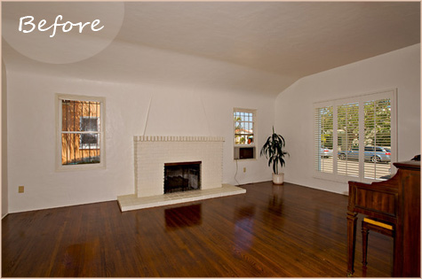
I’ve procrastinated long enough… it’s finally time to get some pictures posted on the living room progress.
As you might remember, the Before shot was just before we moved in. After a bit of painting, several diy projects and finally a whole lotta assembly, here’s where we stand:
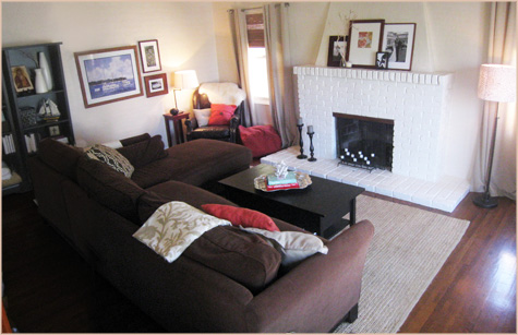
I see little holes and spaces that need attention! But I’ve decided this is my palette to grow on so as it gets minor tweaks and updates, I look forward to sharing all of the fun details.
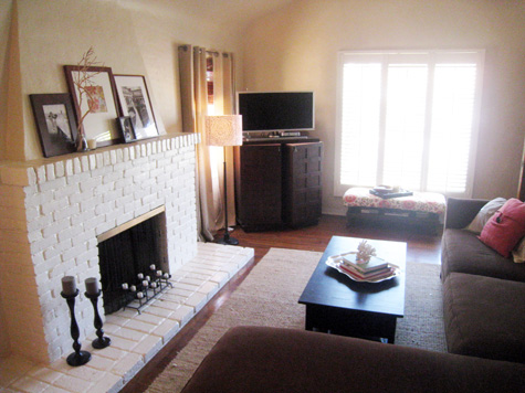
Neutrals remained the theme of the room and I couldn’t be happier with how the soft wool curtains and dark furniture help to set a base for the crisp whites and bold coral colors. Here’s a link to the original inspiration boards back when color combos were being discussed.
Here are a few of my favorite details:
I love picture collages so it’s no surprise that I’ve found a way to fill this space with three (too many?). One symmetrical version behind the sofa, one wedding grouping above the mantel (I’m still playing with a mirror there – the survey from a week ago was pretty divided!) and one next to the bookshelf and above the “man” chair (aka the huge leather chair that the hubby rightfully claims as his own).
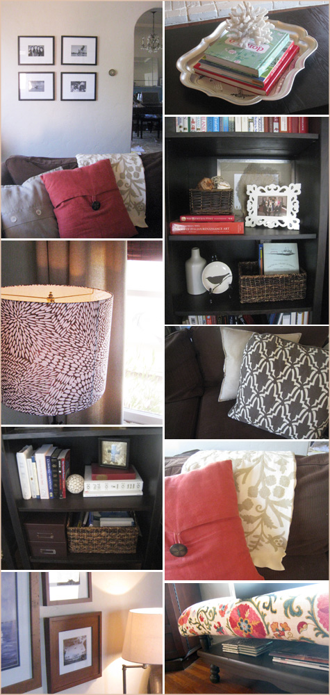
My coffee table-turned-bench has found the perfect spot below our big window and I am still oh-so in love with the suzani print. Jeanne McGee did a rockin’ job on the brown zinnia custom lampshade and I’m thrilled with the splash of pattern it adds!
Storage was critical for us and we found a way to squeeze everything in through baskets, an awesome ‘pouf’ that hides a bajillion blankets, a bar that doubles as a tv stand, as well as sneaky spaces like a coffee table that holds board games, etc. below it’s surface.
Every photo is sentimental, every painting important to us in someway (be it our love of sailing, artwork by Kevin’s mom or diy projects soon to be shared…) and it’s special to know that the space was hand crafted over time with much love.
Sources to come… thanks for sharing the design process with me!



I love what you’ve done with the accessorizing so far — especially the suzani ottoman and the lampshade. I think the room would look even better with the walls painted a pale version of “Tiffany Blue” and with some accents of that color sprinkled in the room. Or maybe you could change the curtains to a color. The room reads a little “vanilla” right now.
Great idea, Joy. I like the idea of incorporating one more *pop* of color though I don’t know if it will be Tiffany blue or something in the same palette that I’m currently working with. Thanks for your suggestions!
~Morgan
LOVE what you’ve done so far!!!
Nice job! Love the neutral/pop-o-color decor combo.
Thanks, everyone!
Molly, I know what you mean about bookshelves and I really struggled with this one. I did a lot of photo ‘studying’ and worked hard to incorporate our collection of books in creative ways (I’ve noticed that most modern bookcase displays rarely carry books anymore!).
Sara, so glad you love the shell idea! I think they make great book toppers. Shells and little ceramic animals… love it.
~Morgan
Love what you put together! It looks great and how special that every photo and painting has some sort of sentimental value. Perfect for a space to be living in!
Love your living room. It looks very warm and inviting!
LOVE, LOVE, LOVE Those floors! The detail shots you picked are too cute. I have some shelves and a shell to paint…maybe I’ll put it on top of some books! Great idea!
It’s looking good! The contents of your shelves look really balanced – I am really struggling with this in my own living room. I feel like a bookcase can quickly turn into a catchall for all the junk you don’t know what to do with :)
great job! cozy & stylish!
Coral is my favorite pop right now! Love all the patterns you chose too, plus that amazing ottoman… great job so far!