We all know a well put together room when we see one – we might not know why it’s so pleasing to the eye, but there’s something about the movement, style and colors that draw us in.
In an effort to capture those little design elements that lie behind a well decorated room, I’m using today’s post to highlight three {quick!} fixes to offer ever so subtle modern updates. Perhaps this could turn into a full article on dressing a room top to bottom, but today’s purpose is get the mind whirling on what you might be able to fix this weekend, and not months in the future. So let’s dive right in!
 p
p
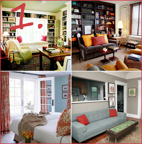
{Idea #1: Bring in Contrasting Colors}
p
Take a look around your room and note the color theme. Perhaps it’s various shades of blue, tan or maybe red. To add an element of design that makes a pop, find an accessory in a contrasting color to add. If your living room is green, opt for fuchsia throw pillows, if it’s red, consider a plum or yellow rug, lamp or blanket draped over the couch.
Weekend mission: Throw pillows are easy-peasy, take your new search to your local design store or hit up eBay for some excellent contrasting finds.
p
p{Idea #2: Reorganize Your Walls}
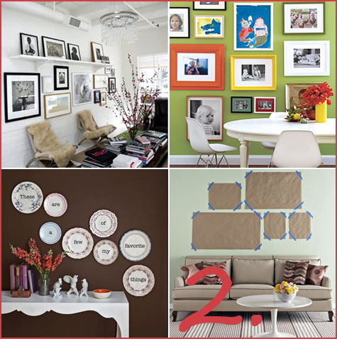
Well designed rooms incorporate well designed wall art. Pull all of your photos and paintings down from their current locations and reconsider your blank wall canvas. Now set up clusters of your favorite pictures at the base of your wall on the floor, and go about your daily business. Come back throughout the day and reorganize your photo/painting cluster until you finally have something that works well for your space and your photos. A simple rule that I like to follow is clustering in odd numbers and keeping larger photos towards the center. When your grouping looks appealing on the floor, mark out your new space with blank sheets of paper on the wall (one piece of paper represents one photo that is temporarily attached to your wall).
Weekend mission: Gather photos from all over the house and match frames that work well together for groupings (frames don’t actually need to match – I love the gold, ivory, brown frame combos, for instance – but you’ll know right away if one photo looks appropriate next to the other). If you don’t have wall art that includes brilliant black & whites of your family or brightly colored framed photos from travels, now’s the opportunity to hunt through drawers and order new, large prints from your favorite photo store – Costco photo, anyone?
p
Follow the jump to learn more about patterns & texture, and for the rest of the article!
p{Idea #3: Patterns & Texture}
p
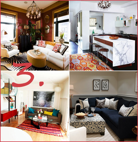
An easy design trick is to add a texture or pattern (or both!) to bring visual depth and spontaneity to your room. Perhaps your curtains deserve a quick fix with a modern pattern or the rug could really be updated with something bold and bright. For texture, I love big, soft faux sheepskin or bear rugs (you can find them for a deal at Ikea) or fabric that incorporates textures like velvet, satin or even burlap. The right natural element can provide texture: consider a moss runner on your coffee table or large bleached Manzanita branches in a vase in the corner. Another easy texture solution is bamboo blinds. If you have time for a bigger project, determine whether there’s one piece of furniture that could incorporate a quick makeover, such as a newly upholstered ottoman or chair (I guarantee it will become the it piece in the room!).
Weekend mission: Decide which element of your room could incorporate a pattern or texture – whether it’s a piece of furniture or an accessory – and then how you can do a DIY overhaul. Branches are the easiest and finding a craft store or florist who has what you’re looking for should be a cinch.
p
p
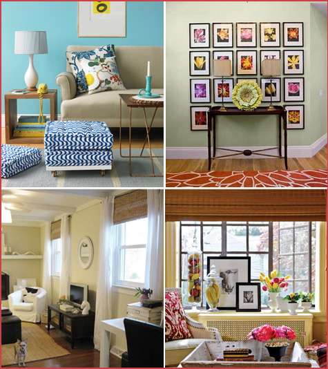
Room Inspiration Board #1, Contrasting Colors (left to right):
The first two images are courtesy of BHG — check out their photo tours for more great ideas, the turquoise and orange bedroom is from Matters of Style — a FANTASTIC blog and great contrasting colors from Apartment Therapy.
Room Inspiration Board #2, Arranging Wall Art:
Great picture rail image at Apartment Therapy in their fabulous Home Tours section, Real Simple provides a more colorful option, the wall of plates is from Craft Stew, as well as planning your wall suggestions from DIY Ideas.
Room Inspiration Board #3, Patterns & Texture:
The great zebra rug and the brightly colored tribal patterned rug images come from the blog A Life More Fabulous, Apartment Therapy again provides a wonderful example of a great rug and Colour Me Happy shows us a terrific ottoman.
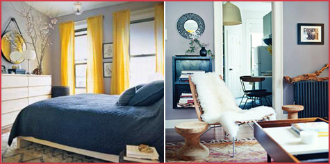
Room Inspiration Board #4:
Both images are from Apartment Therapy Home Tours
Room Inspiration Board #5:
The first image shown comes from Martha Stewart, the second from Cool Photo Ideas, the third image from Young House Love blog, and finally our last inspiring image from Country Living!
Because many of the images came from site home tours, I was not able to compile resources for specific interior design items. It’s my hope that all of the pictures still serve their purpose as especially unique and inspiring though!



what is the best way to hang pictures on the wall without nail holes…love your ideas..
Hello, my name is Adrianna and I am an aspiring interior designer. Im currently working on a project- my own bedroom. In the ‘1.’ photo above, the first box on the bottom row is precisely what I have in mind. I was hoping that maybe you could go more in depth about that picture…? Thank you. :)
It’s not so easy to do a not bad custom written essay, preferably if you are booked. I consult you to find buy an essay and to be void from question that your work will be done by writing service