A Little of This & That… Renovating, Decorating, DIY Projects & Family

Fixes to Make an Old House Feel New(er), Part 1

There are so many beautiful and quirky characteristics about older homes. They are usually purposefully built with unique architectural details and great craftsmanship, and they carry a charm about them that is very appealing. Our 1930s Spanish-style bungalow has arched ceilings and soffits (I love the one in the dining room…), lathe and plaster walls, rope and pulley windows, solid wood doors and original tile and hardwood floors. We could tell when we started moving walls that this home was built by hand by someone with tools of a different caliber using stronger materials (the wood is from old-growth pine that isn’t available today, the plaster walls inches thick) and we know that this baby is going to be standing for a long time.

Oh but the updates! Old homes can come with a list of needs (lets call it homeowner love), including knob and tube wiring, old pipes, lead paint, broken water heaters, outdated ac and heating units – if any, asbestos…

There are certain topical updates though that are easy to take care of right off the bat, and they can make a home feel a bit more modern and a bit more friendly! Here is part 1 in a series that highlight what I thought made a big difference for us (ps you can find part 2 right here).
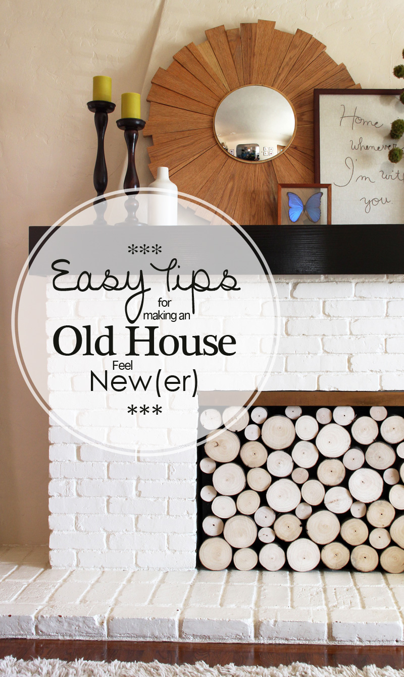
Easy Tips for Making an Old House Feel New(er) | PepperDesignBlog.com

Add crown & floor molding to a space.

A lot of older homes in our area have quarter round molding – that little toe kick detail where the floor meets the walls – but little else. It’s amazing though what crown and floor molding can do to help make a room feel complete!

Here’s what the girls’ room looked like when we bought the house (previous owner’s furniture):
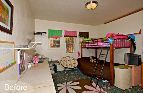
Nursery Before | PepperDesignBlog.com

We turned it into a nursery in 2010 and added a thick 3″ line of floor molding:
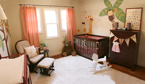
Modern, Contemporary, DIY, Makeover Nursery, Do It Yourself

Now that we are transforming it into a room that will fit two little girls, my number one must-do item (crazy as it sounds) was to add crown molding. And I especially love the look of a solid wood craftsman-style molding.

New Nursery Bookshelves | PepperDesignBlog.com

Doesn’t the room feel that much more clean and finished with that bright white footer and header in the space? It’s almost as if they bookend the color on the walls.

Faux Molding

We weren’t in the budget for finish-type work when we first moved into the house, so during our initial painting frenzy, I added a rim of faux molding in our living and dining space. It was pretty easy: simply tape off a chunk of wall about three inches up all along the room and paint that strip a bright, clean white. Five years later and this faux molding is in need of real floor molding (or a new coat of paint), but it definitely helped to update the space.
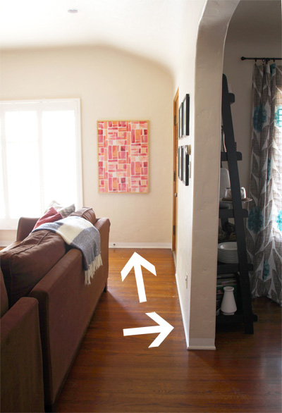
Living Room Faux Molding | PepperDesignBlog.com

Give your fireplace a face lift.

Giving our fireplace a big update is on our list of todos… maybe we’ll get to it in 2015. Quick fixes for an outdated fireplace though include a fresh coat of paint over older bricks, a thoroughly cleaned out firebox (if you have a wood burning fireplace) or a simple boxed out mantle. Here’s how she looked when we moved in:
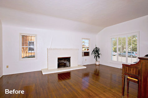
Living Room Before | PepperDesignBlog.com

We added the mantle two years ago. Then when we had to turn off the gas to our fireplace, I added a faux screen of stacked wood (it’s really just about 3″ deep). To me it keeps the allusion of a warm and friendly fireplace as a central focus of our living room, the alternative empty black box was less appealing. A plus to a fireplace facade is that it can be removed when we’re ready to turn back on the gas and use this baby again.
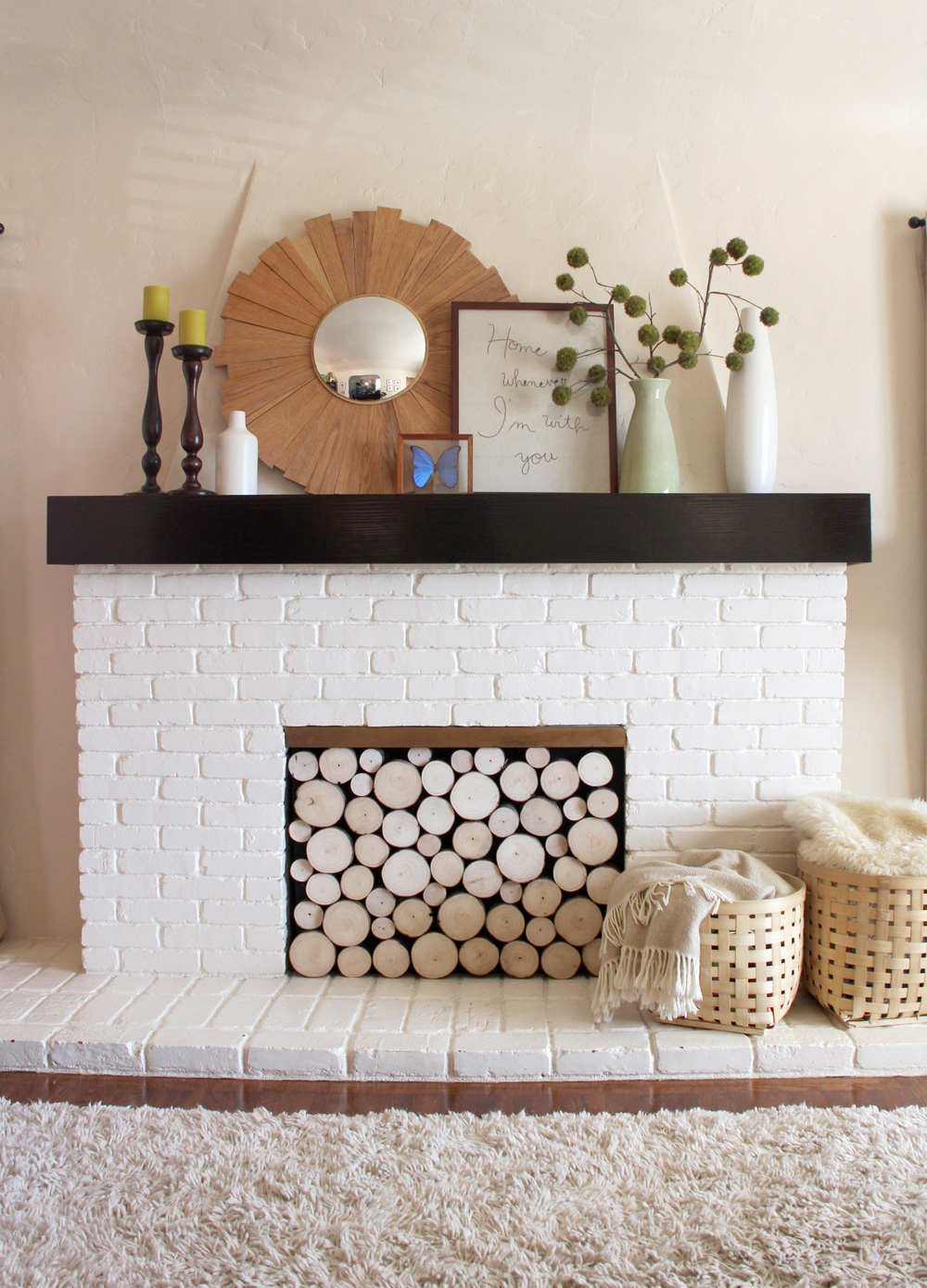
Fireplace Faux Wood Stack Screen : PepperDesignBlog.com

This Old House featured the screen in the July issue of their magazine, and the step-by-step again on their website.

Update old mirrors.

I’ve never been a fan of those all-wall giant mirrors that are in many older bathrooms, and to me they can date a space pretty quickly.
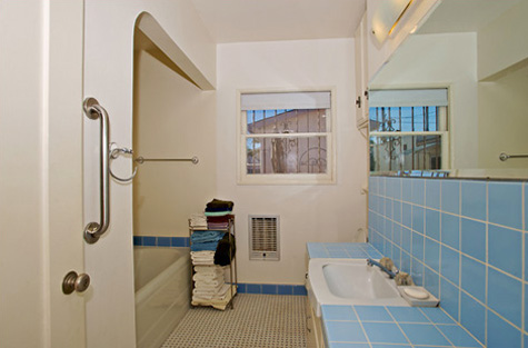
Bathroom Before | PepperDesignBlog.com

We are saving up to really overhaul this bath, but my quick fix to modernize it initially was to tear out that giant mirror and to frame two smaller mirrors from Lowes in Aaron Brothers frames (during their ‘Buy One Get One For a Penny’ sale).
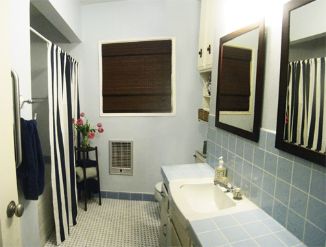
Bathroom Quick Update | PepperDesignBlog.com

Quick, easy and cheap.

Back tomorrow with part 2! And a few more ideas on what has made our home feel like an older-but-modern, meets-our-needs home.

Weekend Fun: West Palm Beach, Florida

We headed out to Florida last week for a wedding and to relax a bit as a family before the summer was officially over. It was a much needed vacation! Beautiful beaches, warm weather, good friends. Heading home we also managed to visit not one but four cities (with an unplanned overnight in Phoenix – where we had family, huge blessing) due to inclement weather. Travel at its best :).

Such a great family getaway! Haven’t been to the East Coast in a few years and that Atlantic Ocean was as green and warm as ever. Here are a few snapshots from Instagram:

Weekend Fun | August, 2013 - Florida | PepperDesignBlog.com

Highlights included a fantastic hotel find – 50% off last-minute through the iPhone app Hotel Tonight – in Fort Lauderdale, complete with lazy rocking chairs to soak in that idyllic ocean.

Weekend Fun | August, 2013 - Florida | PepperDesignBlog.com

Much needed laying on the beach and playing in the sand… (I feel as if summer sort of skipped over us with Taylor’s birth. We haven’t even visited our own San Diego beach in months and months).

Weekend Fun | August, 2013 - Florida | PepperDesignBlog.com

Weekend Fun | August, 2013 - Florida | PepperDesignBlog.com

Weekend Fun | August, 2013 - Florida | PepperDesignBlog.com

Weekend Fun | August, 2013 - Florida | PepperDesignBlog.com

A beautiful wedding:

Weekend Fun | August, 2013 - Florida | PepperDesignBlog.com

florida_groomsmen_500

florida_emilyjakephotographer

That last one was by the fantastic photographer. Love the photo and couldn’t manage to snap a picture of them together while it was still light out.

Liv really dug the trolley transportation!

Weekend Fun | August, 2013 - Florida | PepperDesignBlog.com

And the sparklers were one of my favorite details.

Weekend Fun | August, 2013 - Florida | PepperDesignBlog.com

Weekend Fun | August, 2013 - Florida | PepperDesignBlog.com

We couldn’t leave without an alligator sighting. Because who doesn’t want to see an alligator whilst in Florida?

florida_alligator2_500

So we took an airboat tour – reminds me of Waterboy? – around the everglades through Sawgrass Recreation Park.

florida_airboatfam_500

Just before a big storm hit!

florida_airboat_500

It was windy!

florida_airboatluv2_500

florida_airboatluv_500

But Taylor didn’t seem to even notice that we were on a boat.

florida_airboattaylor_400

We spotted this guy as he lurked around the airboat. He started on one side, seemed to notice Liv and swam over until he was directly in front of us on the edge of the boat… just staring and waiting.

florida_alligatorkev_500

florida_alligator_500

Kept all hands and feet intact and inside the boat at all times. Whew.

A great getaway for our little family of four, we were all getting a little restless after more than a few months at home. But now it’s nice to be back after a busy adventure.

PS More Weekend Fun posts and Travel Adventures from around the blog.

Guest Posting: My Thoughts on Breastfeeding

I am honored to be guest blogging over at A Mama Collective today about my journey with breastfeeding my two girls. Jenna is honoring National Breastfeeding Week by turning it into a month long celebration with various moms sharing their stories.

Taylor Rose is Here | PepperDesignBlog.com

And the HAPPIEST news! Jenna had her third baby girl Friday!! Congratulations, momma!

Related Posts Plugin for WordPress, Blogger...