A Little of This & That… Renovating, Decorating, DIY Projects & Family

Kitchen Inspiration: Black French Doors

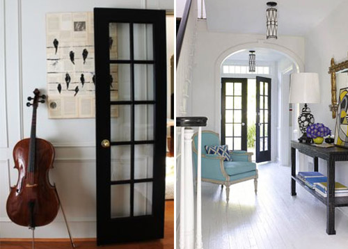
Can we talk about black french doors for a moment?

Inspiration: Black French Doors | PepperDesignBlog.com

I’ve done something drastic with the doors between our kitchen and office, but before I share (and because I have one last little bit of paint touchup to finish), I thought I’d do a little convincing by sharing some beautiful inspiration today. What has surprised me most about my little kitchen makeover is the varying opinions of black on doors – you either love it or you hate it.

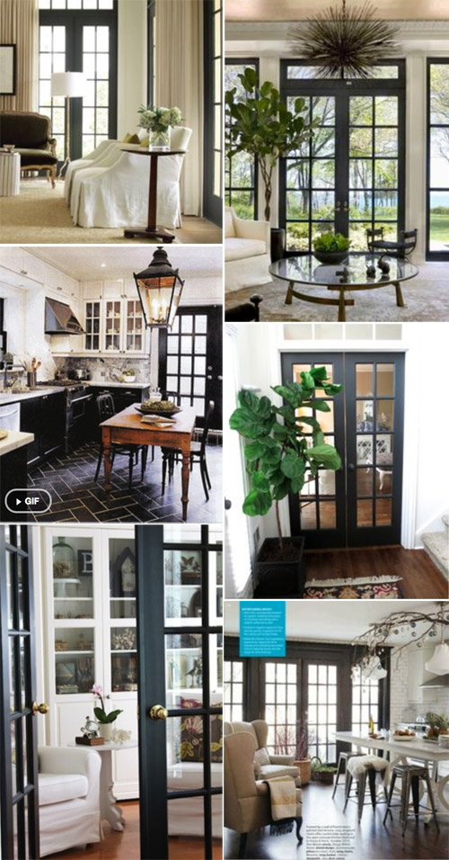
Inspiration: Black French Doors | PepperDesignBlog.com

You can find sources for all of these images over on my Black French Doors Pinterest board (plus a few more!).

Inspiration: Black French Doors | PepperDesignBlog.com

Aren’t they bold, dramatic, glossy and beautiful? Provides just the right amount of negative space in the above rooms, and in a way that deeply saturated color (or lack of color) sort of grounds the spaces.

I will finish up those paint touchups lickity split and be back soon to share our black door kitchen addition.

PS Until then, just in case you’re curious, our kitchen reno posts from start to finish can be found here.

Thoughts on Necklines & Spring Cleaning

We’ve had a weekend of rain, and the first good shower all winter! I know, us Southern Californians don’t have much to complain about. I thoroughly enjoyed the opportunity to stay indoors with warm cups of coffee, lots of imaginary play and to finish up a few house projects.

Imaginary Play | PepperDesignBlog.com

Imaginary Play | PepperDesignBlog.com

Imaginary Play | PepperDesignBlog.com

But warmer temperatures are infiltrating our weather here, when it’s not raining it is sunny and bright and shorts-worthy. I’m pulling dresses out of the back of the closet from my pre-pregnancy days which feels like finding hidden treasures! It’s been two years since I’ve sported most of these since I had a full term belly last summer. That led me to take a second look at the style of dresses that I consistently shop for and find flattering.

That’s a pretty simple concept, but taking a moment to make note of what fits and why makes shopping a funner experience (especially online). I can immediately bypass dresses/shirts/tunics/sweaters that don’t meet certain criteria without batting an eye, dresses like this one, this one and this one will look fabulous on certain forms, but don’t fit my body well (mostly because of how the cuts hit at my arms, neck or chest).

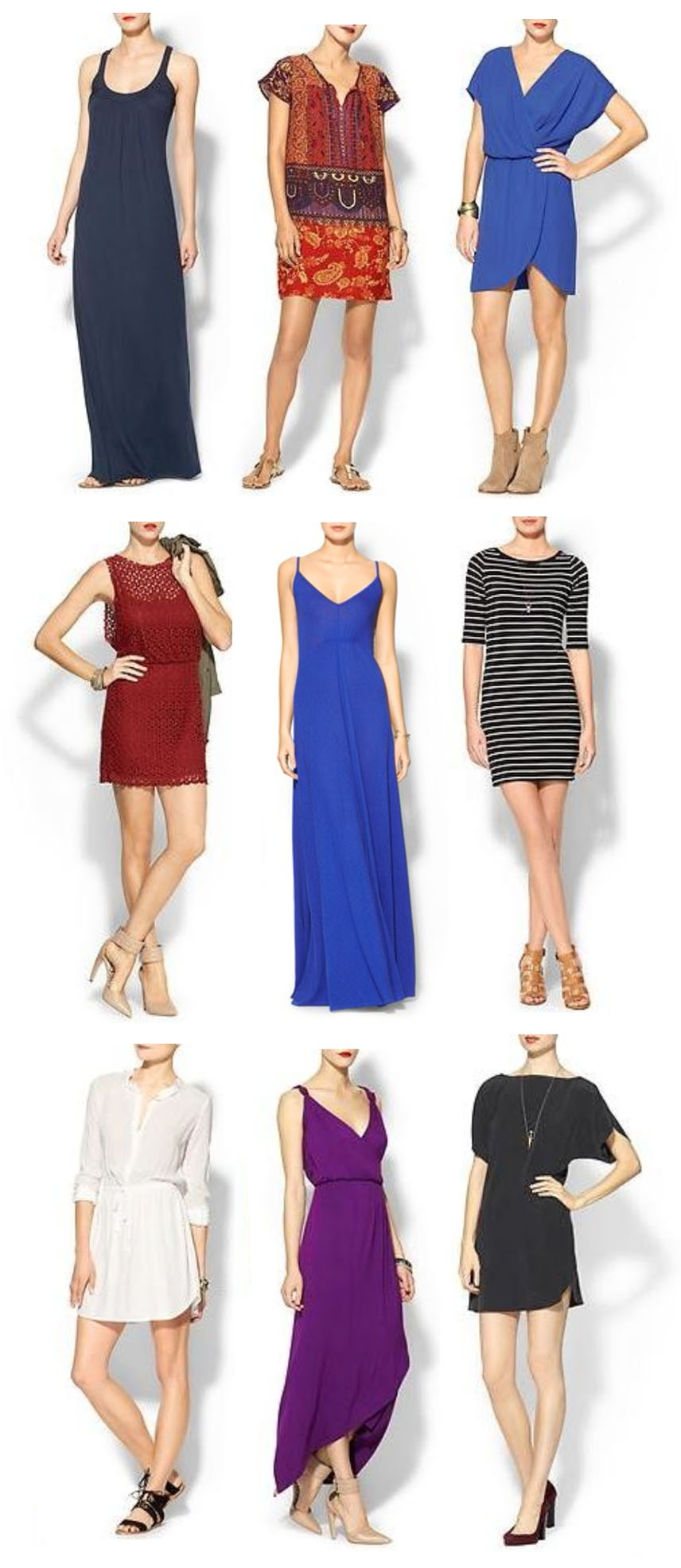
But those that fit well? Here are nine out of the many, many neckline cuts that I go back to again and again:


Wardrobe: Necklines | PepperDesignBlog.com

Scoop necksplit or notch neckline with loose or long sleeves, draping or wrap front (another great color)
loose overlays, spaghetti strap v-line necklinesboat necks with long sleeves
button up shirt dressGrecian v-neck (which start wide at the shoulders), dolman necklines

I lean on these because they feel comfortable to me. I feel good in certain styles, and I know that we’ve all come up with a list in our head of what those styles might be over the many years we’ve analyzed clothing on ourselves. It’s so nice to be able to reach into your closet, pull out whatever your hand finds first and to feel totally comfortable wearing it out the door. That’s the goal for my closet.

This is especially helpful when it comes to spring cleaning! Which is just around the corner. I want to keep only what is flattering, comfortable and multifunctional, a seriously lofty goal. (I’m thinking I’ll use this site to have a big sale soon). Bring on the spring!

PS I’ve heard of stretch limos, but stretching a cruise ship? This is too cool.

Tech Tip: Amazingly Simple Graphic Designs

One of my favorite things to do as someone who works in marketing is to put together a catchy, well-designed piece of marketing material that is both modern and memorable. But coming up with ideas, layouts, graphics, images, fonts and so on constantly… it can be tough! And you have to be a bit savvy at tools such as Photoshop, Illustrator and InDesign to really make it happen.

Enter one of the coolest online tools I have found yet. Have you heard of Canva? Canva is a free website that features pre-made layouts, drag & drop graphics, fonts and colors making it easy for any user to pop in, pull together a professional looking flyer, invitation, postcard, brochure, blog graphic or even a Facebook cover, and publish it within minutes.

Tech Tips: Canva | PepperDesignBlog.com

You can see some of my saved drafts above – even the graphic from Liv’s camping birthday post was a Canva graphic (and it took me 2 seconds to create).
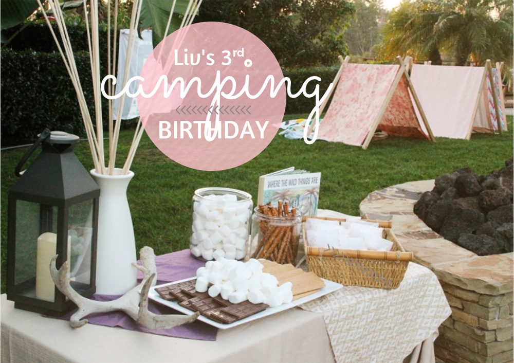
Liv's 3rd Camping Birthday | PepperDesignBlog.com

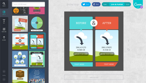
Here’s a little bit about how the tool works and a preview of the workspace:
Tech Tips: Canva | PepperDesignBlog.com

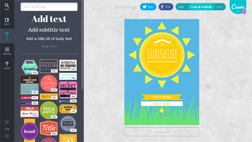
After logging in, 1. you choose which style of project you’re working on (i.e. a postcard or a poster), 2. an already designed layout for that project from their selection (or create your own), and finally 3. drag and drop from a library of really creative graphics (with and without editable text), fonts and images.

Above shows a sample of layouts available when I choose ‘social media graphic’, below a preview of the text graphics that you can include in your design.
Tech Tips: Canva | PepperDesignBlog.com

I upload my own photos for my work, but they have quite the selection of stock images available for a very small price (in the design world we pay big bucks for stock images). There is a paid portion of the site where you might shell out a $1 for something really unique, but I’ve used only the free graphics available and there are plenty.

It’s basically InDesign as a website. With most of the Illustrator work done for you :).

If you are a blogger, I highly recommend this for adding text and graphics to a pinnable picture of your projects – if you’re a mom, this tool is perfect for birthday invitations or photobook layouts – an entrepreneur or business owner? Check out the layouts they feature for business cards, posters and presentations.

I’m one for a super simple explanatory video, here’s Canva’s:

When I first joined it was by invitation only. If they ask you to hop on a waiting list I promise it won’t be long before they give you access. You must give it a try.

PS This is not a sponsored post, just another cool tool I’m sharing as part of a new series called ‘Tech Tips’. We’re two posts in, but if you’d like to check out the first on an email inbox management tool, it’s right here.

Related Posts Plugin for WordPress, Blogger...