A Little of This & That… Renovating, Decorating, DIY Projects & Family

Office Makeover: A New Trellis Print Rug for the Rug

Hope you had a great three day weekend! We traveled out to the Phoenix area to spend time with friends and with Kevin’s family, but now we’re happy to be back home – well-rested from our mini vacation and ready to jump back into work and projects that have been stacking up around here.

Thank you to everyone who offered their suggestions with Friday’s Office Rut post. It was really helpful to hear some great outside perspectives and I agree whole heartedly with mixing up the print sizes/scale of the fabrics (especially balancing out the large print curtains with some smaller print fabrics on the bed – brilliant) and adding a ‘pop’ of a bold color. Ideas are underway on that one…

One recent addition that has helped to bring new life to the room is a new rug.
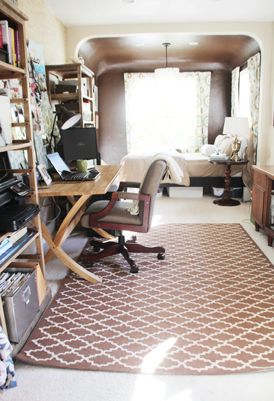
I love the bold trellis pattern print and the neutral brown color – it really helps to tie in that chocolate ‘nook’ behind it nicely!

We originally didn’t have plans to have a rug-on-rug in this room. The room is carpeted and I had hoped against all odds that the white remnant we had installed would miraculously stay that way for years, but I think I have always known that this high traffic area would need some protection some day.
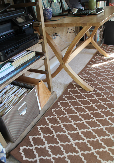
The unfortunate part is that the carpeting is less than eight months old and we’ve already had a professional cleaner (after trying to remedy on our own) out to fix the Bodie paws + Liv spills + shoe marks that have cropped up here and there. I suppose it was inevitable.

So when Rugs USA offered to partner with us to test out an area rug from their site at a discount, it was perfect timing and I was excited to work with them to find the right rug for this space. Rugs USA has a huge selection of rugs at every size imaginable – so finding several that met my criteria wasn’t difficult. That criteria included: dark rug (to hide those inevitable spots), wool pile rug (not dhurrie or flat so that I can easily vacuum up Bodie hair and it wouldn’t get stuck to the rug), and a 5×8′ or 6×9′ size so that the furniture on each side of the office would overlap the rug rather than having a rug-on-rug look that looked disproportionate. It was narrowing the choices down that was the problem :).

Below are a few that caught my eye, though some were indeed flat rugs or strayed a bit from my original brown idea:
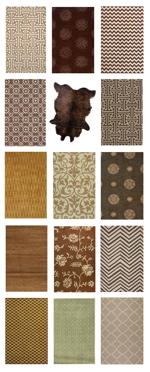
From top: 1, 2, 3, 4, 5, 6, 7, 8, 9, 10, 11, 12, 13, 14, 15

The bulletin board fabric is a busy print (and the board itself can get a little overloaded with photos and clippings) so I was immediately leaning towards options that were either solid or had one repetitive pattern.

And I’m really really indecisive about this stuff – poor Kate over at Rugs USA didn’t realize what she was getting herself into with our email exchange that included a change of heart every couple of days for months.

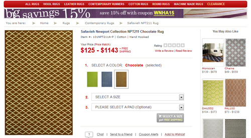
I ended up choosing the Safavieh Newport Collection in chocolate and I’m really happy with the choice. Something solid would have felt too plain and something too patterned (floral, etc) would have been too busy/contrasting with the other fabrics in the room.

This particular rug didn’t come in a 6×9′ size but as a slightly smaller 5’6″ x 8’6″, which actually worked out a little better. If you’re walking into the office from the kitchen, here’s how it looks:
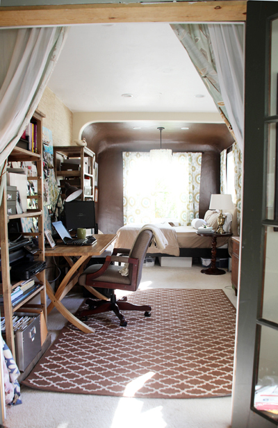
This shot show how the french doors connect the kitchen and office, though those doors are readily in need of their makeover moment. Right now the frame is the natural plywood color and the doors are a hunter green (we left the color from the previous owner for now).

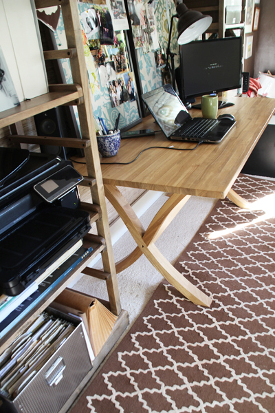
A close up of the pattern:

I’m still trying to decide if I’ll unload those massively packed bookshelves so that the rug can go under furniture on at least one side of the room.  Or perhaps at least add a little more carpet color between the two so they’re not smooshed right up against each other.
If you head back out to the kitchen from the office, I ended up hanging the temporary window curtains on a double rod over the french doors to add a little privacy to the space for guests and to help me ‘disappear’ when working at home. The old french doors separating the office and kitchen will be beautiful when complete, but the clear glass isn’t always the best when a guest is wanting to head to bed or I’m trying not to distract Liv when she’s eating lunch with the babysitter.
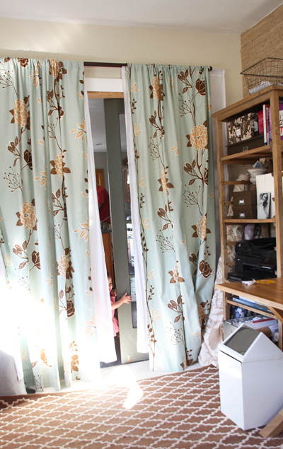
Here’s that beautiful girl coming to find me during me now!
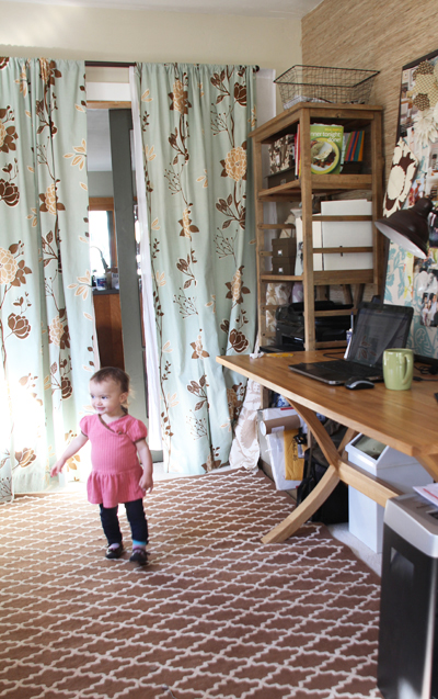
I’m so fortunate to be able to work primarily from home, even if I have to hang a curtain between my office and the rest of the house to get a full day’s work done :).

I chose a double rod so that from the guestroom area you see the thicker patterned panels (that serve as a light blocker) and from the kitchen the sheer, breezy panels (instead of the back of the other curtains). You can always have one or both pulled tightly across depending on how much of a separation between the two rooms you’re hoping to create.
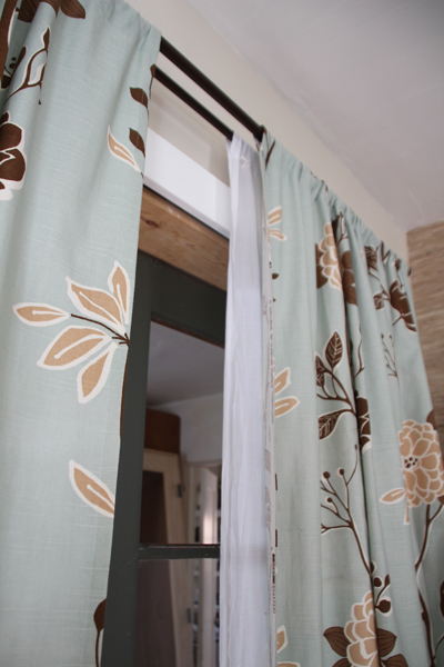
The only bummer? I realized that after I had cut and hung these babies that my salvaged World Market sheer panels (from another room) were about 4″ too short!
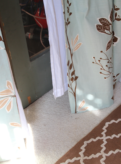
One day I’ll have to line them with a solid fabric or something like that. One day.

So the office is officially back on track. Hope to finish this guy up very soon as we prepare for a summer of guests and the plenty of other projects that are calling our name!

PS Rugs USA is always offering sweet discounts over at their site, check in often to snag an area rug at 20-35% off on any given day.

For more Office Makeover posts, check out: stuck in a rut, designing and sewing the curtains, diy fabric bulletin board panels, handmade capiz pendant light, organizing the bookshelves, wall collage part 1, part 2, fabric bulletin board inspiration, (new) inspiration board, new lamps, wallpapering open shelves, finding the perfect credenza, new trim, dining table-to-desk, a new desk & bookshelves, installing remnant carpeting, grasscloth wallpaper, painting the office nook, finding carpet for the office, chocolate brown wall ideas, plastering progress, inspiration for a diy desk, back in action!, desking hunting for under $300, bookcases under $300,inspirational rooms, room layout options, demo part 1 & demo part 2.

Office Makeover: Stuck in a Rut

I’m in a bit of a rut when it comes to our office/guestroom. So much of a rut that I really haven’t touched it since putting up the new curtains in December. I stare at the space everyday since I work in the office from about 9 to 5 – and it stares back at me gloomily wondering when it will be finished.

See, I had this picturesque plan in my head of how I wanted the finished room to work and as I slowly decorated (after Kevin turned the room into an office from the old kitchen) I slowly realized that the pieces just weren’t fitting together. But I couldn’t put my finger on the problem.

We demoed, dry walled, plastered, rebuilt a concave ceiling, carpeted (to cover up a mismatched wood floor), painted, hung grasscloth wallpaper, found and fixed up furniture:

Organized bookshelves, built bulletin board panels:

Designed curtains (using Spoonflower), created a capiz light pendant, started a wall collage:

And then bam. Hit a decorating wall.

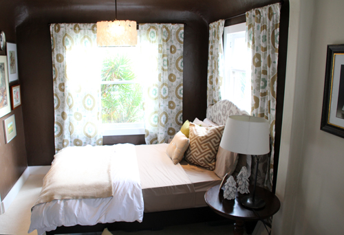
I didn’t know where to go from there. I loved the new curtains but I was having a hard time making a bronze/tan/teal/mint green color palette feel fresh and not 70’s.

I knew immediately that the headboard that I had made from an old bed frame needed to be recovered. The silvery grey fabric was one of my favorites (left over from this event) but it just didn’t fit. at all.

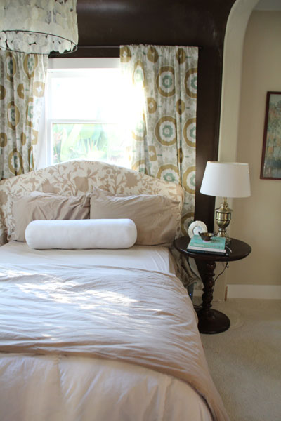
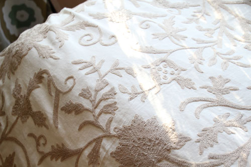
I thought one of my favorite crewel fabrics (left over from this event) would be just right for the space, so I draped it over the original headboard and have had it there for the last two months. But something still didn’t feel right.

I might still need to come out of my color mixing shell, but I love a room full of patterns! I thought I would really love the curtains with the crewel (especially with a nice neutral bedding).

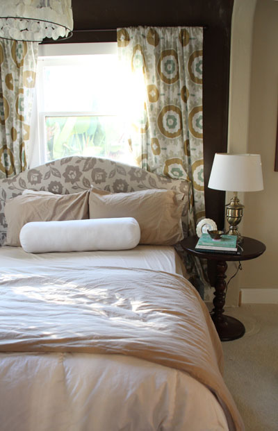
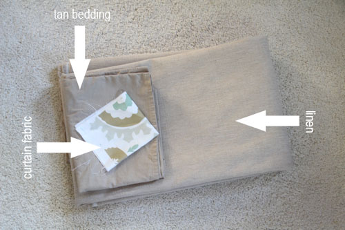
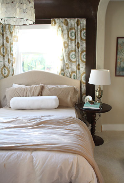
When my parents were here to visit near Christmas my mom casually suggested a solid tan headboard. No, I thought – that would be too safe and boring. Plus, I was kind of digging the pattern overload going on there. But after a month of that sitting on the back of my mind (and me becoming utterly frustrated with a non-progressing room) I headed down to my local discount fabric shop and bought 3 yards of tan linen for $30.

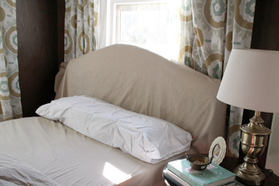
And it worked! Suddenly the room was breathing again and the space felt fresh and light. (All I can think about looking at the above picture is how wrinkled my pillow cases are!). This is a better shot:

I haven’t covered up the original headboard just yet – still letting this idea grow on me. It’s just draped over the headboard for now.

I think that maybe if the pattern on the bulletin boards were subtler and the bookshelves didn’t feel so overloaded with projects and work stuff then more pattern at the far end of the room wouldn’t feel like so much. The room was becoming so busy!

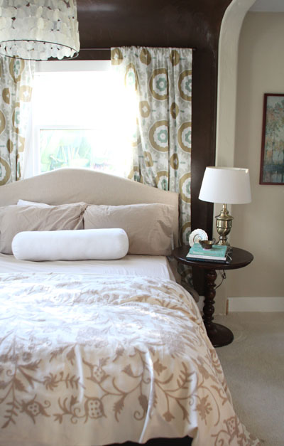
Maybe I’ll make the crewel into a duvet or throw:

Then the patterns won’t be so stacked and there will be enough neutral to help them breathe. It is so, so pretty – see how the floral pattern is raised up just a bit?

So that finally got the brain juices pumping again… and now I’m beginning to see where the space might go from here.

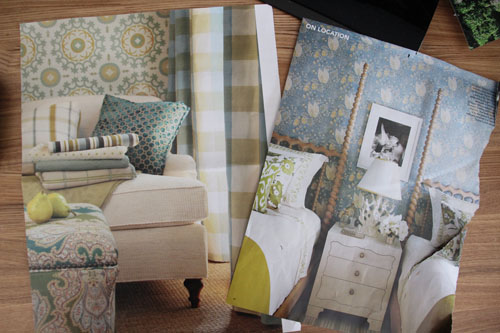
To find that extra inspiration, I started tearing out magazine sheets of rooms that used my color combo.

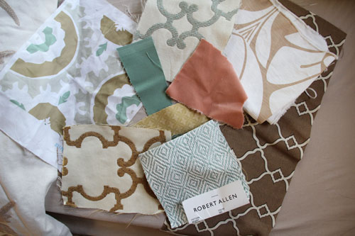
And every time I spotted a fabric that might work I picked up a little snip of it to test out.

I’ll have to narrow those choices down, but maybe light pink or yellow would work well as a contrasting shade to balance all of the tan & teal out.

And so the saga continues! Have a wonderful weekend! PS am I alone in this or have you ever found yourself in a room rut? PPS I am always open to suggestions!

For more Office Makeover posts, check out: designing and sewing the curtains, diy fabric bulletin board panels, handmade capiz pendant light, organizing the bookshelves, wall collage part 1, part 2, fabric bulletin board inspiration, (new) inspiration board, new lamps, wallpapering open shelves, finding the perfect credenza, new trim, dining table-to-desk, a new desk & bookshelves, installing remnant carpeting, grasscloth wallpaper, painting the office nook, finding carpet for the office, chocolate brown wall ideas, plastering progress, inspiration for a diy desk, back in action!, desking hunting for under $300, bookcases under $300,inspirational rooms, room layout options, demo part 1 & demo part 2.

Living Room Update: Butterfly Shadow Box Art

Hope you had a great Valentine’s Day!

I have a funny story… Kevin took me to a really lovely restaurant last night in La Jolla (just north of San Diego) called Whisk n Ladle. It’s a place that I’ve wanted to check out for some time and it was delicious! I’m not sure you can call us ‘foodies’ but we’re big on locavore-style restaurants full of unique flavor. If a menu mentions anything with the words ‘fig compote’, ‘breaded goat cheese’ or ‘lavender infused anything’ I start to salivate immediately. It’s the unique pairings that you can’t always accomplish in your own kitchen that I like most about eating out.

Well, this menu was everything and more and I was so excited to try it all. We narrowed our choices down to two specialty cocktails to start, braised pork shoulder with dates and roasted brussel sprouts as well as seared local halibut for our main courses — and to start us off delicious pan fried sweetbreads with onion confit in an au jus sauce. Are you salivating yet? But this is where things got a little crazy. What do you think of when you hear ‘sweetbreads’? (this is officially why we’re not foodies), I was picturing a most delectable french-toast style of handmade bread with an onion confit for dipping. Nope! Sweetbreads are a friendly word for the throat, glands, stomach and intestines of a lamb or calf. We were half way through the appetizer when I decided to Google it because it just didn’t taste like I was expecting… ha! Kevin happily finished off the rest. So maybe he’s the foodie in the family.

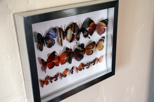
Okay, back to a fun little laser cut butterfly art project that brought a little more Spring to our living room.

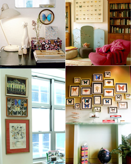
There’s just something about these natural beauties that is so lovely to look at! And such an easy way to add color and bring nature into a space.

More lovely inspiration:

Lots of folks are not fans of taxidermy butterflies. It doesn’t bother me so much if I’m purchasing from a humane seller who harvests butterflies after they have naturally passed (since many live only 3-4 weeks) but if you’re looking for an alternative (or you don’t want to spend $50-100 for a shadow box) plastic laser cut butterflies are the way to go.

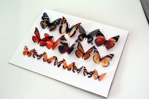
Krista of Kiki’s List (who I learned about from this favorite site) turned me on to Etsy seller Clear Cut Crafts that creates just that – beautiful, natural looking thin plastic butterflies that can be used for cake decor, weddings, you name it.

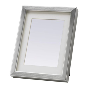
I placed an order for 2 dozen Monarch colored butterflies (love that orange! and thought they were the most realistic – plus I grew up near Monarch groves which are just beautiful when full of butterflies). To hang them, I found a cheap Ikea frame in silver that I altered just a bit to function as a shadow box.

***************************************************************

Butterfly Art (and converting a Ribba frame to a shadow box)
m

Materials: laser cut butterflies (or the like), Ikea Ribba frame, white construction paper, scissors, pliers, 1″ tack nails, hammer, glue

Using the back of the frame as a guide, I cut out a piece of white construction paper to match. My butterflies came pre-cut (huge time saver! hence the laser cut) and so I gently folded the wings and laid them out on my paper to get an idea of how I wanted the finished display to look.

Once I had settled on a layout I used a white glue (so that I could adjust placing as I went) to hold them in place.

I let this dry over night and began working on the frame. Apparently there is a shadow box frame that Ikea makes – and I thought that I had picked up that version when I found my $4.99 find. But later after arriving back home I realized that while it’s deep for a frame (as most Ikea frames are) the photograph mounting was smooshed right up against the glass.

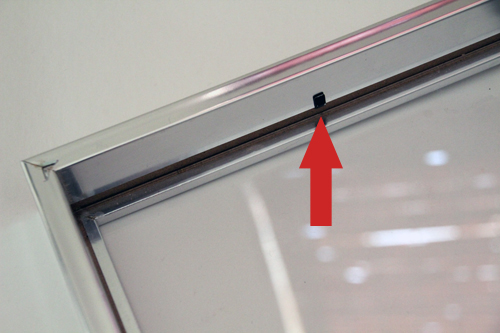
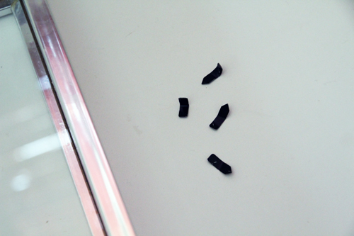
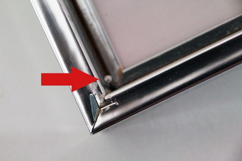
To create a shadow box out of the Ribba frame, I popped out the glass and mat and pulled out each mounting clasp (is there a more accurate term for those little metal clips?) with pliers.

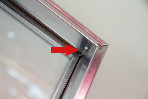
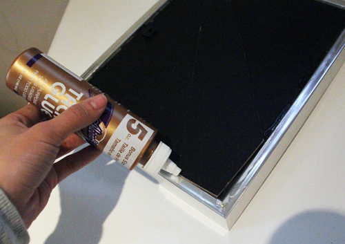
Then I added small tack nails between the edge of the glass and the frame. Just a gentle bump with the hammer and a little glue held these guys in place. I also let the glue dry overnight.

Now the back of the frame would sit atop the nails and the nails would bridge the distance between the glass and artwork — making the frame a shadow box (and perhaps the cheapest I’ve ever bought).

Since I pulled out the little clasps that keep the back in place (because they were in the wrong location for a shadow box) I simply glued my back to the frame edge. Since it’s a tacky white glue that I used it will hold my artwork in place for as long as I’d like but will allow me to easily pull the back off (maybe with the help of a utility knife) later down the line to update the contents. A glue gun here would be equally useful but might not allow the versatility to easily replace the artwork inside. Let dry overnight if using white glue.

Finally, flip over and hang!

***************************************************************

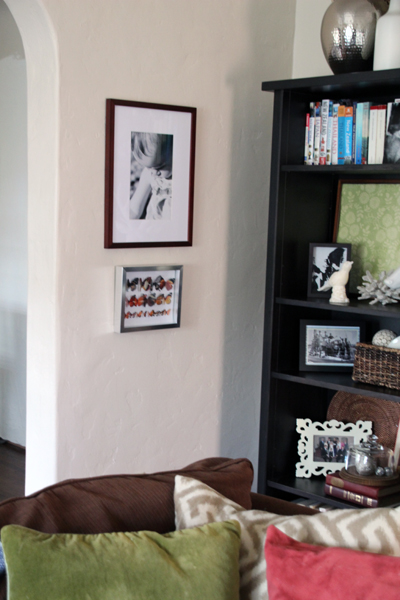
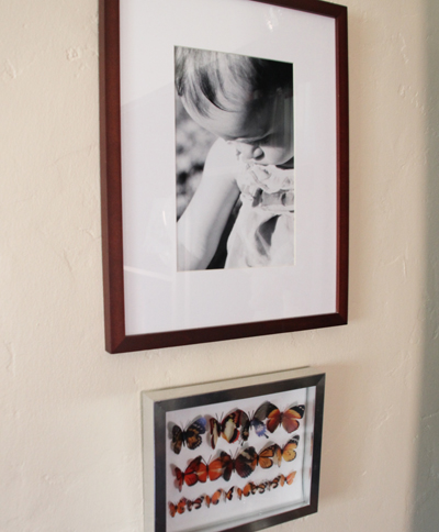
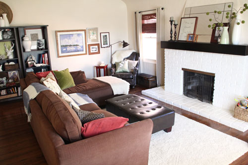
The finished frame fits in well with my Spring update for the living room with the bright colors playing off of the new throw pillows.

And another shot of the corner of the room with the new butterfly artwork:

Do you have any funny stories to share from Valentine’s Day? Or any new DIY artwork projects? What are your thoughts on butterflies – fake or taxidermied?

More living room posts right here.

Related Posts Plugin for WordPress, Blogger...