A Little of This & That… Renovating, Decorating, DIY Projects & Family

*Giveaway* A $249 Room Refresh Design Kit

I’m so excited to share today’s giveaway! I first discovered Anna of Ethos Design on Young House Love a while back – and I’ve been a follower of her blog ever since.

Anna is a talented interior designer from North Queensland, Australia, and Ethos Design is her brainchild for virtually helping homeowners all over the world with their design aesthetics, room layouts and furniture/accessory choices (also known as e-decorating). Today’s giveaway features a Room Refresh Design Kit (full of wonderfully helpful customized ideas for updating any room of your choosing) valued at $249.

In the company’s own words: Ethos Design is an interior design company specializing in interior design for real people and real homes. We offer ‘Design Kits’, an online interior design service which gives you all the inspiration, instructions and shopping lists you need to create your dream home.

This is an interior design firm for those who want a beautiful home, but don’t think they should have to pay designer prices for it. It’s for those people that already have some great pieces and just need a hand putting it all together. And it’s for those people that want to have fun with interior design and create a real home that suits their lifestyle.

When Anna reached out to me about hosting a giveaway as well as offering refresh suggestions for a room of in my home, I was happy to virtually hand over the reigns for a space that has been slow to evolve – the office and guestroom! – and was excited to see what her ideas were. When she shared my finished Design Kit, I couldn’t wait to pass on the same offer as giveaway here.

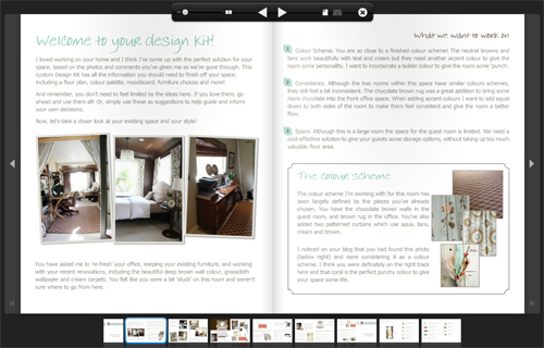
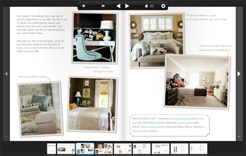
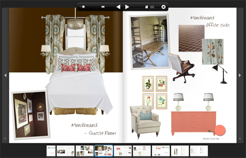
Here’s a sneak peek at our office/guestroom Design Kit, but you can check the entire magazine-style kit out here:

The process begins with a questionnaire that first establishes the space, inspiration, favorite designers, color palettes and so on. (It’s a very insightful way to approach a room and I knew Anna and I were on the same page when many of her inspirational images for the space were images that I had also pinned to my Pinterest board – I was loving where she was going with the design.)

Anna used the questionnaire, photos from the blog and measurements that I sent her way to develop a thorough plan for how she saw the office and guestroom evolving.

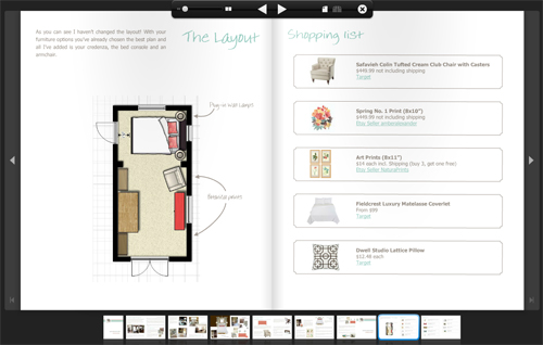
She made helpful suggestions on changing up pieces of the room layout (read through the full kit to see thoughts on switching out the current nightstand for sconces and a homemade behind-the-bedframe version), color palette (note that bright pop of coral!) and on what fabrics, artwork and furniture pieces she thought would look best added to the room. I have my own finished idea in mind, so I loved getting a second opinion and I am definitely incorporating many of these ideas!

Finally, the design kit includes a full shopping list that meets your budgetary needs making the design super easy to execute for the homeowner (or as a great list of guidelines on what to look out for).

What a fun process! This is a great giveaway regardless of your own decorating experience or how finished/work-in-progress your home might be. Read more about Ethos Design here.

******************************************************************************************

Giveaway: A virtual room Refresh Design Kit (see all of the Ethos Design packages here) for any room of your choosing. This kit is valued at $249 and is open to any reader, anywhere in the world (yep – it’s all done virtually!).

To Enter: Leave a comment here with the room in your home that you’re ready to refresh! What’s bugging you about it?

For Additional Entries: Become a Facebook fan of Ethos Design and/or Pepper Design Blog. Follow Ethos Design or PDB on Twitter, or follow the Ethos Design blog. Be sure to leave a separate comment for each additional entry.

Giveaway ends Friday, May 4 at midnight PST, winner will be chosen randomly and announced the following Monday. Good luck!

*****************************************************************************************

Tackling the Yard: Curb Appeal

While I’m busy as a bee inside, Kevin has been making some awesome progress in the curb appeal department.

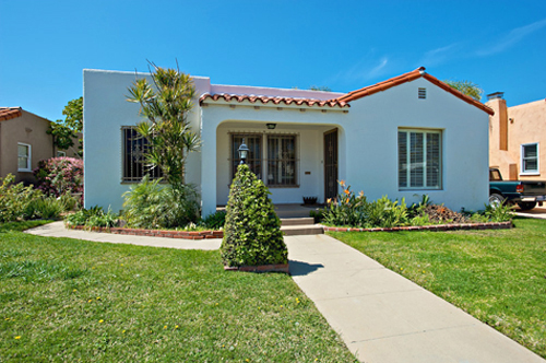
When we bought our home four years ago, it had a nice, clean front yard with a covered porch and a large lawn.

Our Yard - Before

By the time the house sold and we had moved in, the lawn was showing signs of wear and tear in the form of bare patches and browning grass. Rather than reseed, we decided that updating the front of the house would be our first project (maybe we’d earn a few brownie points with our new neighbors?).

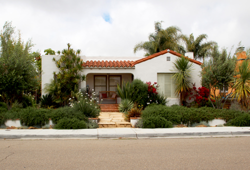
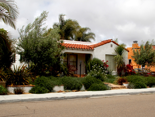
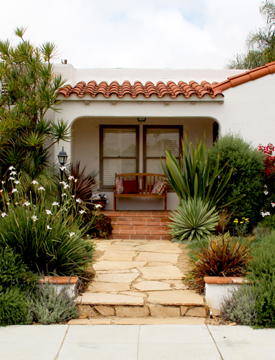
Four years later, and this is our Spanish bungalow:

Kevin built a retaining wall that helped to level out a sloping front yard (the left side of the yard was about two feet higher than the bottom of the right – now they’re about even. You can really tell the difference in that our neighbor to the left has an even higher retaining wall while our neighbors on the right need none at all).

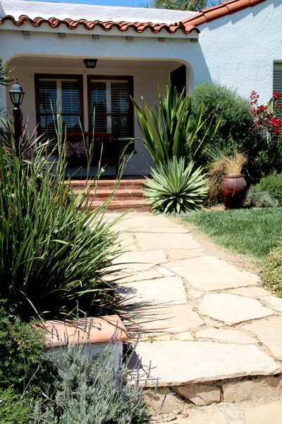
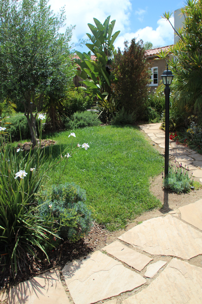
We added flagstone over the top of the straight cement pathway to give it a little curvy appeal, then filled in the gaps with a warm goldish tan decomposed granite. (Ignore that red pot there, we moved him off of the porch to grout the tile.)

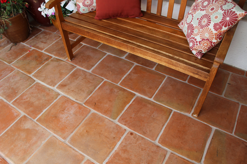
Eventually the cement porch was tiled over as well, this time with beautiful Spanish saltillo tile.

And these are the real deal! We actually picked these handmade tiles out ourselves in Mexico (it’s only 30 minutes away, after all).

I had a lot of fun picking out and organizing the plant arrangements. My mom was a horticulture master at one point in her life and I loved to watch her draw her bird’s eye diagrams of outside areas. They were full of various sized circles, overlapping and intertwining to create beautiful mock-ups of how a yard would progress and what the result would be.

The basic takeaway I’ve always held on to is the issue of layering and height. Keep those tall bushes and plants towards the back (keeping in mind where they’ll grow to be, not the height you buy them at) and then layer in various middle growths until you reach your ground covering up front. My favorite variations include at least three and often four layers of growth.

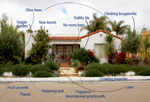
Here’s an idea of everything we changed!

Accomplishing the above on a budget was not easy, and the full transformation took several years (I didn’t start blogging until it was well underway, so I have few in-progress or before pictures :().

Our biggest secret included Craigslist and more Craigslist. In fact, we bought very little of the above not on that magical site. We scored 75% of the plants we purchased from a nursery we found on Craigslist that was getting rid of its entire lot, even though it was an hours drive for us it was well worth it. $3 gallon plants! $1 succulents! Yes please. We bought small knowing that these guys would eventually take over. The funny thing is, three years later and the nursery is still there. We still buy $3 gallon grasses from them.

A huge challenge for us in choosing plants was to keep them style appropriate to the house (Mediterranean, Spanish) and to keep them of the drought tolerant variety as we really weren’t looking to spend a ton on water to maintain the yard. San Diego is a dessert (if not a beautiful one) so our choices were limited, hence the massive amount of tall grasses, succulents and plants in the lavender family.

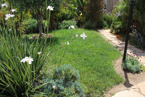
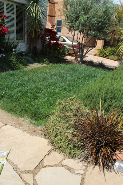
Our lawn was also a Craigslist score. Believe it or not there are plenty of landscape contractors who sell their left over materials – even grass! – online. This was a tricky one because we actually bought each side of grass (left side of path and right side of path) from two different contractors (we couldn’t find enough from one), and even though they were from the same family of grass, they looked horribly different after we unrolled and planted. Thankfully they cross bred (didn’t know that was possible) and today look close to  identical. That would have been a tough lesson to learn.

Here’s the right side:

And here’s the left:

The saltillo tile is very authentic Spanish home – and buying it handmade in Mexico means that it literally is authentic in its look and style and it’s much cheaper than anything you can buy north of the border. We brought two huge truck bed loads over before the border patrol assumed we were attempting to resell illegally in the States and told us no more. But using it for your own land is legit, so it was all good :).

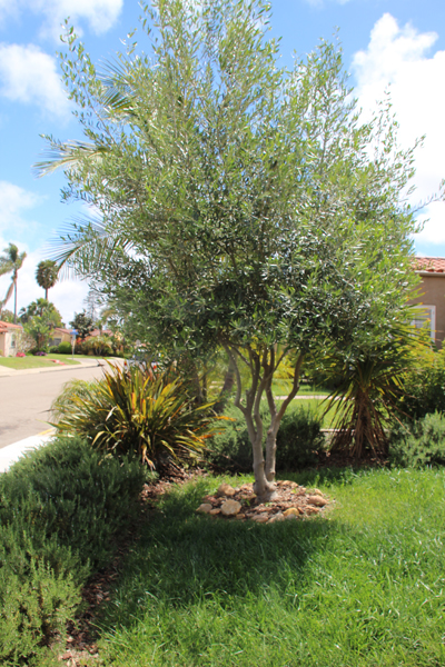
We received two gifts when redoing our front yard, the first were two amazingly beautiful olive trees from our neighbor who had changed their mind about olives and had dug ’em up. Olives are very Mediterranean which goes very well with our Spanish bungalow – it was a huge gift!

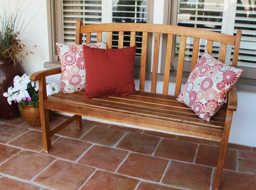
The second, my favorite yard addition, is a teak bench for the porch from my mom and step dad. It’s such a welcoming addition!

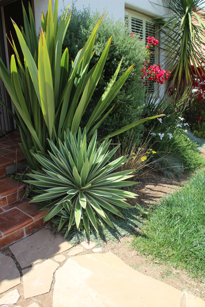
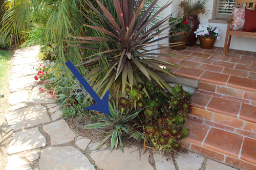
The funny thing about plants is how temperamental they are. Take this little cactus, for example. He’s done okay on this side of the pathway:

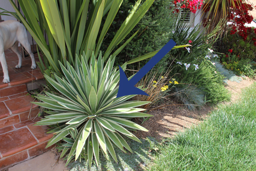
But has thrived on this side of the path! Just four feet to the right.

Kevin has the green thumb in this family and he keeps this yard looking ship shape all of the time. But we recently completed a couple of projects in the front and I’ll share those very soon. Now you’re all caught up on our curb appeal makeover!

(Do me a favor and just imagine a sunny sky above – today was a bit blustery in San Diego :)).

Related Posts Plugin for WordPress, Blogger...