I’ve been anxiously waiting to catch you all up on my breakfast nook project, but I’ve reached a bit of a design dilemma and I thought I’d share what’s going through my mind right now.
I’ve moved the bench seat from the edge of the island:
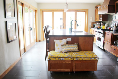
To this blank wall. We’ll call it the problem wall.
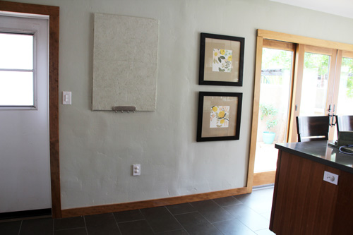
This particular wall used to be the dividing line between what was (way before us) a bedroom and an entry room (at least that’s our suspicion…). It had an unusually placed window just to the right of the side door that makes us wonder if a mudroom existed here before (and a slight buckling in the wall where there may have been another wall that jutted out of it?). The wall was gone before we moved in and a den was in its place.
During our kitchen transformation, this small little window broke and was quickly boarded up and left for a future project. The plan is to either A. replace it, B. use glass block to fill it in, or C. make it disappear altogether as a solid wall. The last is my vote, but Kevin is not 100% convinced on which he loves best. So it sits now as a piece of plywood in the kitchen. We finally painted it to match the walls (though it doesn’t blend much…) and avoid photographing it altogether :). When we have guests over, sometimes I hang a piece of art right up over it.
The ultimate goal is to integrate that space back into the house, and even if we wait on the to-close-or-not-to-close decision for a while, I’d like to come up with a solution to hide the eye sore in the interim.
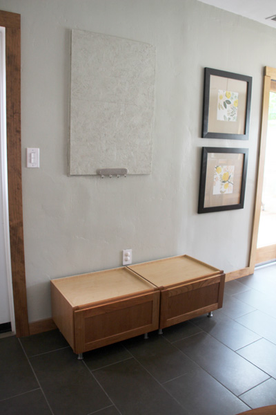
I had this space in mind too for the kitchen breakfast nook and I thought it might work well if the end of counter idea (see top pic) didn’t. And the bench? The perfect size!
Now just picture a round little table and two chairs in front of it.
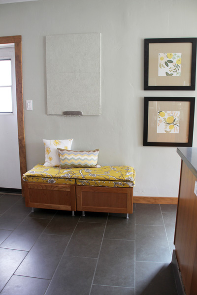
I love that the colors tie in so well with the artwork.
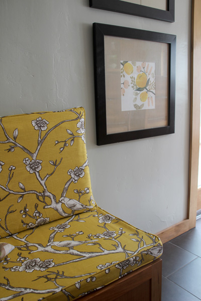
But back to that dilemma, because the plywood ‘pin board’ is a big eye sore.

I have a couple of ideas…
The first one that I imagined as perfect for the space was to find a cool old mirror and convert it into a chalkboard, like this:
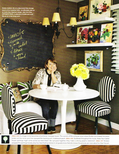
How beautiful! Image from here.
But I searched and searched and had the hardest time tracking down a large enough ornate mirror. See, to both cover up that plywood (temporarily, of course) and look somewhat natural on the wall, I needed a piece that is roughly 44″ tall and 40″ wide (big and tough to find).
Still on the hunt for an ornate mirror, but I suppose option two would be to hang a regular square chalkboard that might look something like this:
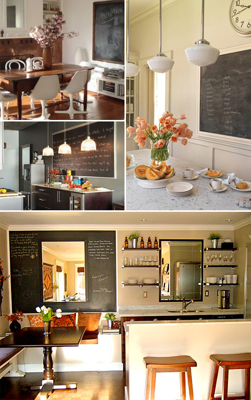
I could build my own or find a large frame and then turn it into a chalkboard.
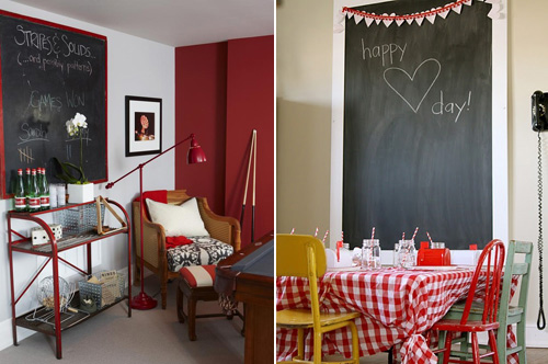
Image sources for all of these ideas can be found over on my kitchen Pinterest board (Pinterest is where I was lucky enough to track most of them down!)
If I build my own frame… perhaps a chunky reclaimed wood look?
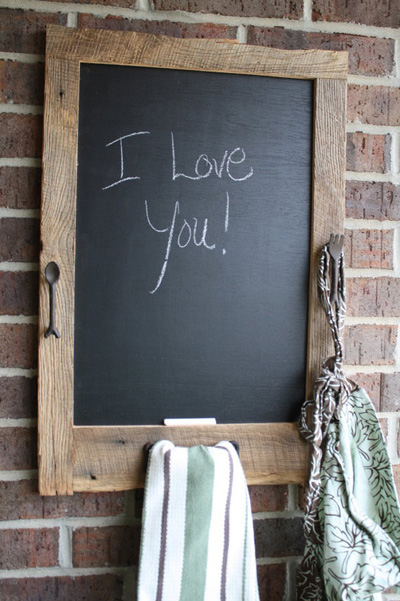
Love the look of wood and chalkboard… though gold is high up there as well!
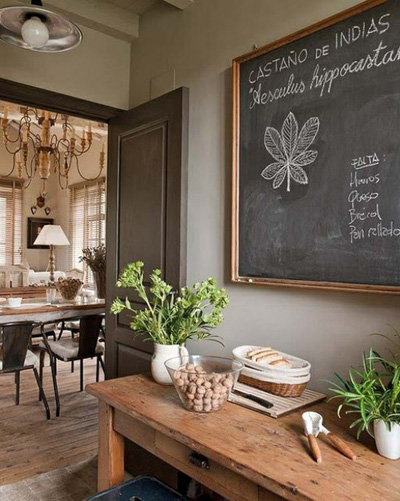
And I’d have to make it magnetic, just like Christina did:
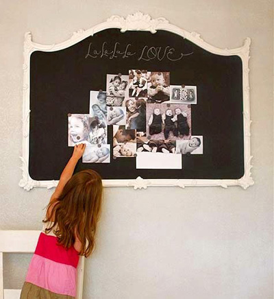
Part of me is secretly wondering though if a command station so front and center as you walk into the kitchen is the right idea? Do I want lists and ticket stubs and reminders so evidently visible? Could I keep this space visually clean?

That wall above is just to the left of the island below. I’m standing in front of it while snapping this picture:
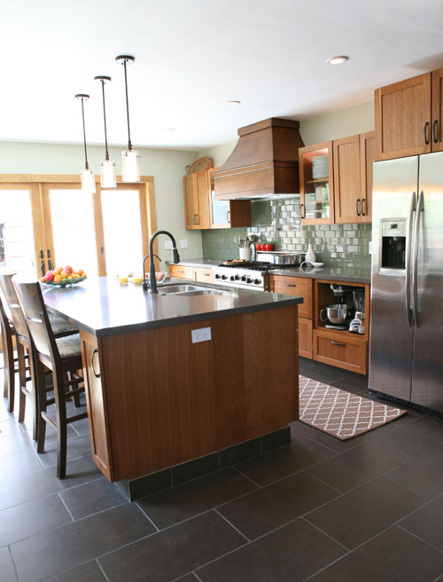
If I could and was willing to make that promise to myself, why not a cool fabric pinboard?
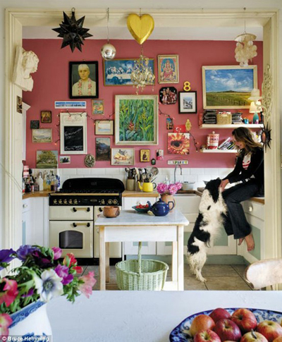
Picture this coral in a square frame and Liv’s art hung up in a semi-organized fashion:
Or perhaps I nix the command station idea and hang just a stunning piece of framed fabric (from a vintage scarf, tablecloth, remnant piece…):
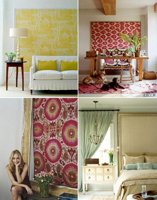
Maybe a framed picture? Painting? Map? What would not look out of place in a kitchen/dining space? See how difficult I’ve let this one become? :)
PS You can find all of the kitchen renovation stories here.


