
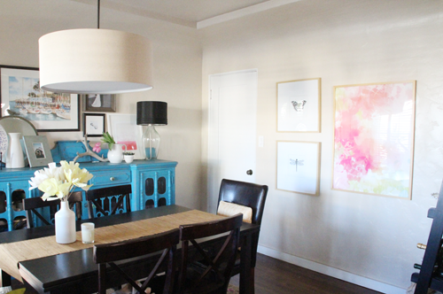
I’ve added a new watercolor print to the dining room and I’m happy to say that I think I’ve found the perfect ‘brightener’ for this space.
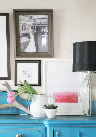
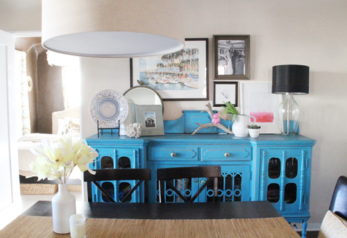
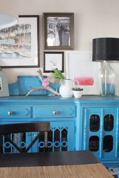
I love my teal buffet, but I’ve always felt that the space across this section of the dining room was a little cooler color-wise than the rest of the adjoining living room and dining room spaces.

I shared last year about adding warmer tones in shades of pink and yellow (as evidenced by this and this art and the above throw pillows scooped up on eBay), and now the warm pink continues on over to the left side of the dining room.
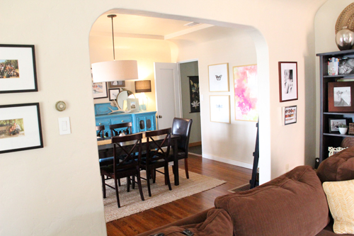
It feels all tied together with hints of the same soft hues showing up throughout.
UncommonGoods and I have been partnering through the holidays to share a few of their products. This is one of my favorites – and it was a complete surprise to me initially that they sold art (turns out they have quite the wall art collection). Really pretty art at that.

I love the abstract, flowing nature of this particular painting, titled ‘Beach’ for its reminiscence of a pink sun setting over the rolling ocean. It’s soothing and soulful. The artist Yao Cheng incorporates traditional Chinese floral techniques and is inspired by rich colors and patterns. You can see up close that there are calculated brushstrokes as she reenacts the way the waves meet the sand.
I found the frame marked down to $9.99 at West Elm. It was a floor sample that was badly beaten up (no nicks, just lots of scuffs) but a quick spray paint covering of Rustoleum white followed by a high gloss clear coat cleaned this baby right up (and $10 for a big, well-made frame? Yes please). The art came matted which was really helpful.
The watercolor works so well with the larger pink and yellow print on the western wall of the dining room, and now when this space is bathed in light it feels just a bit warmer.
Now the dining set is feeling very dark – I wonder if I switch out just the chairs (I love that the table expands to seat 12, which we totally use) for a lighter wood if that would help. We badly need more comfortable chairs. Do these look more comfortable? They’re my inspiration at the moment, I love the shape.
To me, the pinks in both art prints in the dining room help to neutralize the bright blue of the buffet. You still see and feel the bright pop of blue, but now it’s not a solo pop because the pinks jump out at you too.
I’ve thought about moving the print to my office which is another sometimes ‘cooler’ room with all of the green. This watercolor might be playing round robin for a while in the house until it finds the perfect spot!
As for UncommonGoods, I have loved exploring all of the unique gift ideas that they carry, this is actually what I’m wanting right now for me. ;) A home for everything, right?
PS You can find the evolution of this dining space highlighted right here.
This post was sponsored by UncommonGoods, they provided the above product for me to review and share my thoughts on.

I love your teal buffet and the pink of the watercolors works so nicely together. I love your dining room.
Thank you, Tammy!
Such a pretty painting! I do like how it’s both bright and soft at the same time. That and I’m drooling over the picture with the flower softly leaning over. Beautiful!
Yes I love that too – pieces of the watercolor are a bit more intense, while the full effect of the art is much more calm.