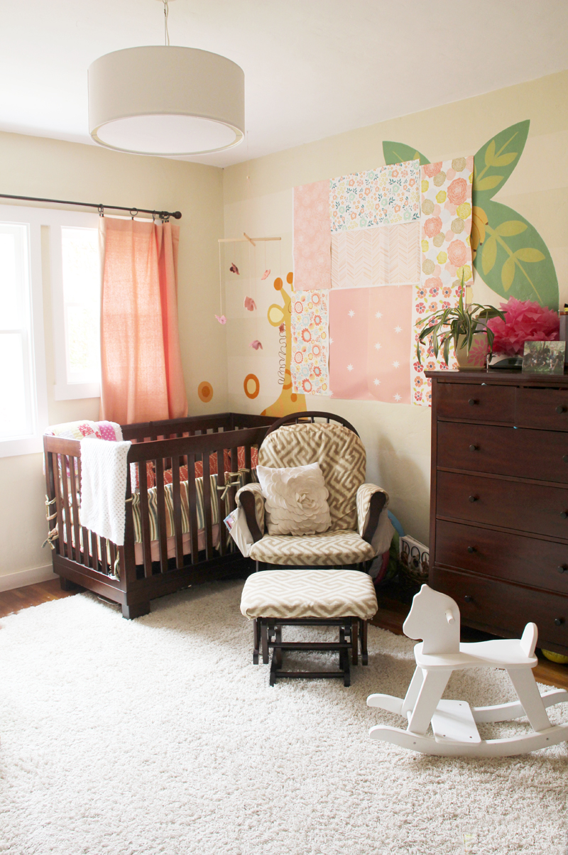
Well sort of. The wallpaper samples for the nursery remodel have arrived. I’ve been staring at them for a couple of days now and am trying to imagine how each might look covering an entire 10×15′ ish wall – and I have to be honest – I love them all. I’m pretty sure that any one of these designs would be so perfect in here. Which oh which to choose?

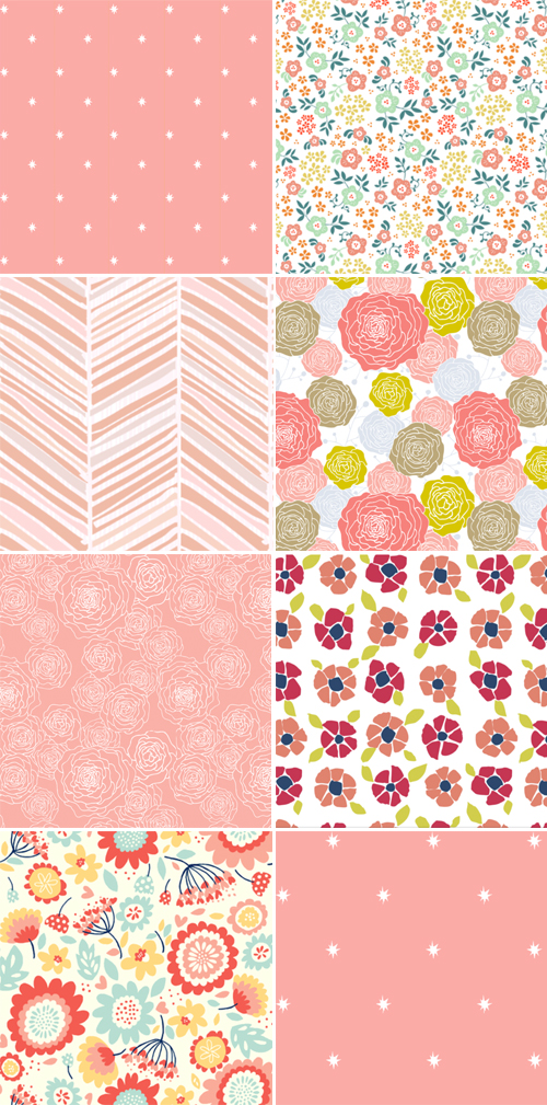
Here they all are up close if it’s hard to see the above at an angle.

Most of these I shared here when I was debating on what direction to take my solo statement wall. Clearly I’m still debating, even when I was sure that ordering my favorites and hanging them up would help settle that nursery quandary!
All of these wallpaper samples are from Spoonflower, an awesome site that lets you design and print your own fabric and wallpaper (oh search thousands of predesigned options by different artists, sort of like Etsy). I’ve used them a ton and they are reasonably priced compared to purchasing something manufactured (though boy does it take a long time to process and ship your order… I have too little patience these days).
I designed the two starry prints (top left, bottom right) which were inspired by this Osborne & Little wallpaper. I spotted the pretty night sky in House Beautiful a while ago and the image sits in the back of my mind. Not happy with any of the colors offered through Osborne & Little, I recreated from scratch and used both a peach (top left) and light pink (bottom right) as the background, while also softening up the stars and playing with the frequency in pattern. The rest of the prints are handmade on Spoonflower by various artists. Clockwise you can find the links here: 1, 2, 3, 4, 5, 6, 7 & 8.
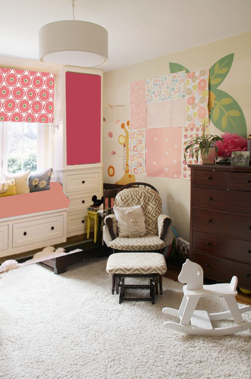
The pinks are not exact, the fabric examples are still undecided (and will depend largely on the wallpaper) and this is in general a pretty crude photoshop markup, but here’s how I think the bookshelves will work with the space once they’re installed:

Amazing for storage, right? Oh man I can’t wait.
Update: Fabric Warehouse Direct is offering that beautiful Kravet window covering fabric that I photoshopped into the above pic at a steal of a rate right now.
Ignore the random throw pillows and the other pieces of photo I didn’t get a chance to photoshop out. I’m imagining a dark pink painted backing in those top shelves, hence the awkward block of color at the moment. If you squint you can begin to see it all come together…
Ahhh, it’s all becoming so real!


I love #3 the Morning Glory one, I think that it is both little girl as well as baby friendly. My second choice would be the chevron but I worry that it is a passing trend and I keep hesitating to put it into my house.
Good luck choosing!
I love #3 too, such a nice color combination between peach, pink, mustard yellow, light blue… and the herringbone! Love the herringbone.
So many pretty choices! Though after seeing your mock-up, I’m a fan of the chevron print paired with that curtain. I tend to lean toward subtle prints on walls, though, and the chevron appears to have texture and interest without being really bold. Then again, how would the chevron work with the geometric pattern of the glider? If you tell me you’re recovering the glider too, I’ll burst. How do you have so much energy?!
I think that I’m definitely recovering the glider… or snagging up a new one on Craigslist! The wooden glider squeaks and squeals these days – not great for a newborn! Haha :).
They are all so cute, but I love the one on the bottom left! I love the flowers and the turquoise…too cute!! Can’t wait to see how it all comes together!
Oh yes, that is a beautiful one! The background is more of a vanilla than a stark white, which is my only hesitation :(. The rest of the walls (as of now) will be white white!
I love them all! Would you consider using all of them in the manner you have them on the wall? Like a decoupage look? I saw that once by a high end wallpaper company and the look was amazing. I am dying to try spoonflower, either make my own design or use one of the artists pre-made.
That’s a really interesting idea, hadn’t thought of that! I worry about pattern overload in this space with the window covering, new fabric headboard (for Liv’s toddler bed), rug, etc. Oh decisions, decisions :).