
About once a month I get the chance to sit down *virtually* with a blogger (or author or artist or designer…) to pick their brain about their own sense of creativity and style.
Usually it’s a home design blogger. Sometimes it’s an entertaining/hostessing site (like here), or an organizing blog (like here), an inspirational everything collection (like here), an author or editor (here or here) and sometimes it’s a super clever crafter (like here or here), but usually it’s a blogger remodeling/redesigning/reimagining their home. Through these little interviews I get to share what makes these bloggers/authors/artists spark, what inspires them, what trends they’re following and what some of their favorite design tricks might be. I don’t get to interview nearly as many as I’d like. It’s a time-consuming sort of post, but it is truly one of my favorites.
Some of my favorite blogs include families that are completely modifying and remodeling an older or builder-style home little by little. Like an HGTV show but over a few years rather than 30 minutes.
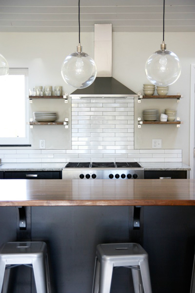
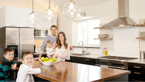
My guest today, Dana of House*Tweaking, is one of those bloggers! And her 1950’s rancher-style home is a seriously pretty example of such a transformation.
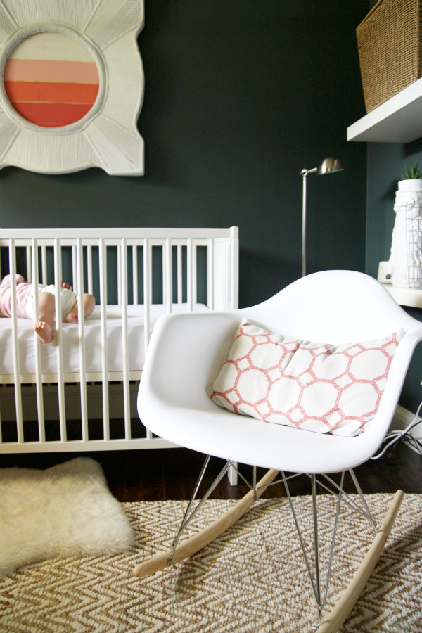
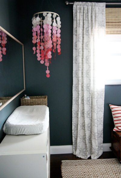
What initially drew me to Dana’s blog is the awesome nursery she designed for her daughter, Mabrey (isn’t that an equally awesome name??). The white wooden mirror with the coral gradient, those dark charcoal walls, the chevron jute rug, the white Eames rocker… I could go on and on.
And the rest of her home? So very inspiring. (Wait until you see their new ‘everything’ room after the jump.) In fact, this interview is a reminder to myself that I’m about one weekend (and ten paint brushes) away from painting the inside of my entire house charcoal and white. Sigh.
Read on for more examples, and Dana’s answers!
………………………………………………………………………………………………………
{PDB Interview with Dana of House*Tweaking}
………………………………………………………………………………………………………
What inspires your design style?
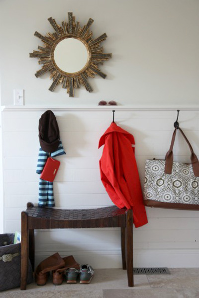
What doesn’t?! There is so much at my disposal nowadays – what with pinterest, decorating books, online magazines and design blogs – that the hard part is figuring out which inspirations to pull from and which to admire from afar. That’s such a politician answer, isn’t it? Specifically, I’m inspired by real homes that have a casual, masculine, uncluttered and somewhat tailored look but I like a little quirk here and there. Nate Berkus, Emily Henderson and Emma Reddington are some of my favorite designers. Emma’s “Hello! Neighbor” house tours get me every time. I’m drawn to interiors with high contrast, natural materials, a mix of shapes and different textures.
What do you love most about what you do?
I get to explore so many of my creative interests. I’ve always loved writing, photography, design and all things home. My blog is a compilation of all that with a dose of real life thrown in for good measure. I guess you could say that what I love most about what I do is that I get to do what I love. It hasn’t always been that way. I quit my respectable (to be read “life-sucking”) day job less than a year ago. It has been so freeing!
What are your favorite design trends?
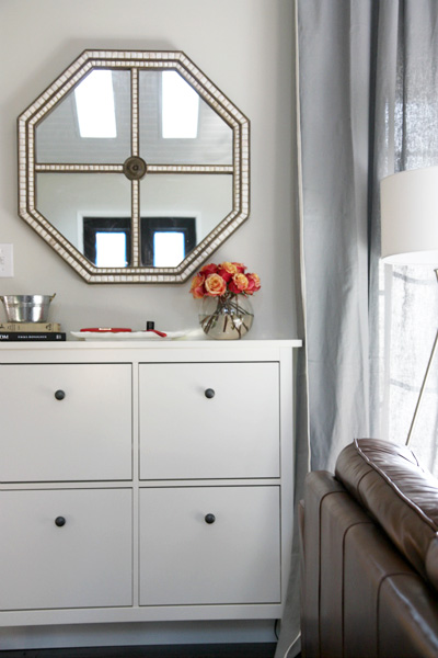
Black accent walls, floor poufs, open shelving, reclaimed wood, industrial lighting and anything made from a kilim are on my radar right now. I never met a stripe I didn’t like.
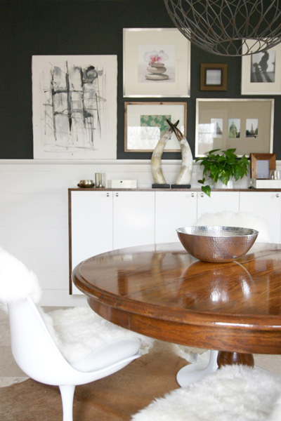
The ‘everything’ room that functions as dining room/mud room/laundry room.
What are three design suggestions that you would like to offer our readers?
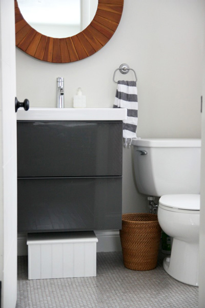
{1.} Add curves and circles into a room with mostly linear pieces to give it better flow. Round coffee tables, round accent tables, round rugs, round lighting and round mirrors are great at softening straight lines.
{2.} Sometimes the best choice is the obvious one. I think with the tremendous number of interior design images floating around on the internet, we feel the need to try something totally unique and new in our own spaces just to get noticed. But if all of your inspiration images have a white slipcovered sofa in them, then by all means buy a white slipcovered sofa and enjoy it!
{3.} In rooms with little to no architecture, fake it with large freestanding bookcases or floor-to-ceiling curtains and/or open shelving.
Thank you, Dana!
………………………………………………………………………………………………………
If you loved this interview, check out more great spotlights {and tips & tricks!} from fantastic bloggers, designers and authors.


This was so fun to read and full of eye candy. :) I love that rug!
Thanks for the interview. I started reading Dana’s blog a couple of months ago and really enjoy it. Love all the moody charcoal colors with softened decor.
I love how the colors flow throughout the tour. Thanks for sharing.
morning :)
thank you for the design highlight of dana’s darling home. great job! would she share the paint color/line of the charcoal gray used in the nursery? love it!
thanks so much for all,
beth
Hey Beth!
The wall color in my daughter’s room is Benjamin Moore Dark Pewter. It has a lovely indigo/green undertone to it that reminds me of dark denim jeans. Definitely one of my favorite paint colors at the moment!