Yesterday I posted on my curtain dilemma. Six great designs but how to decide which one? Or are any of these right for this space? These are the questions that keep me up at night.;) (But hey, that’s far preferred to the usual spreadsheets or parenting quips, so I say bring on the design conundrums).
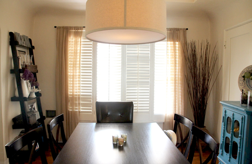
I couldn’t help but throw together a rough photoshop version for each – sometimes a visual is all you need to get the brain juices brewin’. Here’s the space as is right now (boo for capturing the seam of the pendant shade, now in every. photo.):
Here’s that lovely Tilbury in Lapis that I’m sure I’d be 100% head over heals for if I didn’t have some sort of suzani/ikat print for curtains in the guestroom and in our bedroom:
I’ve always loved this Thomas Paul print, but when it was featured as curtains (hadn’t though of that!) in May’s BHG issue, I fell for Perch all over again. Bah, beautiful!

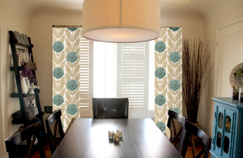
Here’s a modern print that I really dig. I love that the pattern immediately updates the space but that the colors still play nicely with the slightly muted palette we’ve got going on in the dining room. The catch? I’d have to make the curtains out of an Orla Kiely duvet cover!

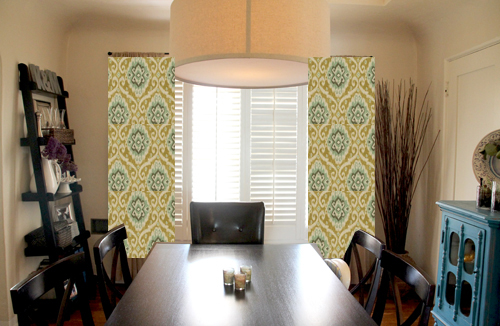
Cannot go wrong with a classic suzani like this Ubud by Iman Home Fabrics. I’m leaning least towards this one at the moment, I think the weight of the fabric might drown out too much natural light from the space.
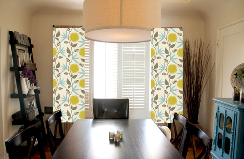
Such a fun print! Is that bright yellow too much of a pop or just right? Dahlia by Thomas Paul:
One more Thomas Paul print that I love. Botany features an illustrated pattern similar to the Perch above but with just florals. The nice white background is soft and perty
Can you guess which one I’m leaning towards? Do you have a favorite? The right fabric might not be any of the above *sigh*, but then again maybe I’ll just have to sleep on it…
Read the full dining room story by starting here: curtain call part 1, newly styled bookshelves, a buffet-over, upgrading the lighting, the before.


I like the Botany! But then I am a sucker for anything with turquoise in it.
Argh! I mean the DAHLIA. Sigh. It’s been a long day.
Haha, it’s okay – I love both!
Love the UBUD – ties in the sideboard. Love that color!! Both times I went through the choices my eyes went to that one!
Thank you, Sandy! That one has lovely colors!
I love the Perch print, it really makes your little blue cabinet pop! My second choice would be the Orla Kiely duvet.
Love your choices :).
I absolutely love the first set.
Me too!!
Morgan, I love love love the second to last one. My suggestion is move a away from the the cool blue color. Rock a secondary or tertiary color thats in the same color family as those cool blues and tans.
I was strongly considering that… either way I’m planning on bringing both contrasting and complimentary colors with other fabric pieces in the room. :)
my favorite by far is the duvet cover. Good luck with your decision!
Ooo I’m glad you love that one!
I like the Thomas Paul or the Ubud. They both are bigger prints and pull the sideboard color into the room.
Yes I agree, pulling in that sideboard color is a must! Thanks Stephanie!
I like the first one. The Tilbury. Pretty. Do not like the birds at all. Cant stand bird stuff.
Yes, that first one was definitely at the top of my list for a while! The color are stunning and perfect for the space.
I like the 2nd one, ikat, and the Ubud fabrics!
Good luck, any of them will be fantastic!
Nancy
Powellbrowerhome.com
Thanks, Nancy!
I am leaning towards Perch or the duvet cover! Good luck!
Thanks, Sherry! Love me that duvet cover and perch.
I agree with Teresa S. the UBUD the color looks great with your furniture and brings it all together perfectly……
I do love that print! It’s a suzani so it’s very similar to the styles of the guestroom and bedroom.
The Orla Kiely is my favorite, at least from this angle ;) but I like Dahlia, as well! I considered some of these when I was curtain shopping for my living room!
I think I agree! Love the perch too…
I am loving the Thomas Paul bird print. Subtle and unexpected. And completely different from anything else in your house.
Thank! Love that one too!
I love the Dahlia!! I also like the one that would come from a duvet…I am sure whatever you pick will be fabulous! :)
I know, I know! So tough… Love both. Cannot decide. :)
Add me to the Dahlia love!
Thanks for your comment, Dusa! Love that Dahlia too!
I like the Orla Kiely duvet cover option the best, but that whole “would have to make them myself from a duvet cover” thing is a bit of a drawback, indeed. So in a very close second, I love the Perch pattern, because — hello, easy option.
Oh it is sooo pretty! almost worth the challenge ;)
I have that Dahlia print on my a chair… The branches are gray-er then I thought and the yellow is more mustard-y then I thought. Just a recommendation to get a swatch of it first, because it doesn’t look the same in person even though it’s still really cute. (though I don’t think that’s the one you’re leaning toward anyway :) )
I have a few shots of it here: http://sandpaperandglue.wordpress.com/2012/03/14/sunny-little-sunroom/
Beautiful chair! Love the print there.
I think the UBUD looks great! That pop of blue is wonderful!
So pretty, right?