As a guest, there’s something about the first couple of rooms that you walk into in a home that sort of sets the stage for the rest of the house. Kind of like that first impression that you’re so conscious of when meeting someone for the first time. If you’ve been reading this blog for a while, you know that we always have one or two rooms/spaces that are under construction. I’m talking open walls, ceilings, floors… the works. So when it comes to rooms that we don’t plan on touching with a sledge hammer and nail gun, I really enjoy making these the ‘first impression’ areas (then as a guest you can walk right into the mess, but at least at first glance all seemed well!)
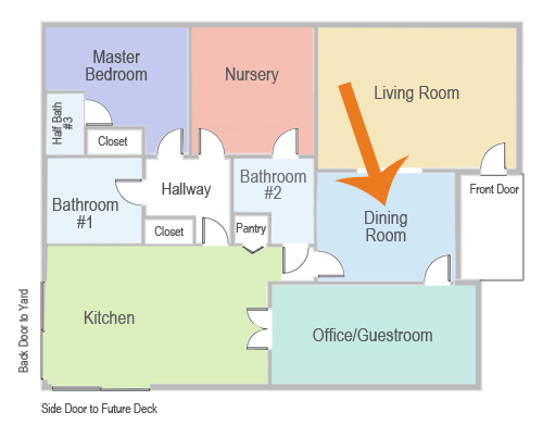
Our dining room is one such room. It greets new visitors with its rounded walls and inset Spanish ceiling, and it’s hard to miss when you pass our living room (the two are connected with a large arched walkway). It is the gateway to the rest of the house, and the first impression that I’m going for is a warm ‘welcome to my cozy dining area, friend! Let’s share a yummy meal and a glass of wine’. Wouldn’t you love for a room to ask you that?
The dining room is on its way… but it’s not there yet. Not by a long shot. Let’s start by taking a few steps backwards with a quick look at the last couple of years.
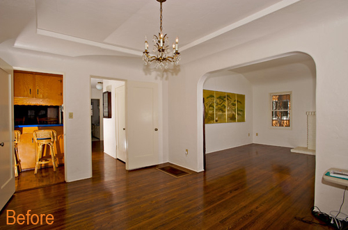
This is the before, before shot – before we even moved in. It offers a clear view of the original chandelier and how the arch between the dining room and living room helps to integrate the two rooms. In this photo you’d be standing in the door that connects the office/guestroom to the dining room.
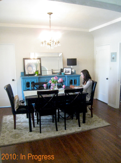
This ‘in-progress’ is from an interview with 6th Street Design School on favorite spaces – at the time the dining room was my home office while we demoed the old kitchen and slowly restored the Spanish plaster and ceilings for the new office.
Believe it or not this photo is probably one of the only few I have with the space looking as it did above, and this is the way the room stayed for several years.
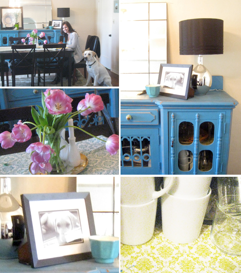
A few more details from that interview:
Sorry about the terrible exposure in these photos – it was also early in my photography days. :)
Can you see the old kitchen peeking out back there? And that second extra door that led to the old hallway? All gone now!
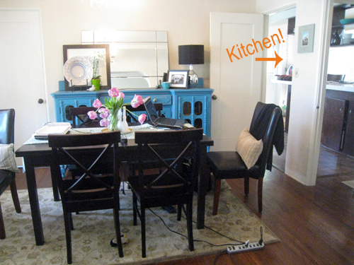
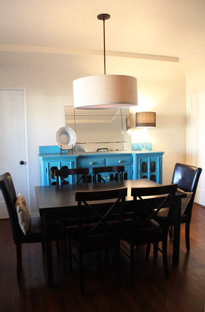
Shift to this year and the rug is now gone (the Pottery Barn rug was a Craigslist find and had lived a good life – but too many permanent stains with us and we let her go just recently in favor of something a little more modern), as well as that original home light fixture (I hope to reuse it in another space someday). The new pendant can be found right here. That beautiful mirrored lamp broke last summer and a clear glass Ikea version has taken its place. Still love that black shade.
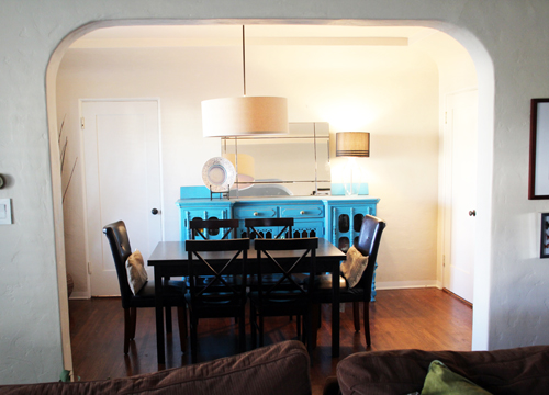
Here’s a look into the new blank slate from the living room.
We’re starting from close to scratch in here and it’s clearly in need of a little oomph, you know?
I have a few rug ideas that have just shown up on the doorstep! And a new wall collage solution to share soon. This room also needs new curtains as well as a new feature piece over on the right where that door is now closed up and a large wall sits empty.
The favorite piece in this room that won’t be going anywhere is this vintage blue credenza that we spotted at an antique store the week we moved into our home – and my parents-in-law surprised us with as a housewarming gift! It’s more of a teal/turquoise-y blue and it’s so awesome. Definitely commands attention and a piece that the rest of the room will revolve around color-wise.
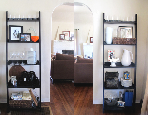
On the other side of the room is my set of Crate & Barrel leaning bookcases (found on Craigslist) that fill in either side of the archway back to the living room. I shared these guys in this post on my favorite bookshelf styling ideas, but I’m ready for these to be re-oomphed too (same with the other set of bookshelves featured in that post!).
There are two really tricky, permanent details about the room that are difficult to decorate around.
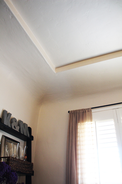
The first is both a favorite feature and a frustrating architectural detail – these high, rounded walls and inset ceilings are common with Spanish architecture but they make painting a room difficult because A. the ceiling has to be the same color as the walls or B. you have to have some sort of chair rail/picture rail to cut off one from the other.
The second is the door to the office/guestroom on the left there that throws the room a bit off center. It’s definitely a convenient in & out (otherwise you’re walking around to the kitchen) but it means that the buffet is now two feet off from the center of the room, so the table, rug, pendant light all line up with that inset ceiling, but nothing else. The only solution I can think of to fix this (without plastering over the door) is to find a shorter buffet that can line up on center with a larger object (standing mirror?) on the right side to balance out the door. But I love my blue one too much. Argh.
Well there’s our blank slate! It’s getting a heavy dose of makeover (most of the projects are underway) and I’ll keep you all updated on the progress.
Meanwhile… Kevin has been busy drawing up plans for a new back and side yard and right now we’re thinking decks, pergolas, fountains, flagstone pathways, a giant farm-style table with lots of fun chairs… it should be a great summer project!


That blue buffet is SUCH a find!!! What a gorgeous vintage piece, I just love it! Were you ever able to find a match for the color? I would love to try and replicate it somewhere in my little house. :D
Hi Eliza, sorry for the late reply! I’m not sure of the exact color but I took a moment to do a color swatch match today and it’s very close to Safe Harbor by Olympic. Take care!
Looks like you’ve got your work cut out for you! My first thoughts when seeing the room as it is: swag the pendant and move the table over to balance out the door; paint the ceiling inset to compliment your credenza (as in, the same shade, just much, much paler); and/or add some bright yellow or orange fabric accents to soften the table and also set off that gorgeous blue. I know that whatever you do will look amazing – this is just what I start to dream of when seeing that dining room. I can’t wait to see your outdoor projects…they all sound fantastic!
Leslie – that is a great idea for the light! I will have to take a closer look at that option. Thanks for your suggestions!
I love your pendant! ;)
I pestered a nice visitor to install it for me! :)
Good luck with everything- I love your buffet too. Your outdoor project sounds like a blast, can’t wait to see pictures!
Thanks, Jenna! Very excited about the outdoor projects :).