I may have just found my new inspirational color palette for the office.
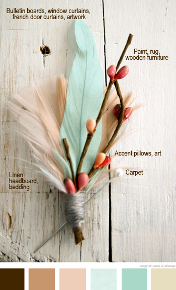
I borrowed this beautiful boutonniere from Pomp & Plumage and inspired by a color palette from Pinterest, created my own with the office/guestroom in mind. When I first came across the image I adored the color combination and decided that perhaps this is the direction I should work towards (you can see in the bottom final color line up that I’m leaning towards the softer pinks and beiges over the burgundy reds though).
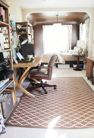
Here she is now, clearly in need of some of those alternative colors since the room is full of teal, tan and brown (the teal is hiding in the window curtains, on the bulletin boards, in the artwork and in the fabric leading back to the kitchen):
Color is not really my thing. I think that in general I have a pretty good eye when it comes to mixing color schemes but sometimes I get stuck (and that leads to a crazy amount of frustration because I can’t pinpoint the problem and then am nowhere near a solution).
But over time I’ve pulled together a resource list from those great design experts (you know, the ones with the degrees in color theory and not business – I am the latter) and I have come to embrace these color strategies:
Color Palette Inspiration
- Nature: color schemes in nature are perfection. They can provide inspiration and always always look beautiful. Nature does not screw this up.
- Room temperature: warm and cool should exist in every room. It’s not a hard and fast rule – you will find all blue or all green rooms and they will be beautiful, but one of the happiest pieces of advice that I have heard and attempt to implement today is to make sure that I balance my cold and warm colors in a room for that overall harmonious feel (you know when you walk into a room and it just feels right? I think this is the secret). Now if only there was the perfect tool to find the right warm orange for the right cool blue.
- Shelter magazines and blogs: color schemes resonate with us when we see them. Pull images from your favorite rooms and dissect to learn what it is about those color palettes that you love.
- Fabrics and photos: pull colors right out of a beautiful swatch of fabric or a favorite photo. They work well there so they’ll work well in your room.
- Fashion: trends in fashion turn into home decor and color inspiration soon after.
- Color wheel: stick to color and use it in various shades (from the lightest light to it’s darkest saturation) – and then head to the opposite side of the color wheel for that ‘pop’.
- Online tools! See below.
A few favorite online tools include:
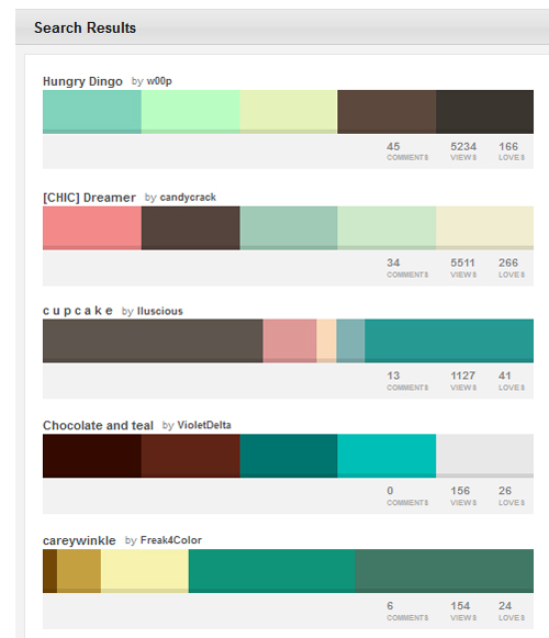
- Colour Lovers: You can search the millions of palettes for a few specific keywords (I chose teal and brown here) and it offers up hundreds of color combinations to choose from. For those of us stuck in that color rut (why don’t they offer color theory in business school?) it’s kind of a sweet life saver.
- Kate and Katie each shared about their experience with Colortopia and it sounds like a great site to have in that color toolbox. The idea here is that you can upload your own favorite photo and select areas or colors from that image – Colortopia will create several beautiful color schemes for you to play with.
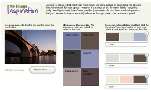
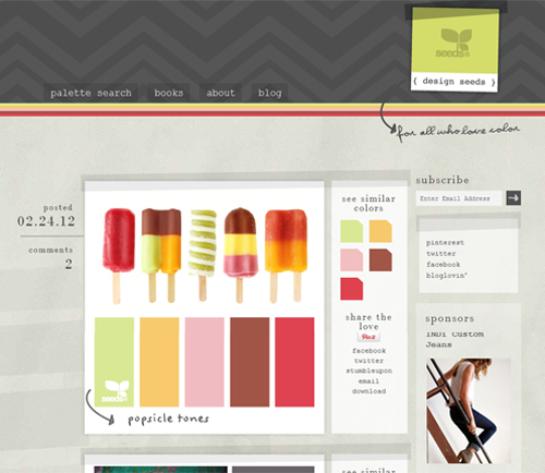
- Elle (a reader) mentioned Design Seeds in the comments, which after checking out I had to add. Maybe they were the designers of the original inspirational palette of that above boutonniere that I saw on Pinterest? What I thought was especially cool is that you can enter a color value (I could use a color directly from my curtain design, for example) into the Palette Search tool and it listed all posted palettes. So neat. Anyway, worth a look:
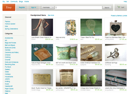
- Pinterest, Houzz, Etsy & blogs: these are often forgotten about as color tools, but when it comes to online solutions there are few better resources than experts out there that have shared their work. Be it for a party, home or piece of art. Use these experts to inspire good color choices.
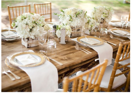
Speaking of using alternative inspiration, here’s a wedding shared over at Style Me Pretty that inspires my love of natural wood in the home. Mmm beautiful!
There you have it! This is where I turn when I’m stuck in a color rut.
A quick wrap up: turn to nature, take your room’s temperature, be inspired by shelter magazines & blogs (a few of my favorite who readily offer advice are Emily, Jenny and Janelle – among countless others), find fabrics and photos, take a nod from fashion, don’t forget the all mighty color wheel, utilize online tools (such as Colour Lovers, Colortopia) and turn to a diverse round up of inspirational sites (Pinterest, Houzz, Etsy) and blogs that break out of your traditional design reads (especially wedding sites!).
Any other suggestions out there? am I missing any key tools? At the end of the day, I just love me some color.


Morgan, here’s a tip I share with clients. When you’re trying to balance colours together in a room never mix a “dirty” colour with a “clean” colour. This is truly the secret to success. Dirty colours are the ones with gray, muddy undertones and the clean colours are fresh. Both are great but they need to stay together:)
Carol, that’s a really interesting tip! I haven’t heard it before and will keep that in mind. Thanks for the suggestion!
Such great tips! I’ve definitely heard of using nature as inspiration for color palettes. Like you, I have a business major, and sometimes I get waaaay to methodical and analytical for my own good!I’m going to have to use some of these tips for decorating the T’s new room and for redecorating the nursery!
Morgan, have you been to design seeds? Fabulous website for color. Love love love it!
Ohhh beautiful! I have not heard of them but I’m so glad you mentioned the site. I’ve added to the above list!
Thanks! This post is so inspirational and informational!
Thanks, Linda! I hope it’s useful!
I love the softer color combinations you’re leaning towards. I guess I have a problem with the warm & cool balance in my home because I don’t really like the warmer oranges, reds. I definitely lean towards the cool blues, greens, purples. Even my neutral taupe has a blue undertone. Hmmm, this may be a difficult one for me to overcome.
Sheila, I definitely feel you on this one (thought I do love warm colors like red and orange) – what I’ve learned is that you can actually have a warm green and a warm blue (based on the foundation of the color). I’m not sure I totally understand the concept myself but it’s worth researching! PS Purple can be quite warm in the right shade.