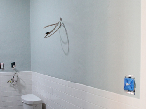
Happy to report that the bathroom is painted! It’s hard to convey in these photos, but the color of the paint is a saturated blue/green named ‘Sea Salt Blue’ by Valspar. At different times of the day it almost takes on a grey tint (similar to below) but is most often that calming, soothing blue (with a tinge of green) that was just what I was on the hunt for.
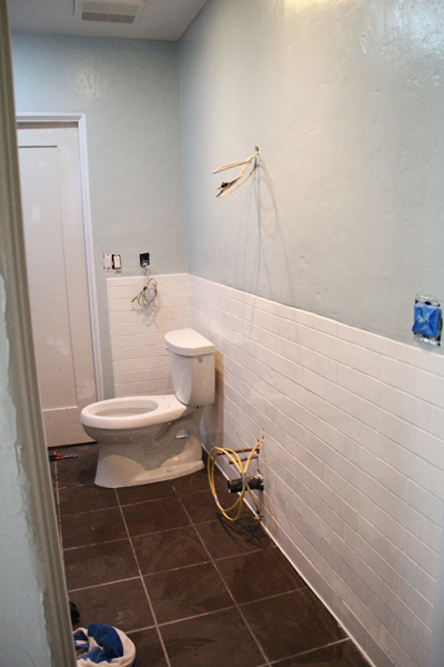
We tried out four variations of blueish/greens. Actually, nearly all four read too green on our walls (and yet they look so blue in these photos!) in the light of the bathroom. The Chosen One is pointed out below.
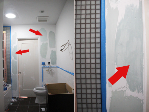
Usually I’m a big fan of adding a swatch to each wall to get an idea of what the color will look like when sunlight hits different walls at different times of the day, but because we have no windows (except the new skylight!) it was more of a concern that the color compliment that awesome recycled tile hiding in the shower nook.
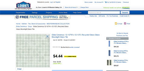
See how the tile looks greener here? We could have totally gone green in the room and it would have looked just as great. This tile is tricky like that…

But as you can see when the paint colors are up right against the tile it matches our blue options really well:

We opted for Valspar Signature’s Hi-DEF paint in a low VOC version (for the babe). Their new line offers enhanced color accuracy, meaning the color you select on the chip will match the color on the wall and (if we had old paint on the walls) claims to cover your old paint faster in less coats, saving both time and money. The paint is also highly durable and has superior fade resistance, meaning it will last even in high traffic rooms like our bathroom. You can learn more about its benefits over here.
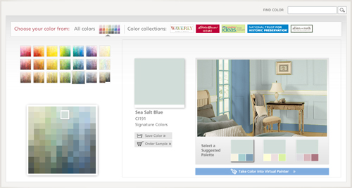
Wanna check out a nifty color sample tool? Try this one here (I’m a huge fan of the Ideas Library). I tested a few different blues in the Color Selector tool and it made searching for specific shades of specific colors so much easier than trying to cross your eyes and compare paint chips at arms length in the florescent lights of the store. Since I was going for a blueish-green, I chose a color palette that boasted of coastal and ocean shades and then just slid the little highlighter box from grey to green to blue until I found a few that I loved. If something was too blue I moved one box back to the green or vice versa.
You can even upload your own photo, here’s our unfinished wall waiting for plaster and paint:
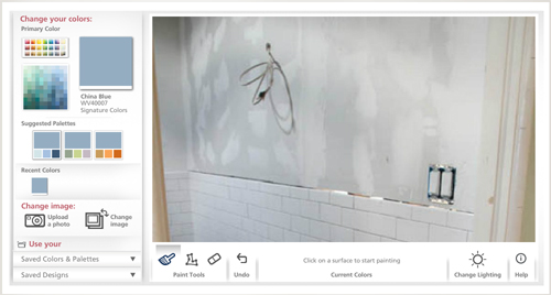
Next I selected a color from my palette:
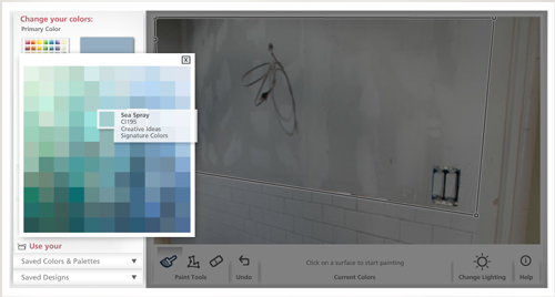
And then I boxed off my space using the little tool provided and ‘painted’ in the color:
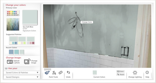
We didn’t end up choosing Sea Spray (too teal) but here’s the Sea Salt Blue on the actual wall:
Of course you don’t have to upload a pic, you can always play around with a selection of rooms they have ready to go, too:

Anyway, it’s one more cool tool to file away in the home improvement toolbox for making big decisions like settling on a room color. And it might just save us some serious dough in the long run if it cuts back my paint sample expenses from 10 mini cans a room to just two or three :).
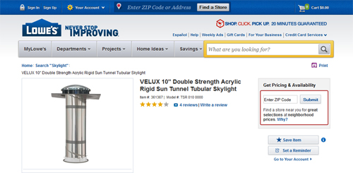
PS this is how we were able to funnel a little bit of that awesome natural daylight into the space. It is definitely the DIY of skylights!
I love a freshly painted room! Now we are one step closer to a finished bath.

As shown above, the toilet no longer resides in the living room… but as one reader put it, it sure would have made potty training easier!
More building a bathroom posts: vanity wars, subway tile installation, floor tiles and toe warmers, a quick catch-up on our work on the bathroom in 2011, tiling with recycled glass, choosing and installing a bathtub, demo time!, a peak at the layout, initial inspiration, partnering with Lowe’s
We partnered with Lowe’s on our bathroom remodel and received some product at no cost and some product at a discount. The ideas and stories shared in this post are entirely our own.


Congrats on getting the bathroom painted…love the color! When we painted our basement years ago, I chose a light blue that I loved at the time (it was certainly better than the dark green that was there before!). But now I’m looking for a more versatile color that’s probably more grey than blue. I’ll definitely have to check out this color.
I love blue-greys too! They stand the test of time color wise.
I love that color with the tile choices, it’s beautiful!
I love the paint colour you selected. It looks and sounds a lot like the colour I used in our family room, BM Silver Marlin. It also changes colour depending on the light, from almost grey during the day to turquoise at night. Blue is a hard colour to get right. You really have to try out samples, and chances are you’ll have to go greener or greyer than you think you want.
The tiles and walls look great together – can’t wait to see the room all done!
Agree! Testing is definitely important. The light changes the color often. I think yellow is the trickiest color to get right!
It’s looking good! Can’t wait for the final product – as I am sure you guys are too! ;)
Looking beautiful, Morgan – thanks for all the color selection info!!
That’s a beautiful paint color, and I love your glass tiles. Did you use a dark grout on them? Everything is coming together very nicely- I’m sure you’ll be glad when it’s finished. :)
We did choose a darker grout. I was initially wary of the idea but it will keep the shower looking new and clean for years – no staining to worry about! Now that the bathroom is coming together the grey looks really nice.