*Update* Images were having trouble loading earlier today – now the post includes all missing photos :).
We took our Christmas card pic this last Sunday (yay!) and I thought I’d share a few tips I’ve picked up for producing better family photos.
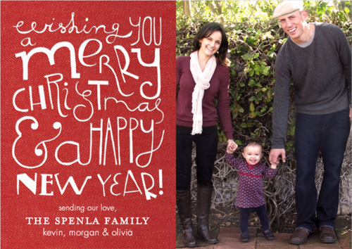
I should begin by saying that I’m no expert when it comes to taking a great photo (I use a Canon Rebel t3i and I generally try to work in manual mode to capture the best lighting – but I’m really a beginner in this area, as evident by all of the horribly lit indoor pictures on this blog – here’s a great resource to help with those questions!). What I am pretty good at, however, is editing. I’m in marketing by trade, so Photoshop is like my third arm – I use it for everything.
But you don’t need a high powered photo editing program to enhance your photos, in fact there are many free versions out there such as Picasa, Picnik and Photoshop Editor (see my suggestions near the bottom!). Regardless of how ordinary a family photo might be you can enhance it to bring out the strongest qualities.
Shooting
m
Let’s start at the beginning. For me, the secret to a creative family photo lies in: the background, positioning of family and candidness of the photo.
1. Background:
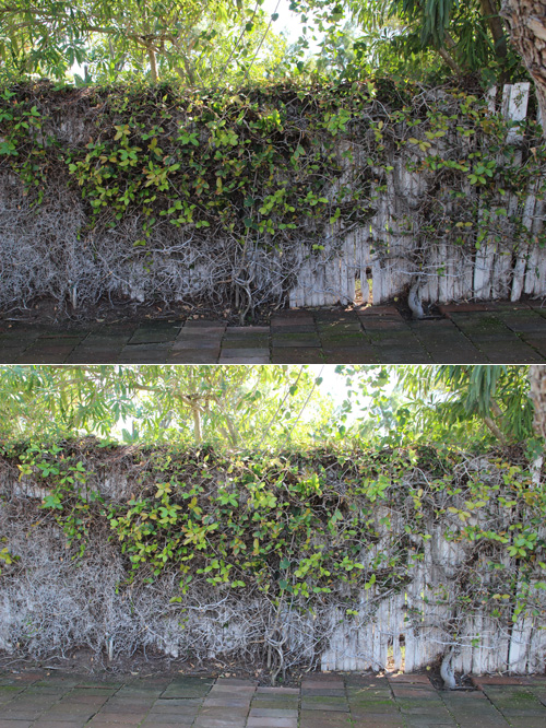
Choose a background full of texture and contrast. Living backgrounds work wonderfully – fields of flowers, the bark of a tree, even a red brick wall (not living but equally neat) brings visual interest to a photo. Adjust your camera settings right off the bat without anyone in the picture (here’s another link to Kate’s great suggestions for this).
2. Positioning:
When it comes to positioning the family, consider taking a few shots from a ‘normal’ angle (photographer standing holding camera up to their eye) and a few from unusual angles. For this photo I knew the positioning that I wanted – all three of us standing and the photo taken straight on. Even a slight angle would have taken away the effect and I’m pretty sure this shot was not taken at eye level but that the camera was held down a bit at the chest or even belly.
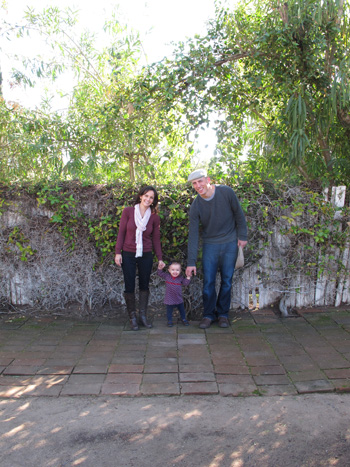
As long as your image is in focus (if that’s the goal you’re looking for), start big and then later crop in an editing program. You’ll have the most freedom with how your final image looks. Take a LOT of photos. If you think you’ve captured your shot take 20 more anyways, double that with kids.
3. Candidness
Generally speaking, I like it when one family member is looking at another or the whole group is laughing with eyes in different directions (aka not all looking at the camera). We tried a few photos with one of us not looking at the camera:
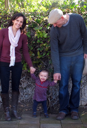
But in the end both of us looking won out. By the way, getting Olivia’s big grin took about 50 photos and much dancing by our friends. (Thanks, Phil & Trish!)
The image in its current state is ordinary. It’s now time to edit to enhance.
Editing
m
1. First, crop uniquely:
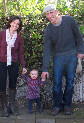
The goal here is to avoid symmetry. By leaving my outer hand out of the shot and including Kevin’s, I’ve broken up the symmetrical feel of the shot – now Kevin is in half and Liv and I are in half instead of third, third and third. Play with cropping for your cards, tighter then wider then some crazy ones just for fun.
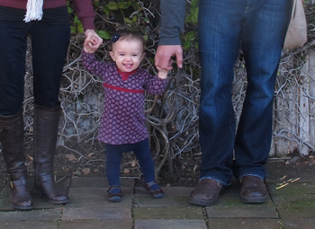
This one is unexpected but adorable! Pair that with another shot of all of us grouped together and smiling and that could be a cool Christmas card.
2. Next, I adjusted the contrast:
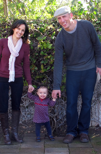
Pop up that contrast to really pull out the shadows (you can play with brightness as well).
2. And then the exposure:
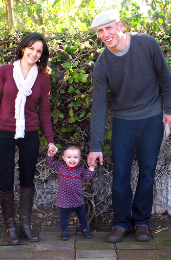
The photo already feels so much more alive!
I would approach editing this photo differently if we were planning on hanging it on the wall, but because it’s for our Christmas card I’m taking the editing of contrast, exposure and lighting a bit to the extreme. You can get away with it for holiday cards!
3. Here’s a subtle edit that packs a punch. The photo was getting a little top heavy in color (with those brilliant greens above and the soft greys below) so I used a red filter over the bricks. See how much better this is?
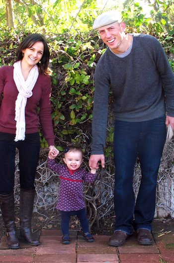
Unfortunately that’s a Photoshop edit, not available in the free editing versions… (see more on that below).
4. But adding just a touch of sepia (or ‘temperature’ as some of these programs call it) is!

Much more worthy of a Christmas card!

More on Free Photo Editing Software
You can make nearly all of the edits that I made above in a free photo editing software like Picasa, Picnik or Photoshop Editor. I have each a spin and here are some of my favorite features:
1. Picasa
First up is Picasa, a free photo editing software that you download on to your computer (no need for internet) and that automatically uploads every photo on your hard drive into the system. It also connects easily over from Picasa Web Albums if you use this program to store your photos online.

The photo is imported with all of it’s specs (ISO, f-stop, aperture – even a histogram) for those of you looking to see what went well and what can be improved next time you use your manual setting on your camera. The tool allows you to adjust lighting, contrast and exposure (and will even do an auto correct if you’re wanting a quick fix) – but my favorite feature was the ‘Temperature’ which adjusted color to achieve a white balance change or even an allover warm/cool look. I was able to achieve the same semi-sepia look that I did in Photoshop using the Temperature feature.
2. Picnik
Picnik is a great little tool that works right on the internet (no editing when you’re not connected though) and probably the most user friendly. You simply upload a photo and you’re immediately presented with a wide range of options just like the above. They have a Temperature tool as well, and also many effects presets. I would say Picnik and Picasa are near identical with the one exception that Picnik allows you to upload a solo file to the internet and Picasa scans your entire computer and becomes your ‘editing software’ that’s on your hard drive.
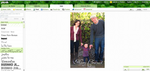
Picasa will upload any existing font (that’s on your computer) to its database, but Picnik’s font tool is easier to maneuver.
Last but not least is Photoshop Editor. This is the most complex of the three and allows for more advanced editing. What I love about this tool is that it offers you a selection of photo options for each effect:
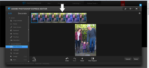
The terminology is similar to advanced photo editing programs making it easy for me to navigate through (no ‘temperature’ button here), but it gets a low grade in my book for user friendliness. The screen is dark, the editing buttons are a little confusing and if you don’t take time to learn the tool you might be lost. On the plus side it offers features such as ‘burn’ and ‘dodge’, which are very neat enhancement tools that the other two don’t have.
The conclusion? I use Picasa Web Albums to share my high res photos with family and friends (the only free program that I know of that does this!) and because it links automatically to Picasa editing and Picnik I’ll probably use these first to edit quickly when I’m not in Photoshop itself. Because Photoshop Editor is designed by Adobe though (which all of my graphic design programs have in common) I’ll probably continue to check in on its list of growing features offered :).
Creating
m
Tiny Prints sponsored our cards again this year and I had the toughest time choosing from their adorable designs (see last year’s here). Others in the running included:
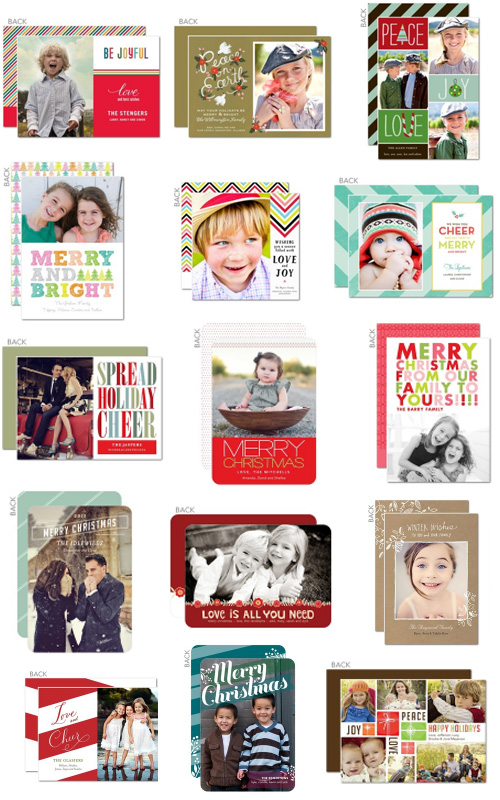
Difficult, right? They have a ton of adorable and contemporary designs to choose from in their selection of over 500 Christmas cards, but to me the best feature is the ‘Favorite’ bar located at the bottom of each page. As you find a style you like, you simply add it to the bar (I had something like 40 in mine) and then you can narrow down your results by comparing just the ones you love.
Tiny Prints is offering 20% off + free shipping on orders of $49 or more with coupon code: holba20 through 12/11!
***********************************************************************
There you have it, my thoughts on shooting, editing and creating a photo card for the season. Happy Holiday Card making!


I love the font, what is it called? For quick editing I also love paint.net
Hi Wendy, which font are you referring to?
~ Morgan
Ha! Don’t mind my baby brain, I read your whole post and then somehow seemed to forget that you used Tiny Prints to create the card!
You really should check out pain.net, I like to call it photoshop lite!
Oooo that’s intriguing! Will definitely have to try it out!
Great tips, Morgan- however,you missed the most important- put an adorable kiddo in there and it really doesn’t matter what else you do! Love your Christmas pics! :)
So true!
Excellent tips, Morgan ~ thank you for sharing. Your Christmas card turned out beautifully!!
Your cards look fantastic! Thanks for the tips.
Merry Christmas