In the week of blogiversary giveaways, I posted that recently I had turned my favorite calendar into new wall art for the kitchen.
Previously, the gap on the wall looked like this:
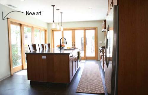
Sorely in need of something large and in charge to both soften the room and fill up blank space.
I’m pretty picky about art, especially something so prominently placed that’s going to be seen day in and day out, so I had a hard time (a really, really hard time) coming up with a solution for the space. I had one large Ikea square frame in my little frame collection and realized that this area of the kitchen might just be the place for it. After testing out on the wall I determined that two stacked would be better and picked up one more. Progress was made! Now I needed to find art.
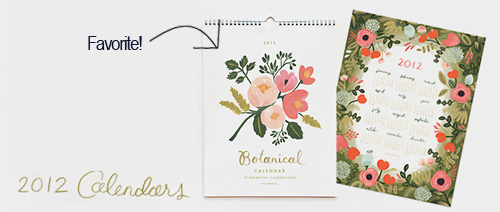
When I came across this calendar on the Rifle website by chance, I fell in love with the style of the illustrations! There were several months in the calendar that I thought would especially work well and in one of those crazy moments where the stars collide and you make up your mind on the spot, I bought the calendar online.
While I waited for the calendar to arrive I set out to find mattes for the frames since I knew that the calendar pages were 11×11″ and not my 22″ frame size. I usually err on the side of white but the linen mattes from the office wall collage were some of my favorites, and a similarly textured matte would look great in the kitchen against the natural woods and jute rugs. After much price comparison I went with Michaels where they cut the mattes for me for ~$20 each (I usually buy my all white mattes on eBay where they can be custom cut and are the cheapest).
But then the calendar arrived and oh no! Not only were the beautiful illustrations visible in the frame but the title of each month was too:
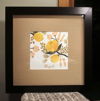
Why hadn’t I thought about that? Not what I was hoping for.
After a little creative brainstorming I ended up cutting apart other pages of the calendar with similar foliage and tried to camouflage the lettering by covering it up.
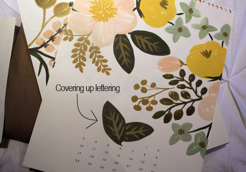
In tutorial form (because I am all about visuals), here goes:
**************************************************************************
DIY Art with Creative Cover-Ups
mfra
Materials: frame, matte, art to frame, photocopy of art to frame OR similar art (for the purpose of camouflaging whatever it is you’re trying to hide), scissors, glue stick
Cut, position and glue!
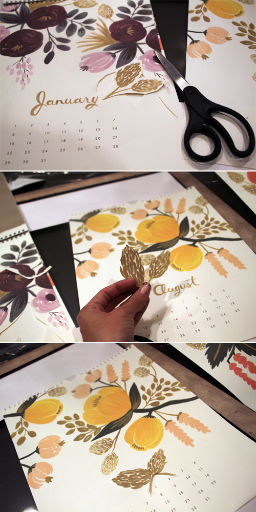
Cut as closely as you can to your copied art (via photocopying, scanning and printing, or purchasing a duplicate of the same piece) and hide your lettering (or whatever it is you’re hoping to make go away).
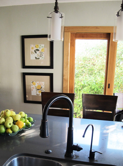
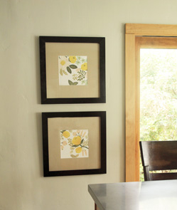
And here they are hanging!
**************************************************************************
Love the look of the linen matte (which has a slight texture) against the illustrations and love the dark frames that compliment our oil rubbed bronze kitchen faucet and pendants.
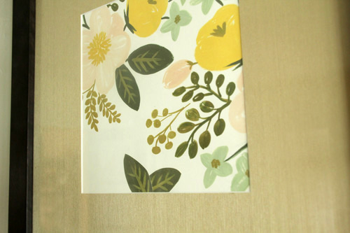

It’s all about bringing in different elements in different places. The dark wood barstools compliment the dark wood range hood, the lighter walnut cabinets are similar to the doors, the dark slate tiles have the same leathery grey as the counter tops and now the oil rubbed bronze is evident in both the faucet, pendants, cabinet pulls and art.
The left side of those frames is a window under construction (boarded up) waiting to be turned into the top of a built-in bar (potentially in many many years ;)). But as of now, the new art compliments the room really well! And I’m glad I found a fix for art that I really do love.
All kitchen makeover posts can be found right here.


Clever way to cover up the month’s names, but you could have left them in and it would still look beautidul. Maybe chose the birth month of those in your family?
You know I didn’t even think of that clever idea until Carol mentioned it in the comments as well – that would be have been great! The only bummer is that I loved the yellow tones of the two months I picked and thinking back September and May (Kevin and my’s birth month) were a bit more pink. But I do love that idea!
~Morgan
A great idea Carol, but well done Morgan! You cannot actually tell that you have made a cover up, great work!
That is a great solution to the problem. I also thought it could have been fun to hang the ones with months for your birthday, your husband’s and Liv’s. BTW, the pendant lights on your island are great. Where are they from?
Carol, I love that idea! That would be very clever. The pendants are actually from Lowe’s :) .
~Morgan