
Did you recognize that quote from yesterday? One of my favorite children’s books by Robert Munsch and one of my favorite sayings.
Today’s Friday guest blog interview is such a treat. Sheila, the editor and one of the fabulous design masterminds that is behind Houzz, joins me as we reflect on favorite trends, great design ideas and why homemade and well-made trumps it all (read Sheila’s stretched canvas idea – so awesome – just after the jump).
Houzz is the largest online community of home design enthusiasts from around the world. Contributors regularly upload inspiring images of real homes in real cities, and great dialogues about the design qualities (including where to find product) begins. Jump out there and create an ideabook (basically the online version of cutting pages out of magazines) – you won’t regret it.
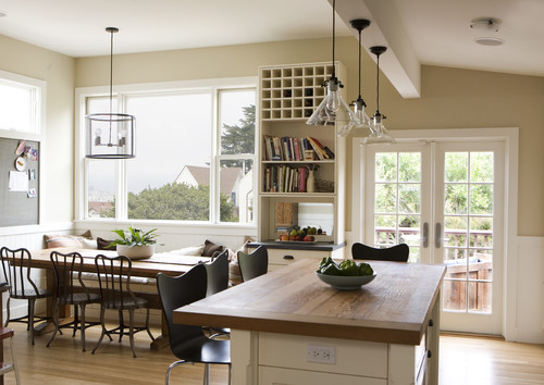
The above is one of Sheila’s favorite photos on Houzz and an example of the integrity of design that is posted regularly, she notes that “this room looks like it can become anything you want it to be: party central, reading nook, wine bar, studio.”
I’m especially excited to share Houzz with you today since it’s one of my regular go-to sites for searching for home inspiration, and I love that you can browse by style, space or metro (I’ve used the tool to identify beautiful, well-designed houses in my home town for potential San Diego Magazine projects, too).
Read on for PDB’s four design questions and keep an eye out for Mr. Schmitz’s (Sheila’s dad’s) decorating tip that you don’t want to forget (and I need to heed more regularly!).
………………………………………………………………………………………………………
{PDB Interview with Sheila of Houzz}
………………………………………………………………………………………………………
What inspires your design style?
Originality. ”I’m hopelessly sentimental about the things my family members and friends have made or given me. Pretty much everywhere I look in my house, my eye will land on a piece of quirky furniture or art with a backstory. So by default the style is Entrenched Eclectic. I think that’s one reason I like clean, modern architecture — it’s the right backdrop for things like the vintage chair my sister reupholstered in midnight-blue velvet, the table my brother made from a fallen walnut tree, or the freestanding eggplant-colored obelisk that looks solid but opens to shelves of dishes. My mom is a painter and potter and my dad was an architect, so I grew up surrounded by the handmade, heartfelt and one-of-a-kind, and that will always be with me.
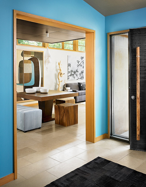
Wood, art and robin’s egg blue = bliss.
Asian entry design by Austin architect Webber + Studio, Architects
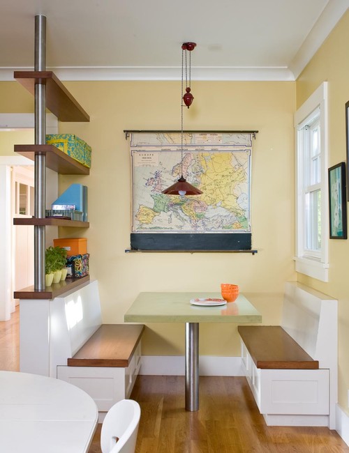
Contemporary kitchen design by San Francisco architect awarchitect.com
What do you love most about what you do?
Being around creative people, sharing ideas and inspiring off-line action. I’m constantly surprised and inspired by the ideas and goodwill I see from people on Houzz. More than 23,000 design professionals have shared their portfolios with the community. Design bloggers and creative homeowners upload the most inspiring DIY projects. There are something like 140,000 images up there now. People from all over the world post their design dilemmas and share their projects, suggestions, and experience with materials, sources, etc. On one thread a group of homeowners and designers is helping a user in Texas redo her front yard. In another they’re discussing options for kitchen counters and cabinets, and in another they’re designing a bedroom together. Content doesn’t get much more current than that. Houzz is an online platform, but its content is all about making things better in the real world, and it’s thrilling to watch that happen in real time.
What are your favorite design trends?
Well made, solid, functional things. That gets back to the handmade, but also to modern design and giving new life to quality old things.
Rethinking living spaces and setting them up for how you like to live. Maybe your living room really wants to be a media room/lounge, and your dining room wants to be a wine bar/bistro. It’s your house; you get to decide.
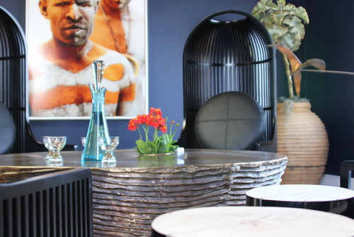
People are using their rooms in new ways that fit how they want to live. Maybe you want your living room to be a salon.
The geek in me loves the quirky, sometimes off-kilter look of steampunk’s wheels and gears.
What are three design suggestions that you would like to offer our readers?
{1} I’ll quote my dad Pete Schmitz here: If you are struggling with a design choice, go with the bolder idea.
{2} If you aren’t already, start making something. Buy yourself the biggest stretched canvas you can find and slop your favorite paint color on it with a big brush. Don’t try to be neat. Don’t try to make it look like anything. Cover the whole thing, even around the edges. Let the brush strokes show. (Did I mention you might want to do this outside?) Add a layer of a lighter or darker version of your first color and let some of the background peek through. Keep at it until it feels done, let dry, then hang it up in a room that needs a shot of energy. You might be surprised what you come up with. If nothing else, it will be colorful and theraputic, and you can always paint over it again later. (Your second one will be even cooler.)
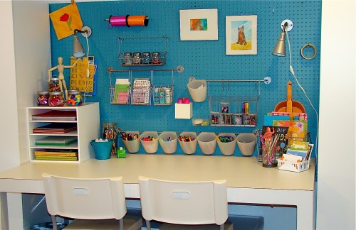
Eclectic kids design by Cincinnati Media and Blogs The Vintage Glitter House
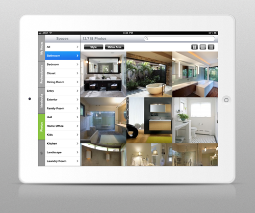
{3} Join us on Houzz. You’ll find many creative home and landscape design ideas you’ll want to save to your own ideabooks and share with friends. And by all means download the app. It’s free, and the combination of all the eye candy and that touch screen is deliciously addictive.
Thank you, Sheila!
………………………………………………………………………………………………………
If you loved this interview, check out more great spotlights {and tips & tricks!} from fantastic bloggers!

