
I haven’t been great about regularly posting on this series (so much is going on over here!), but there are so many wonderful blogs out there that I wanted to revisit it on the occasional Friday to share favorites that I think you’ll find especially inspiring. The best part of this series is diving into the who, what and how of these talented bloggers – from their favorite styles to what they love about blogging to their best tips and tricks.
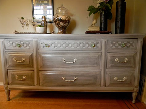
So here we are back again with another Friday Guest Blog Interview with The Design Pages, a blog by Vancouver-based interior designer Carol Smyth. She shares her crafty design style and diy projects (like this mid-century modern makeover featured on design*sponge) and seriously – I don’t know where she finds the time to get it all done.
And when a friend recently asked me, ‘do you know of any distressing tutorials?’, I sent her this post – and that’s the sign of a great blog!
Let’s jump out to the Who, What and How.
………………………………………………………………………………………………………
{PDB Interview with Carol of Design Pages}
………………………………………………………………………………………………………
What inspires your design style?
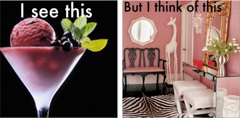
I am inspired by absolutely everything. Whether I’m walking my kids to school, eating dinner or grocery shopping there will be a moment (or many moments) when that experience takes a back seat and I will completely zone in on a colour combination or a texture that really appeals to me. I am the one who misses the plot line of a movie because I was taking note on how the kitchen curtain was hung and enjoying the colours of the rusty pick-up truck in the scene.

What do you love most about what you do?
I love to create and design so being able to do this for other people while getting paid to do it feels like the best job I could possibly have. I have had jobs that I hated and that can suck the life out of you. Doing what you love can bring happiness to all the other parts of your life as well. There is a feeling of contentedness that comes with doing the right work.
What are your favorite design trends?
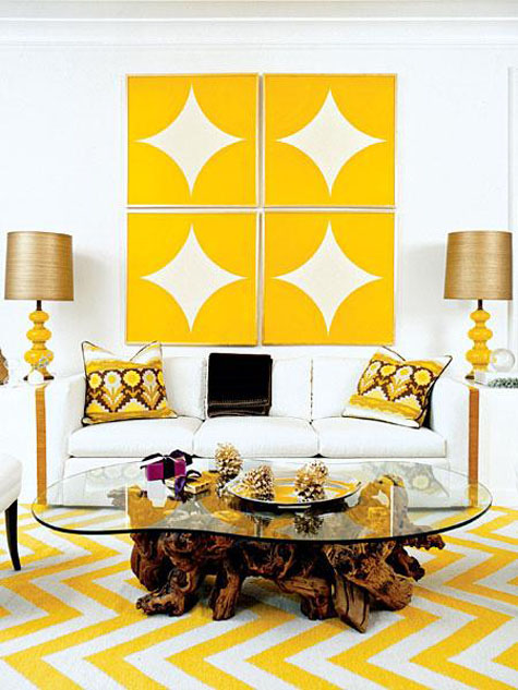
I try not to put too much emphasis on trends but a room can really benefit from incorporating just one well thought out trend to keep it current. I have to admit that I’m a huge fan of the chevron pattern. It’s such a simple but bold pattern and it can work for any space because it looks great in either a contemporary or traditional space. Not a lot of trends can say that.
I’m so happy to see colour making a comeback in our homes. I have been living with and designing with neutrals for quite a while and it’s so refreshing to see all this great colour making its way into our homes through paint, fabric and furniture.
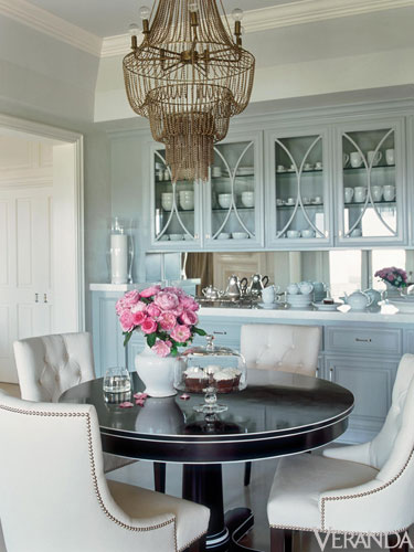
Oversized lighting is really hot right now and I love that look. Whether it’s in the living room, dining room or bathroom I think it can make a huge impact. Just make sure you have the piece placed high enough that you don’t knock out your visitors.
What are three design suggestions that you would like to offer our readers?
{1} I would have to say that the first and most important is to make sure your home reflects your family. Hang your children’s artwork in the kitchen, display your family photos and incorporate meaningful pieces that you’ve inherited along the way. All this can be done with design in mind but without them your house looks like a gallery instead of a home.
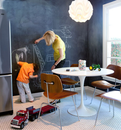
{2} My second tip would be to learn to identify your focal point. The focal point is where your eye should naturally be drawn when you enter a room. Without one a room can look chaotic Look for it in an architectural feature first…fireplace, large windows, vaulted ceiling. If none of these exist then you need to create the focal point before you start the design process. If might be a piece of art, a stunning light fixture or some really great curtains. Once you know what it is, you’ll take direction from that piece and design around it. You’ll be amazed how easy design becomes once you can identify the focal point.
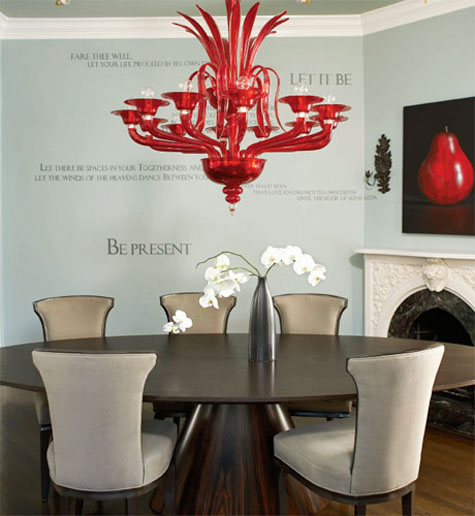
Wendy Blount for Elle Decor
{3} Lastly, a really simple way to add personality and warmth to a room is by bringing the outdoors in. Fresh flowers look great but even a few branches snipped from your tree and stuck in an oversized vase can add huge drama to a room. In spring there are small pots of flowers being sold really inexpensively. Buy 4 or 5 in the same colour and repot them in a large pot for a big splash of colour.
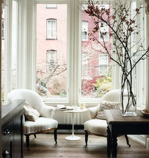
Domino
Thank you, Carol!
………………………………………………………………………………………………………
If you loved this interview, check out more great spotlights {and tips & tricks!} from fantastic bloggers!


Love Carol’s blog! She is one talented gal and a kindred spirit – she is one of my thirsting buddies! I almost bought that dresser she distressed and am glad she bought it and worked her magic! We will be posting this week about our twin tables!
I love The Design Pages :)
There are some really great tips here. Btw, the same exact thing happens to me when watching Mad Men (or any tv show or movie with interesting decor)!
Thanks for putting this together ladies. I really enjoyed it. Great tips, Carol!
Hi Morgan,
What a great post. Carol has some good practical advise. Thank goodness colour is back! So much more fun than neutrals any day.
Also enjoyed the nappy posts, may come in handy
one day? Liv is just so sweet.
Wishing you and your family a happy Easter time. Have a great spring too.
Enjoy,
Sue
Carol’s is one of my favorite blogs, lots of great advice.
Great interview Carol, your such a great inspiration! Thanks for having Carol over!!!
Thanks for the change to be on part of your amazing blog Morgan!