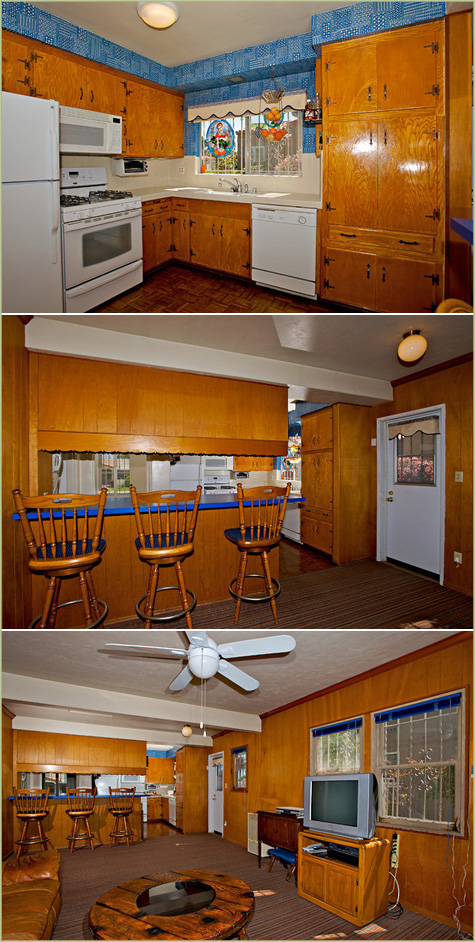
Our kitchen is in week 4 of it’s remodel and nearly finished! Here are photos from weeks 1 and 2. But before we jump into the updates, I thought it would be fun to take a quick walk down memory lane.
Let’s go waaaay back… two and a half years ago we purchased our first home *woohoo!* right around our first wedding anniversary. With the mindset of ‘worst house on the best block’, we chose a little historic district in San Diego that was known for it’s Spanish and Craftsman style homes.
Our goal was to renovate while keeping the beautiful 1930’s architecture in mind. But modernizing was a must, and that meant out with the old carpets, wood paneling and geometric wallpaper (here’s a little gallery of the ‘before’ of the house). We started with the backyard and created an outdoor grilling and fireside area out of an awkwardly built outdoor room. Next came a quick update on our one full bath and a cozy lift in the living room.
About a month ago the big day came when we decided to move on to the meat n’ bones of the operation: the full remodel of our poor cobalt blue kitchen that was seriously outdated and out of shape.

We were tackling this gem on a serious budget. Kevin is a full time architecture student with a passion for building – he would take on 95% of the labor (basically everything except electrical) and we would hunt down materials from sources like Craigslist, eBay, mom & pop shops and the discount aisle ends of Home Depot. On top of that, we were moving the kitchen from it’s current kitchenette location and relocating it to the back den area (see where that tv is above?). Now it would be easily accessible to the new outdoor area and would double in size.
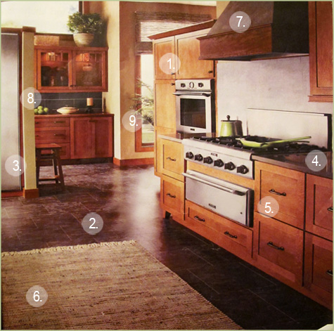
We needed a design direction – a roadmap to base our new choices off of (there are too many to take on blind) and inspiration that we both loved that fit the integrity of the home. I stockpiled a design file on my computer and saved every inspirational photo for nearly a year – but when we came across this image in a Kitchen & Bath Design Magazine we had struck gold. It fit the look and feel of a modern + Spanish kitchen and it was love!

Here’s the breakdown:
1. While I love, love the all-white kitchens that bedeck most design magazines today, we felt that warm, honey-stained wood cabinets would compliment the Craftsman/Spanish aesthetic of the home. I love these shaker-style cabinets as well because they bring a modern frame to a more traditional wood.
2. When the carpet was pulled up in the den we found a mis-match of wood flooring running in different directions with several beams through the middle of the room. Most of the wood in the house was salvageable – but unfortunately not in the kitchen. We opted for a dark, porcelain tile that broke the usual tan flooring trends. Then we took the tile in a more modern direction and ordered 12×24″ pieces to lay in a brick pattern.
3. New appliances were huge, but with our budget we were scouring Craigslist every day (in about a 500 mile radius – no joke) for the best deals. We scored a stainless steal fridge, viking range (drove over 300 miles to nab this beauty – thankfully it turned into a great roadtrip!), range hood, dishwasher and sink. Our criteria included a stainless steal finish, reputable brand, less than 2 years old and at least 40-80% off the current price of a new version (and that number fluctuated based on how old the appliance was).
4. I’ve always been a sucker for dark countertops… but how to balance dark floors and dark countertops without creating a dark space? That was the dilemma. And what material? With so many options to choose from we really had to do our research. In the end we settled on Quartz – a fabricated material that combines natural quartz with a polymer resin and has been named by Consumer Reports as the top overall performing counter (plus it’s resistant to scratches, heat and stains!). Our color of choice was Tiffany Grey by Hanstone.
5. I think traditional pulls and fixtures in an oil rubbed bronze finish will help to balance out the modern elements of the space and keep up the Spanish influences throughout – we found a faucet that we love for 50% off at Lowes and pulls that matched.
6. Natural elements are a must for this space – fibrous rugs and bamboo shades would look great.
7. This was a great find! We loved the wooden hood range cover in the above inspiration photo but decided that it wasn’t worth the extra splurge – a stainless steel version would be just as beautiful and would help keep us in our budget. But when we came across a reject from a previous buyer at a local mom & pop shop, and were offered a killer price, we jumped at the opportunity to include it. We brought our Craigslist hood to the shop for custom fitting (which they included in the price) and had the handmade frame stained to several shades darker than the cabinets. Yeah!
8. And the walls? We’re leaning towards a shade of green like the above. I love the play of the warm cabinets against a complimenting hue such as a soft green.
9. We wanted to add over-the-top amounts of natural light to the space while creating an indoor-outdoor atmosphere for entertaining. I would say our big splurge for this space was two large sliding doors that we installed and stained the same color as the cabinets. Bonus that they’re eligible for an energy efficient tax credit come April.
Oh boy! Now that’s the kitchen in a nutshell.

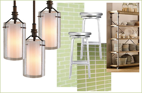
Decisions to still be made? Backsplash tile, a few light fixtures, a new microwave, bar stools and maybe some neat open shelving to display ceramic plates and platters for along one wall?


Can’t wait to see it! What a fun journey for us to read about!
We also chose quartz counter tops from Hanstone in our recent kitchen renovation. It’s only been a couple months but I really love them!
I can’t wait to see this come together! What a dream come true to get to do a kitchen reno like this… I am so impressed with your plans and budget!
Wow, you have put together a really good plan and admire all the effort into finding great resources to pull it together within your budget. Looking forward to seeing more photographs of the project in process! Janell