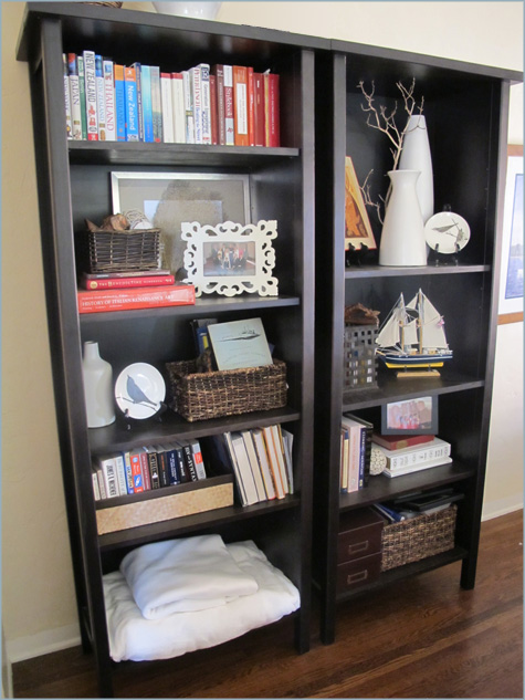
When I first posted on the finished living room, I received a few comments and questions on bookshelf styling. I had put so much thought and research into redecorating our bookshelves (believe you me when I say they were crowded and totally unappealing at the start) that I thought I’d share a few of the tips and tricks I learned from other blogs and my favorite catalogs.

The biggest challenge? Corralling so much material into one space. Sure it’s easy to style a bookcase if you don’t have any… books (like all of those lovely catalog photos), but trying to incorporate different sizes, colors and heights of dozens of paperbacks and reference books so that the bookshelf was usable was another story entirely. At the end of the day our bookcase needed to pass both the form & function test, and ultimately become a reflection of who we were.
But back to the styling… my trusty Pottery Barn catalog actually turned out to be the biggest help in determining layout, organization and aesthetics while Young House Love’s bookcase styling tips came in handy as well.

Top Ten Bookshelf Styling Tips & Tricks
a
1. Start with a fresh slate. Clear your palette, dust all of those hidden corners and start with a clean slate. Sort your now de-shelved items into broad categories: related books (ours were home improvement, paperback novels – fiction and nonfiction, philosophy/religious topics, travel and over-sized), picture frames, tchotchkes, etc.
2. Create a rough layout. This may take some time but play with the layout and design of your space. This might mean adjusting shelf heights to accommodate larger items or baskets.
3. Don’t fill every shelf with books. When you’re ready to start building, consider random book groupings throughout the shelves. I suggest starting with books over decor items because it’s easiest to see what will take up the most room, require organization (in baskets, bins, etc.) and which ‘book categories’ should go where. An every-other-shelf rule is a good one to follow, or at the very least skip large spaces on each shelf to give the eye a visual rest.

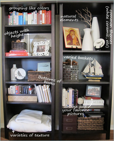
4. Baskets, boxes, bins, oh my! Now that you’re aware of what types of storage you’ll need, pull in a few baskets and other holding receptacles to wrangle unruly items. I used a large basket and two brown note card containers on the lowest shelf, for example, to house miscellaneous papers, DVDs and CDs. A shallow basket on the second level easily holds paperbacks that aren’t as pretty (two levels deep with just the tops of the spines popping out). Stick with like-colored baskets in various sizes or choose two-three complimentary shades to keep the flow. Michael’s, West Elm, Home Goods and organizing stores are all great resources.
5. Grouping books by size and color. Now that we have many of the books ‘boxed up’, choose your favorites to display. I chose to add them back to the shelf in their ‘categories’ for easy access but you could group but just height, color and size for aesthetics. I arranged the books within my categories until they were pleasing to the eye (taller books towards the ends, like colors grouped together, etc) and even placed several on their backs (bottoms out) because the whites of the pages were much more appealing than large, random colored spines. As you place your books step back occasionally to be sure that the flow from the top of the shelf all the way to the bottom works well.
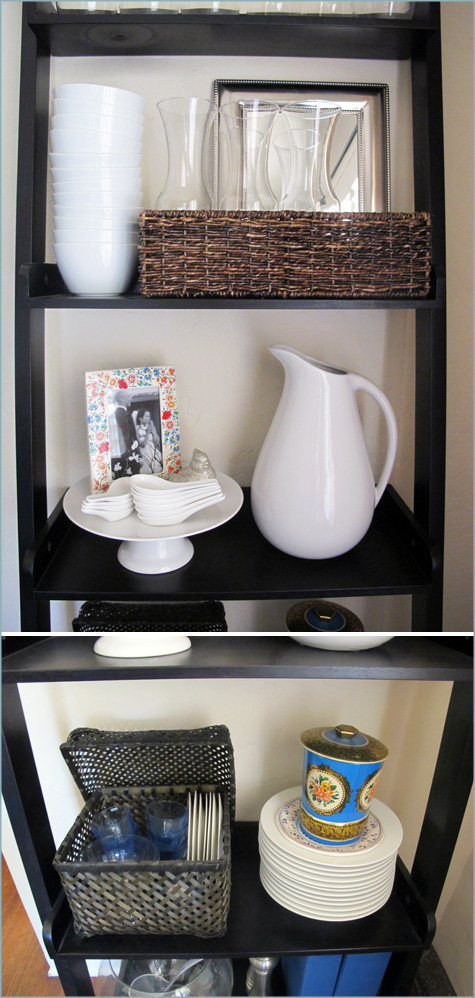
6. Now on to the decor… Not every bookshelf will need to hold books. Here’s are two examples from my dining room used primarily for glassware and serving dishes. But book-toting-bookcases and display-only shelves alike, general decor objects can all follow the same rule: less is more. Choose only your favorites and sort them out by height, size and color.

7. ‘Filling’ the space while taking care of the height. One of the easiest mistakes to make is to not ‘fill’ in a shelf space. This means horizontally and vertically. Try stacking your books with picture frames on top or paintings in the background. Vases, plates and sculptures also help to fill in on height. A note on pictures (since they provide a great option fo height): It’s fun to display every great framed photograph you’ve got but I found this to be the most crowding effect on the whole shelf. So I sadly sorted out the not-so-great ones for other locations and chose a select few that tied in well with the overall layout (height, color of frame, etc).
8. Rounding out your space with a variety of textures. Between the baskets, boxes, books and decor items you have plenty of textural elements all in play, but keep in mind that they should be varied and found through out the display to create the most appealing look. After playing with this bookshelf forever I finally found the right solution for the lower left hand corner – a simple stack of soft blankets that pulls the white from the vases and create a soft and comfy element to the layout. Branches and decorative wood-themed balls helped to tie in enough natural elements to make up for the lack of a great plant (or the like). I do wish one would grow in this shaded corner of the room, though!
9. Similarly colored ‘extras’. By extras I mean all of those vases, bowls, ceramic animals and general keepsakes you have lying around. Kevin is quite the sailor and we have slowly amassed miniature boats, anchors and navigational notebooks to account for a whole shelf, but by choosing just a few for the living room that represent his love, the shelf feels less ‘overtaken’. I also love simple white decorations – ceramic vases, animals, plates, you name it – and a few here and there tie together a clean and organized layout.
For the dining room, it’s easier to group items by color because you likely have all clear glasses and perhaps just one or two colors of plates, bowls, etc. Group in odds (love those odds!) and get creative with displaying (such as vintage plates or juice carafes popping out of baskets). Pitchers, vases and stacked plates/bowls make great height statements, but don’t be afraid to incorporate non-dining room wares into the mix (such as this thrift store mirror that ‘fills’ in the space behind the juice carafes). And use those cake stands! They make great display areas.

10. Step back and smile! The bookshelf should represent you and not the random findings of a West Elm photoshoot, but now that it’s organized, well-laid out and aesthetically pleasing you’ll love the look. Take this opportunity to move around pieces and level out spaces. Congrats!
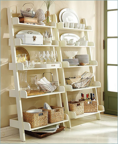
Here’s more inspiration I dug up for the dining room displays:

As a quick wrap up, here are my go-to tips for organizing a bookcase: group by height, color and size – don’t be afraid to pull in plenty of storage help – keep the flow of your shelf constant by ‘filling’ in the shelf height – and less is more!


here, here. I found the post useful too. But some of the ideas for styling with books which look good are not practical- eg piled high on a chair. I’ve tried it, for about two days!! I like having a decluttered look, but what we like living with is not what other people like when they visit- books give a feeling of security and comfort- we have academic family friends like that – jsut love going to their warm house with art and books everywhere – it’s so rare, it’s like we’re trying to erase our pasts, most of the time. However, I couldn’t live like them!!
there are various types of display stands available in market. Literature racks are the easy way to display your literature at exhibitions, product launches, conferences, schools or museums as well as a useful display in your reception area.
Really great post which I will refer to often. Hope you don’t mind if I share my one pet peeve: we should have FUNCTION as well as form. Why even call it a bookshelf, if the books are turned backwards or covered in plain paper, so you can’t find the book you’re looking for, or you aren’t lured into taking it off the shelf? I love books (although I love my Kindle, too) and think they should be treated with reverence, not just as props in a staging scenario. But since I love books and have lots of bookshelves, thanks for your great suggestions on how to make the shelves have variety and interest.
Great tips! I feel like going and organizing my bookshelves right now. They need help.
-FringeGirl
Morgan, this is hands-down the best advice on bookshelf styling ever!! I’d never seen books placed upside down w/just the bottoms showing. I’m going to incorporate that into my bookshelf today! Also loving the shallow basket for paperbacks, and the mirror behind carafes in basket. Your end results are absolutely beautiful and well worth the time you invested!!! ;)
oh I am so saving this post for future reference! SUCH great tips for the perfect bookshelf!
Your shelves do look awesome btw. I love the ceramic jars and the Mother & Child picture.
Can I also add to the list: don’t reorganise bookshelf when toddlers are awake/around. And keep breakables up high away from the aforementioned toddlers. (SIGH).
http://www.modelmumma.blogspot.com
Jacinta, Great suggestions! :)
~Morgan
Love these tips! I always struggle with styling bookcases and these ideas will definitely help!
This list is perfect! I have a bookshelf at home that’s pretty difficult to work with, but this will help. It’s from my high school days, and it’s curvy… what was I thinking?
I think bookshelf styling can bring a lot of personality into the room and allows you to be a bit creative too.
Loved all these fab tips and tricks! I will have to give my bookshelf a face lift now!
Luvs!
thanks for the tips!! great ideas!!
Bookshelves are so much harder than you would think! Great post and awesome tips!! Thanks!
I loved this post! Thanks for the tips and ideas.