Sometimes it’s the little projects that take the longest to complete… our hallway light dilemma or the dining room curtains, for example (the former still in progress, the latter finally crossed off after much deliberation). You’re ready to tackle your new project with much gusto, thinking it will be an easy fix or decision – but then you run into all of the little hurdles that keep it from completion and the project sits. For a long while. Patiently waiting its turn. This particular wall collage project is one just like these and one that has been nudging me for months!
There’s a narrow wall to the right of the guestroom door at the far end of our office (if you were lying in bed you’d be looking at it) where I attempted a little art gallery a while back.
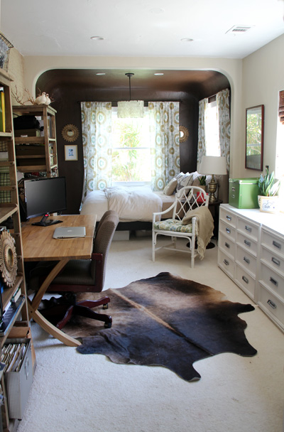
If we step forward through the office to the little guestroom nook of this room you’ll see my newly transformed wall collage there on the left. Art framed, frames hung!
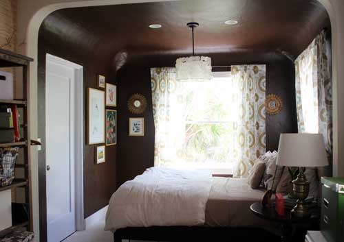
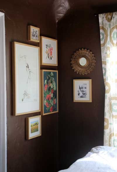
I’d still like to add another photo under the sunburst mirror on the right to help balance the wall out. Love those little starburst mirrors I picked up at Ballard Designs a while back.
The previous collage was not working, too many random frames, mats, colors… the entire wall needed grounding in the form of some sort of consistency throughout. Something that would tie the entire collage together…
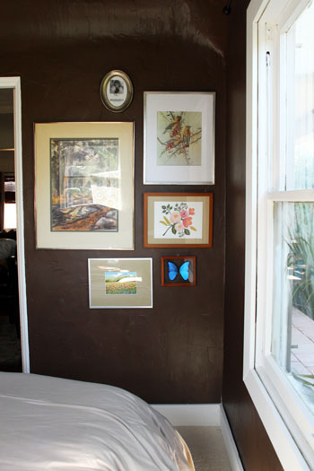
When Anna mentioned matching mats I thought it was a great idea! I had always planned on switching out the off white mats to white all around, but the mention of that idea again started to get the wheels turning.
This image is what inspired me most next:
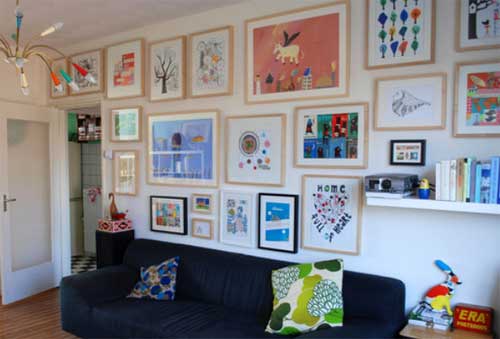
I had decided that birch frames were the way to go (had tried silver and brown and white – not working as well with the dark brown walls) but couldn’t find great birch frames! Searched everywhere. Then the homeowner for the above (gotta love Houzz for their great forum) answered my reply that the frames were from Ikea. You might remember these Ribba guys from this project too, I actually bought the wall collage versions first but they hung with no art for a long while.
The only bummer about Ribba frames is that they are so deep – there’s really no mixing in other art or the levels of the frames become a little disproportionate. No big deal for this space though, I was looking for all birch.
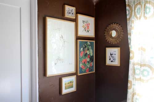
The birch frames bring cohesiveness to the space – exactly what the previous collage was missing. And the color is perfect against the chocolate brown walls!
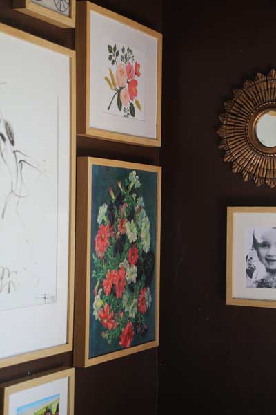
And just like finding the right frames for the space, the artwork has taken me quite some time to piece together, too. I would still like to replace the very bottom Tuscany fields painting (that we found on vacation) with something that fits the overall color scheme better at some point.
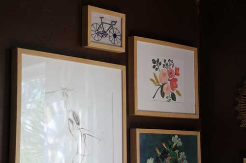
This dancer is one of my favorite finds. I needed a large, bright piece that wouldn’t compete with the rest of the wall but would be interesting enough to feature in a pretty large frame. I thought a basic black charcoal on white would be ideal – an opportunity for the eye to rest and enough white space to brighten up the corner. I found this dancer on Etsy from the BalletArt shop.
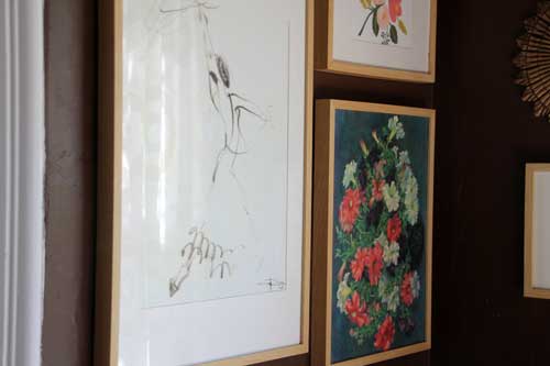
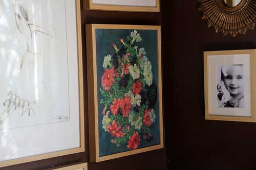
The floral prints just past my dancer bring coral and navy into the room – two colors that work really well with the existing sage, brown and tans.
The first is from one of my favorite calendars (I snipped the front page right off) by Rifle Paper Co and the oil painting is a $10 antique store find that I cut right off of the canvas board with an exacto knife and framed (don’t worry, it was a reproduction :)).

Love the colors! I’m thinking of switching Liv’s picture (on the right there) for a sepia rather than b&w because of the warmer tones in this collage.
The very top piece of art is an embroidered bicycle that I made Kevin for Father’s Day. Kev loves biking and it’s one of his favorite activities to do with Liv. Originally this little box sat in the living room but I think it looks great here.
Much improvement over the first trial run:
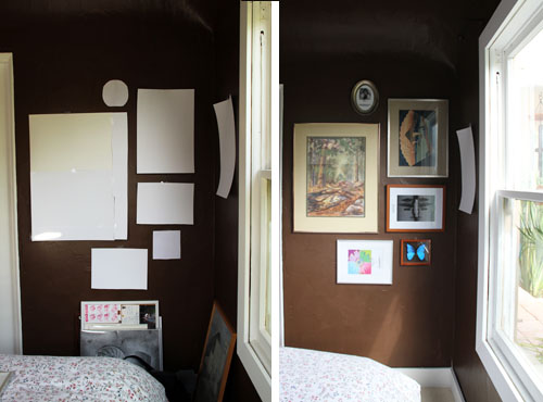
And here she is again today:

Now to find new ways to bring coral and navy into the room. I brought in a little coral/pink art canvas for the side table and perhaps a throw for the bed and pillows for the new bamboo white accent chair will help.
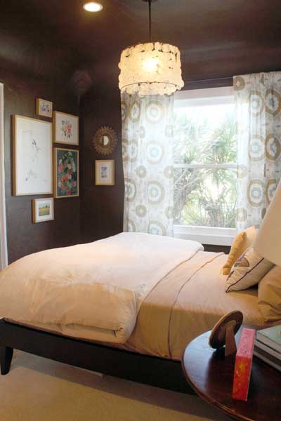
The office is that much closer to being complete! So happy with how it’s coming along these days, the dreaded design block (writer’s block for design?) for this room feels like it’s finally over.
For more Office Makeover posts, check out: a new rug, chair & bookcases, a new tufted headboard for the guest bed, our floor plan, color inspiration, a new trellis print rug, stuck in a rut, designing and sewing the curtains, diy fabric bulletin board panels, handmade capiz pendant light, organizing the bookshelves, wall collage part 1, part 2, fabric bulletin board inspiration, (new) inspiration board, new lamps, wallpapering open shelves, finding the perfect credenza, new trim, dining table-to-desk, a new desk & bookshelves, installing remnant carpeting, grasscloth wallpaper, painting the office nook, finding carpet for the office, chocolate brown wall ideas, plastering progress, inspiration for a diy desk, back in action!, desking hunting for under $300, bookcases under $300,inspirational rooms, room layout options, demo part 1 & demo part 2.




i just love the wall color!
Love the birch! I’ve had a ton of designer’s block in our house – still haven’t finished the toddler’s room after several months! And now I’m planning on repainting our family room/playroom.
On another note, we have some throw pillows that might add a pop of color to your room. If you’re interested I can email you some pictures. (They were wedding shower gifts that don’t work with the color scheme of our house; but I just can’t bring myself to send them to Goodwill)
Leslie, sorry for the late reply! I would love to see them, how fun and thank you for thinking of me!
The birch frames look great against the dark walls. And I love the way the little starburst mirrors echo the fabric pattern in your curtains.
You’re right. The matching frames and mats really make a huge difference. I’ve seen lots of gallery images of mismatched frames and tried in my own home- but same thing. It just wasn’t working for me. I guess it depends on the space.