I’m in a bit of a rut when it comes to our office/guestroom. So much of a rut that I really haven’t touched it since putting up the new curtains in December. I stare at the space everyday since I work in the office from about 9 to 5 – and it stares back at me gloomily wondering when it will be finished.
See, I had this picturesque plan in my head of how I wanted the finished room to work and as I slowly decorated (after Kevin turned the room into an office from the old kitchen) I slowly realized that the pieces just weren’t fitting together. But I couldn’t put my finger on the problem.

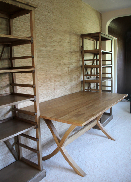
We demoed, dry walled, plastered, rebuilt a concave ceiling, carpeted (to cover up a mismatched wood floor), painted, hung grasscloth wallpaper, found and fixed up furniture:
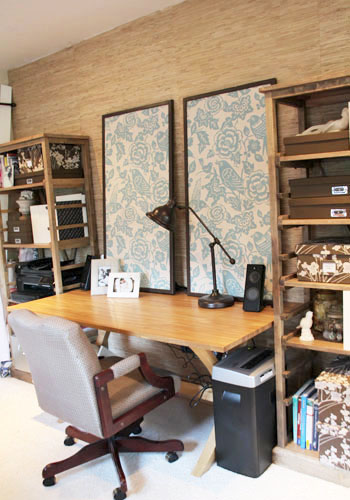
Organized bookshelves, built bulletin board panels:
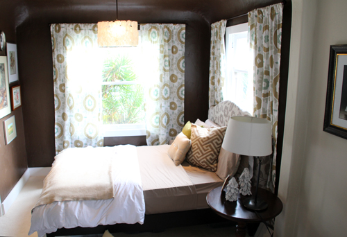
Designed curtains (using Spoonflower), created a capiz light pendant, started a wall collage:
And then bam. Hit a decorating wall.
I didn’t know where to go from there. I loved the new curtains but I was having a hard time making a bronze/tan/teal/mint green color palette feel fresh and not 70’s.
I knew immediately that the headboard that I had made from an old bed frame needed to be recovered. The silvery grey fabric was one of my favorites (left over from this event) but it just didn’t fit. at all.
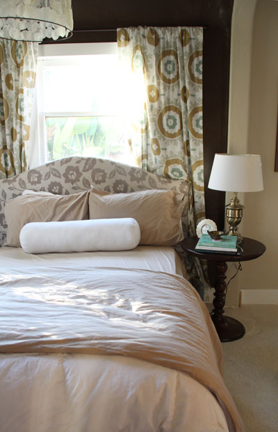
I thought one of my favorite crewel fabrics (left over from this event) would be just right for the space, so I draped it over the original headboard and have had it there for the last two months. But something still didn’t feel right.
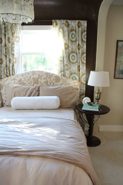
I might still need to come out of my color mixing shell, but I love a room full of patterns! I thought I would really love the curtains with the crewel (especially with a nice neutral bedding).
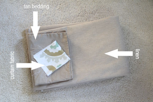
When my parents were here to visit near Christmas my mom casually suggested a solid tan headboard. No, I thought – that would be too safe and boring. Plus, I was kind of digging the pattern overload going on there. But after a month of that sitting on the back of my mind (and me becoming utterly frustrated with a non-progressing room) I headed down to my local discount fabric shop and bought 3 yards of tan linen for $30.
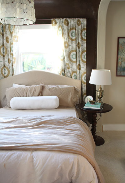
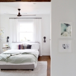
And it worked! Suddenly the room was breathing again and the space felt fresh and light. (All I can think about looking at the above picture is how wrinkled my pillow cases are!). This is a better shot:
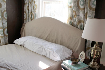
I haven’t covered up the original headboard just yet – still letting this idea grow on me. It’s just draped over the headboard for now.
I think that maybe if the pattern on the bulletin boards were subtler and the bookshelves didn’t feel so overloaded with projects and work stuff then more pattern at the far end of the room wouldn’t feel like so much. The room was becoming so busy!
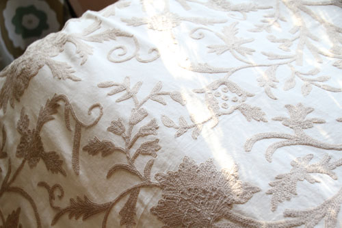
Maybe I’ll make the crewel into a duvet or throw:
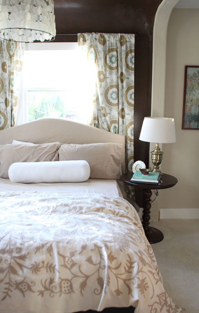
Then the patterns won’t be so stacked and there will be enough neutral to help them breathe. It is so, so pretty – see how the floral pattern is raised up just a bit?
So that finally got the brain juices pumping again… and now I’m beginning to see where the space might go from here.
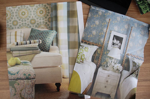
To find that extra inspiration, I started tearing out magazine sheets of rooms that used my color combo.
And every time I spotted a fabric that might work I picked up a little snip of it to test out.
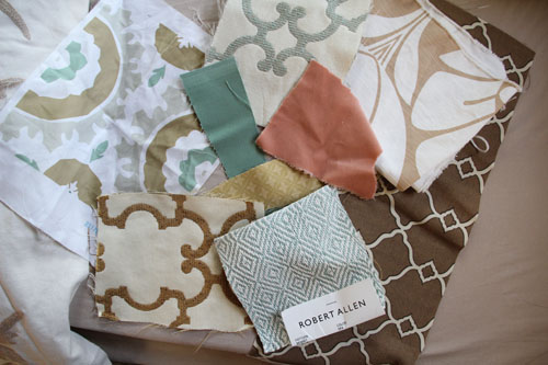
I’ll have to narrow those choices down, but maybe light pink or yellow would work well as a contrasting shade to balance all of the tan & teal out.
And so the saga continues! Have a wonderful weekend! PS am I alone in this or have you ever found yourself in a room rut? PPS I am always open to suggestions!
For more Office Makeover posts, check out: designing and sewing the curtains, diy fabric bulletin board panels, handmade capiz pendant light, organizing the bookshelves, wall collage part 1, part 2, fabric bulletin board inspiration, (new) inspiration board, new lamps, wallpapering open shelves, finding the perfect credenza, new trim, dining table-to-desk, a new desk & bookshelves, installing remnant carpeting, grasscloth wallpaper, painting the office nook, finding carpet for the office, chocolate brown wall ideas, plastering progress, inspiration for a diy desk, back in action!, desking hunting for under $300, bookcases under $300,inspirational rooms, room layout options, demo part 1 & demo part 2.




I love the linen on the headboard but I think a punch of colour would really be a perfect finishing touch. I’d try out something really bold like a hot pink or orange. Good luck. You’re soooooo close:)
Love the idea of a punch of bright color! If only I can get myself to be so bold…
Hello, I am the Assistant Editor of TheOfficeStylist.com, a magazine based on the idea that we should live well at work. We have a weekly series where we feature Office Makeovers from around the world that are interesting, stylish or innovative and we’d love to feature your office in an upcoming article. If you are interested please email me. Thank you!
Love how this space is working itself out…good call on the solid tan head board and the crewell fabric at the foot of the bed looks awesome. Doesn’t seem to compete with your curtains as much anymore. As for the other fabrics your debating over…loving that splash of pink for some contrast and teal robert allen to get a smaller pattern in there.
Thanks, Kelsey! Thank you for your thoughts on this – I’m trying to figure out the right way to incorporate the pink and robert allen fabrics because I agree that they are my favorite.
Your mom did good suggesting the solid!
I also think that it is because the two patterns are of the same scale. What I think is missing is little punches of bright colours, perhaps in an accent pillow or vibrant print in your collage wall.
I am currently having the same problem with my bedroom, I have a Tiffany blue and chocolate brown theme but it is feeling tired. I might just have to go fabric hunting in the near future.
Love the idea of introducing that vibrant print in the wall collage!!
I love the linen on the headboard, and add turquoise for the pillow cases. You could add a few of the prints for throw pillows. I like the crewel spread at the foot of the bed. For another headboard option, I like the Robert Allen fabric. A stripe throw into the mix would help balance out all the prints.
Shiela, I was thinking along the same lines with the tab headboard and one of the patterned fabrics in pillowcases or shams. Thanks for your suggestions!
Hi Morgan….I agree with Kai about the 2 prints being similar. They just seem to blend in. I also love the RA diamond fabric and maybe do the roll pillow in the orange velvet to add that pop. Love the crewel at the end of the bed. Good luck and can’t wait to see what you come up with.
Thanks Sherry! Great suggestion in doing the rolled pillow in the velvet.
I’m surprised to read about your unhappy situation since I think your office/guest room is really pretty. In my humble opinion, the problem was that both headboard prints you tried are large-scale, which doesn’t harmonize with the equally large-scale curtains. I love that Robert Allen diamond fabric as an alternative to the tan headboard – I think the scale would look much better and I’m not crazy about the tan headboard/tan bedding combo. And I love the crewel fabric made into a throw. It looks gorgeous at the foot of the bed.
Kai, I think you hit it on the head regarding the large scale print! Thank you for your suggestion, I learn something new everyday!